

Family members, a couple of parents and their four children, returned to Israel after several years living in Barcelona.
Their house in north Tel Aviv, which is approximately 250 square meters in size, was built in the 1950s and has undergone several transformations and expansions over the years. To adapt it to the family’s current needs, all the interior spaces were renovated and the house was re-divided.
Interior designer Eitan Cohen found creative solutions to deal with the constraints of the structure, created numerous functional storage solutions, and designed the house in an accessible yet elegant and unique way.
Geometric motifs of grids in various divisions have become a complete design language that wraps the house in the floor, ceiling and carpentry, creating visual richness with deep thinking behind it. We know you want details and examples, please:
Stanley Home | Ofri Paz
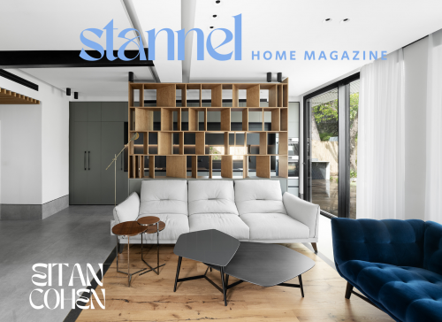
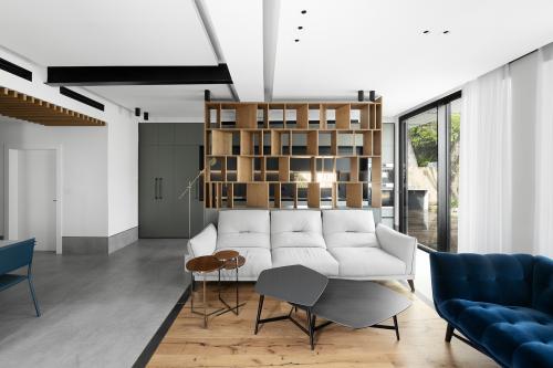
Public space ceiling
The changes and additions the house has undergone over the years have led to a lack of uniformity in the ceiling height. Constructive limitations and a desire to create a sense of height led to an unconventional solution: “The existing plaster ceiling was dismantled, and in its place I created a new grid that wraps around the existing beams and creates a kind of new rhythm from them,” says Eitan.
Niches in the ceiling emphasize the division, and new false beams were designed to carry electrical, communication, and air conditioning systems.
Note the air-conditioning vents incorporated into the apron above the dining area, where, to create a more intimate feel, the ceiling was lowered and covered with wooden slats. Another element worth mentioning on the ceiling is an iron beam that runs between the living room and dining area – “It’s an original beam from the 1950s and very massive. We decided to expose, sand and paint it to integrate it like a sculpture into the space,” the designer explains.

Photography by Gideon Levin – 181 degrees
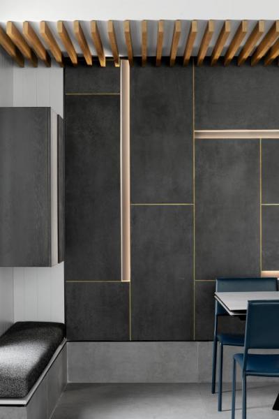
The wall covering in the dining area
On the back wall, which provides a backdrop for the dining area, you can see another grid that was emphasized with brass bars and hidden lighting – “We used thin 3 mm thick tiles that were laid in a Mondrian pattern. Niches for lighting were incorporated into the plaster wall, and we made sure to design them so that there would be no glare,” says Eitan, explaining that the direction of the light was determined according to the direction of view – standing or sitting – to create a pleasant feeling and prevent glare.
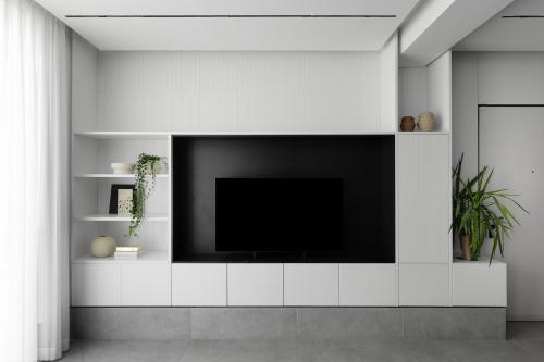
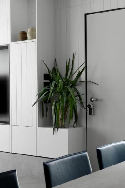
A versatile carpentry element
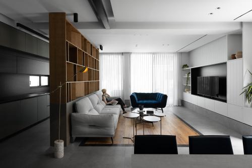
The entire entrance wall is used, from end to end, for smart and functional storage. Opposite the living room, closed units were combined with open shelving for display.
The television is placed in a blackened rectangle in the center, blurring its boundaries and creating depth. A planter was incorporated next to the door for a refreshing green addition, and a bench and liquor cabinet were designed next to the dining area. The result is a clean and meticulous composition that connects the various functions in the space.

Photography by Gideon Levin – 181 degrees
Defining areas with paving
The entrance to the house is located between the dining area and the living room. To create a visual separation between them, the designer chose to cover the living room floor with wooden parquet, the same type he used to cover the dining area.
Basalt stone surrounds the parquet, creating a kind of carpet that echoes the division into squares designed in the ceiling. The same basalt stone also defines the external path, which surrounds the house and runs alongside old fruit trees that it was decided to preserve.
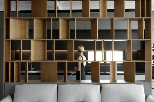
Partition between the living room and the kitchen
One of the homeowners’ dreams was to design an additional kitchen. In reality, they ended up with three functional kitchens – a representative one facing the public space, a more hidden one in the back, accessed through a hidden door embedded in the wall of tall cabinets, and another outdoor kitchen.
The designer even provided a convenient solution for taking out dishes and transferring dishes from the two interior kitchens to the exterior dining area through the windows. A wooden partition, consisting of a grid of squares, separates the living room from the kitchen and creates privacy and partial concealment. It was adjusted to the width of the sofa, and some of its ribs were designed diagonally to create depth and interest.

Photography by Gideon Levin – 181 degrees
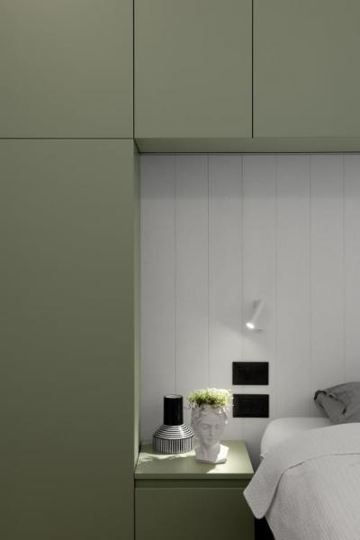
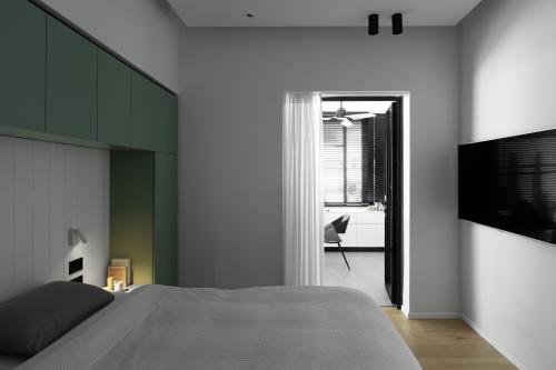
Bed frame in the double unit
The existing house space was divided into more rooms to accommodate the family composition, and with the idea of creating a separate housing unit in the future.
This required the designer to make optimal use of the space and plan smart storage solutions. In the master bedroom, he designed a carpentry unit that hugs the bed – small cabinets for personal belongings were designed on both sides, and small chests of drawers were next to them. Reading books are stored above the bed, and hidden lighting was incorporated to create a soft and enveloping atmosphere. From the bedroom, you can access a home office, where a large wardrobe was designed. From the office, you can also go outside to the garden, so meetings can be held without disturbing the daily routine of the household members.

Photography by Gideon Levin – 181 degrees
Bathroom design
The bathrooms incorporate square elements that continue the design language of the house, as well as details that emphasize the proportions of the space. In the master bathroom, for example, concealed lighting from floor to ceiling was incorporated behind the toilet, creating a sense of space and height. A square skylight brings natural light into the room and defines the sink unit from above.
Details and selection of materials
Brass bars, floor frames, recessed lighting and contrast between materials highlight the design motifs and the grid division designed in different areas of the house. Large tiles were chosen to create a sense of size, and a tall panel recessed into the wall with a black cut-out detail meets functional needs and creates an effect of height in the public space.


Photography by Gideon Levin – 181 degrees
Design and planning: Eitan Cohen About the studioETN
StudioETNis a dynamic, eclectic and up-to-date studio, founded by Eitan Cohen in 2010 after graduating from the Holon Institute of Technology (HIT). The studio specializes in designing urban living spaces, using light, natural materials and functional design that considers space in its natural form. It believes that good design begins with observation and attention, placing the client’s desires and needs at the heart of the project. Through a precise combination of materials, people and art, the studio creates spaces that tell a unique story, collaborating with various workshops to create customized furniture and lighting fixtures.
Chat with Eitan >>>>Eitan Choen » STANNEL HOME
Pietro Hecht Furniture << Make an appointment <<Pitaro Hecht – Israel » STANNEL HOME

Subscribe to our lifestyle channel newsletter
Error: Contact form not found.
Subscribe to our lifestyle channel newsletter
Subscribe to our lifestyle channel newsletter