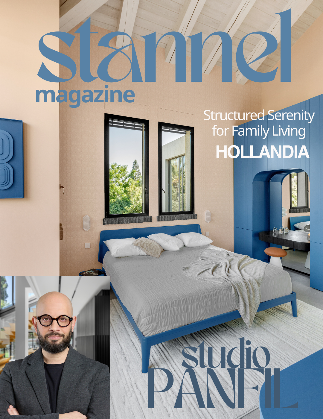
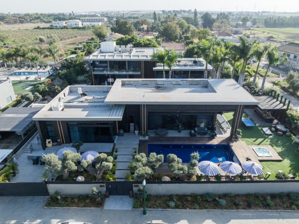
Some houses reveal their potential immediately, even when the way they are organised no longer reflects the lives unfolding within them. This 300 square metre residence in Ramat Gan was one of them.
Set on a corner plot in an established neighbourhood, the house was originally built around 15 years ago for an older couple. When a family in their forties with three children moved in, the architecture was still compelling, but the way the interiors functioned belonged to a very different chapter of life.
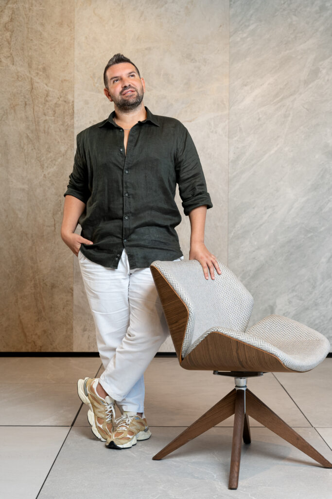
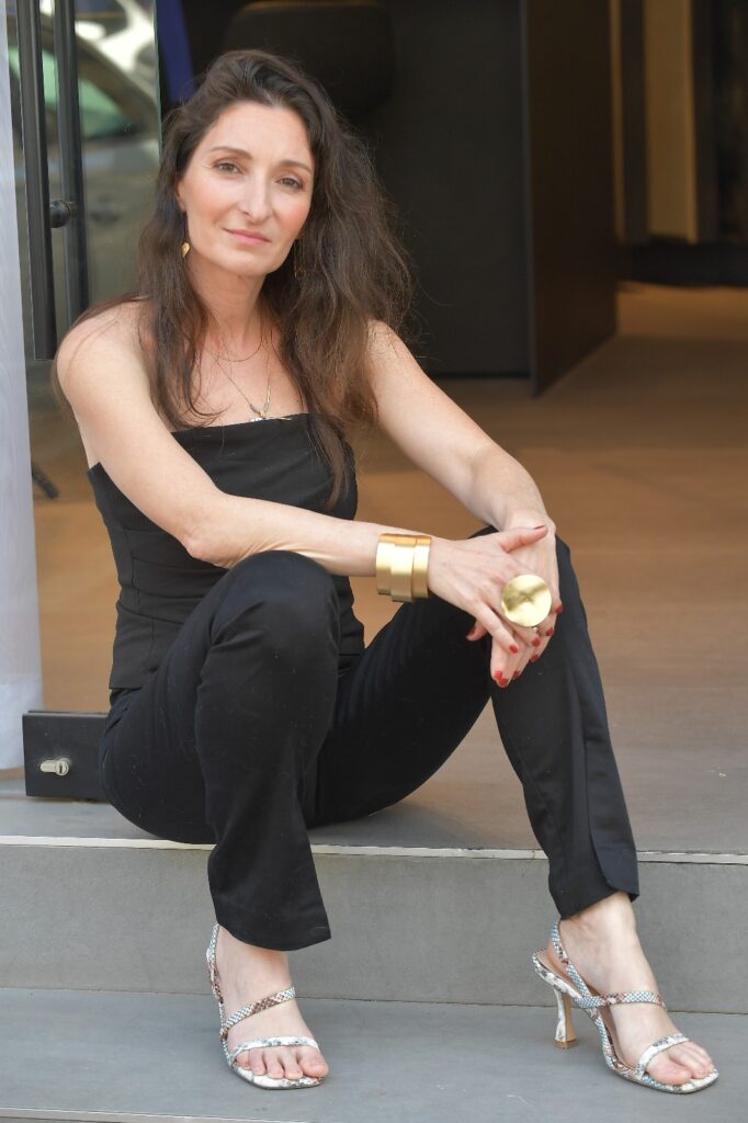
Interior designer Tuvia Panfil, founder of Studio PANFIL, was invited to rethink the house around the rhythms of a young family, creating a home that could move easily between everyday life and entertaining without losing the architectural character that made it interesting in the first place.
Ofri Paz | STANNEL
The original plan was relatively fragmented. The kitchen occupied a remote position facing the parking area, the public spaces were divided, and despite the generous garden surrounding the house, the relationship between indoors and outdoors remained surprisingly limited.
The existing structure, however, was fundamentally sound. Rather than pursuing dramatic architectural intervention, Panfil concentrated on reorganising the interior and establishing a clearer hierarchy between spaces.
This proved to be the real challenge.
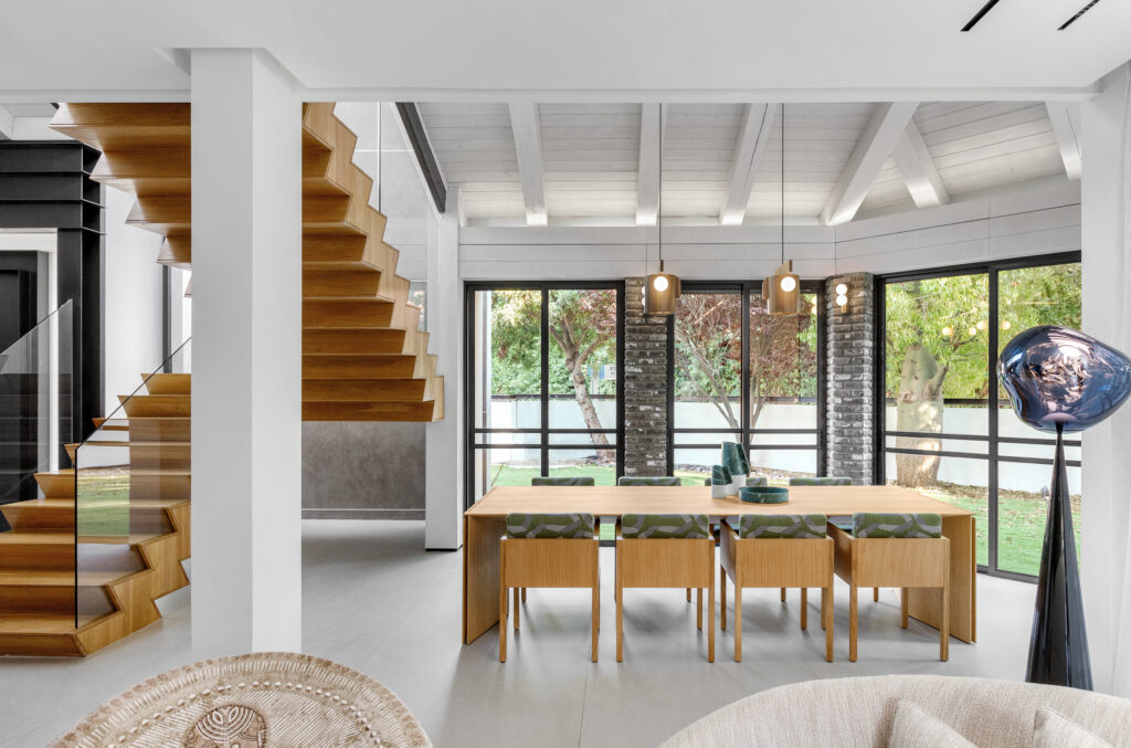
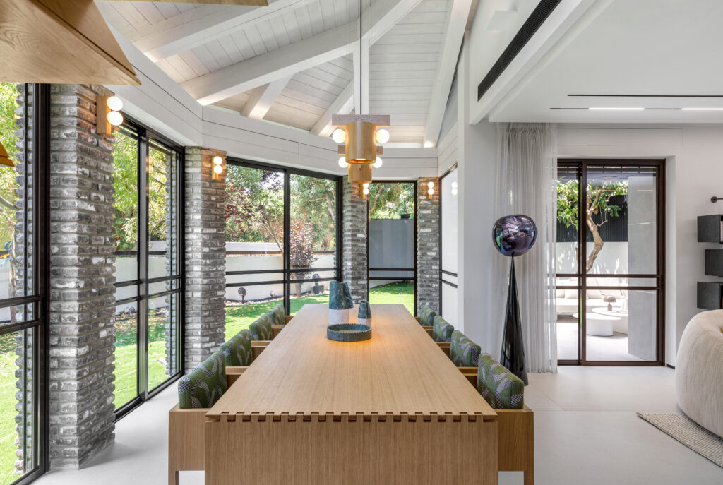
There are few continuous walls in the house. Instead, the architecture is defined by large openings, abundant natural light and an unusual geometry of diagonal lines, sharp corners and ceilings that shift in angle and height.
Rather than concealing these irregularities, Panfil allowed them to become part of the new design language.
“The goal was to create a modern, calm and precise home,” he explains. “One that does not depend on passing trends, but on quality materials, considered proportions and functional planning.”
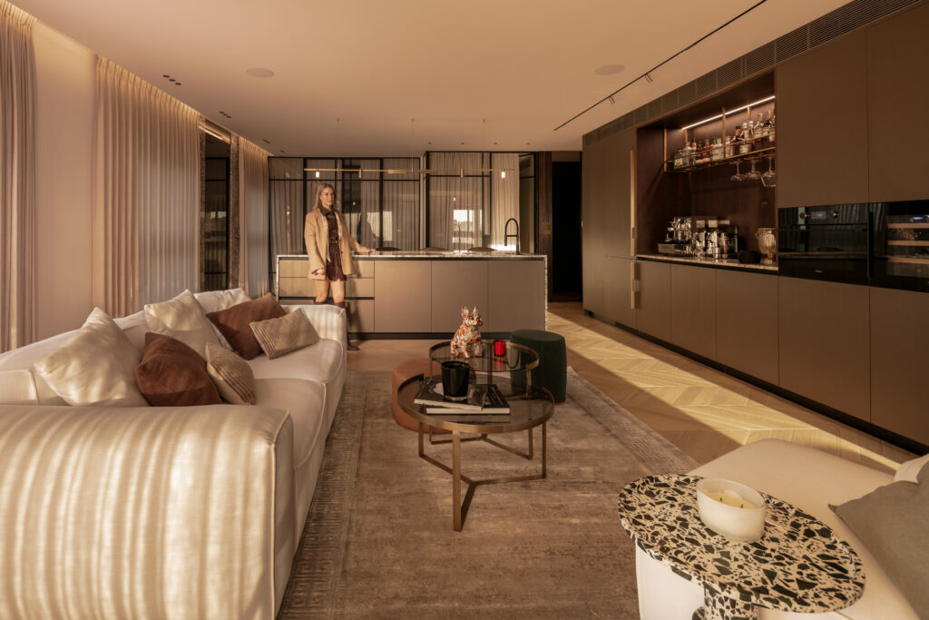
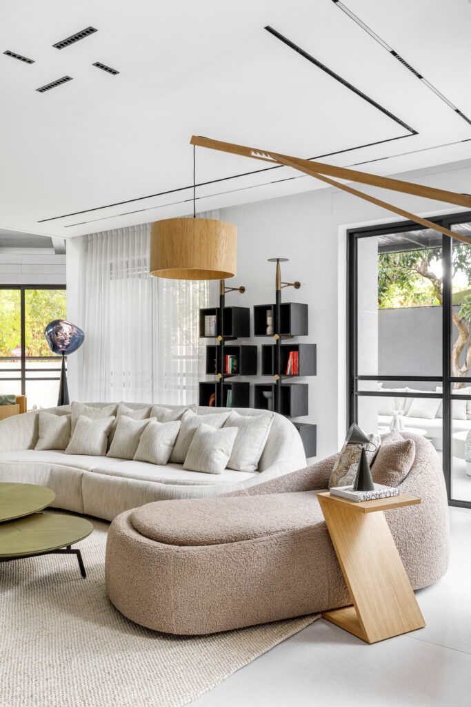
At the centre of the transformation is a newly continuous public space connecting the living room, kitchen and dining area. The kitchen was reconsidered as an integral part of family life, generous enough for daily routines yet equally suited to entertaining. Storage was incorporated throughout, but deliberately kept as discreet as possible, allowing the architecture and the sense of space to remain visually uninterrupted.
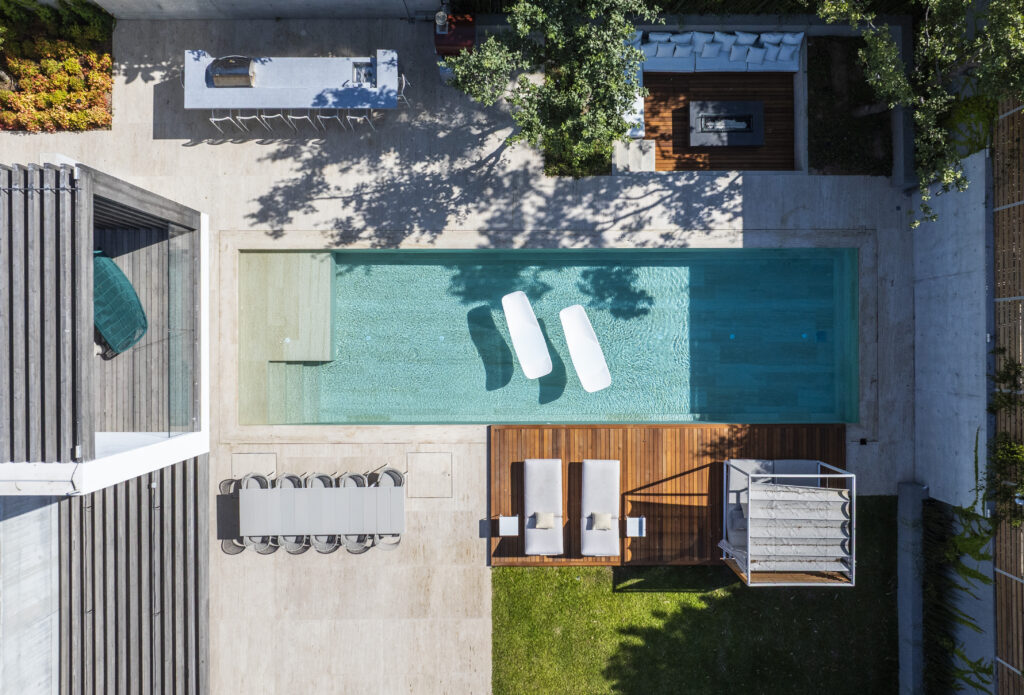
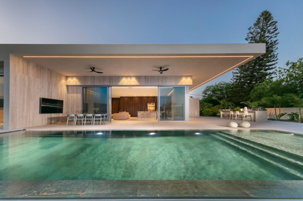
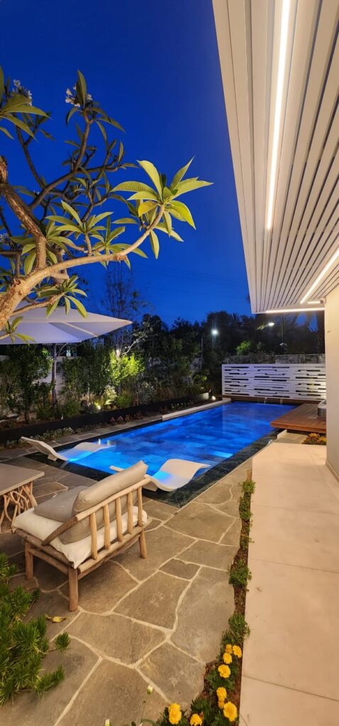
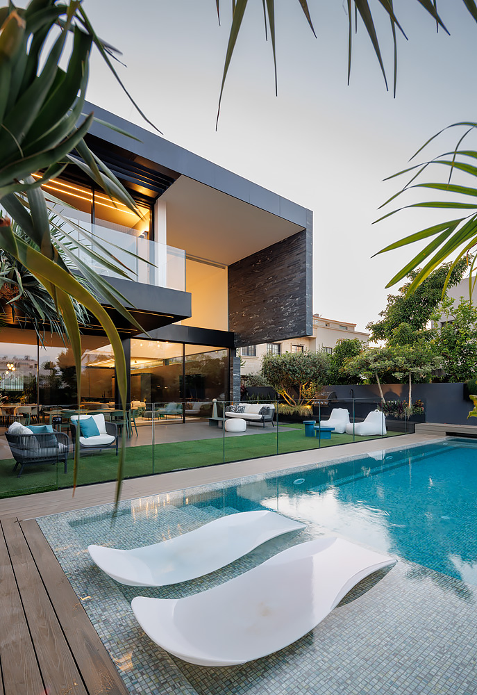
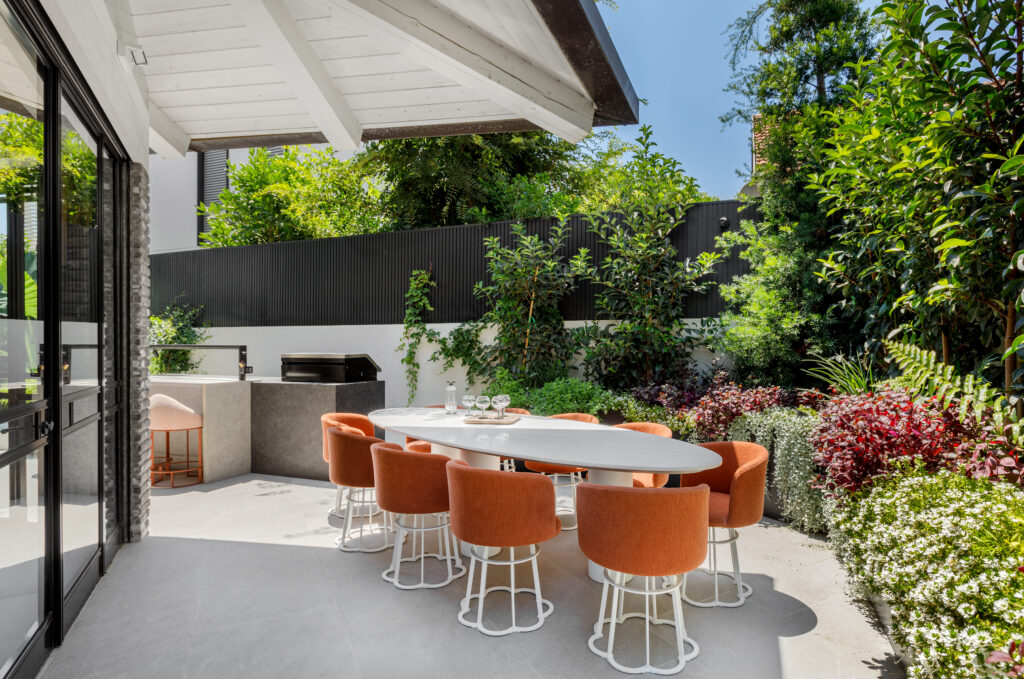
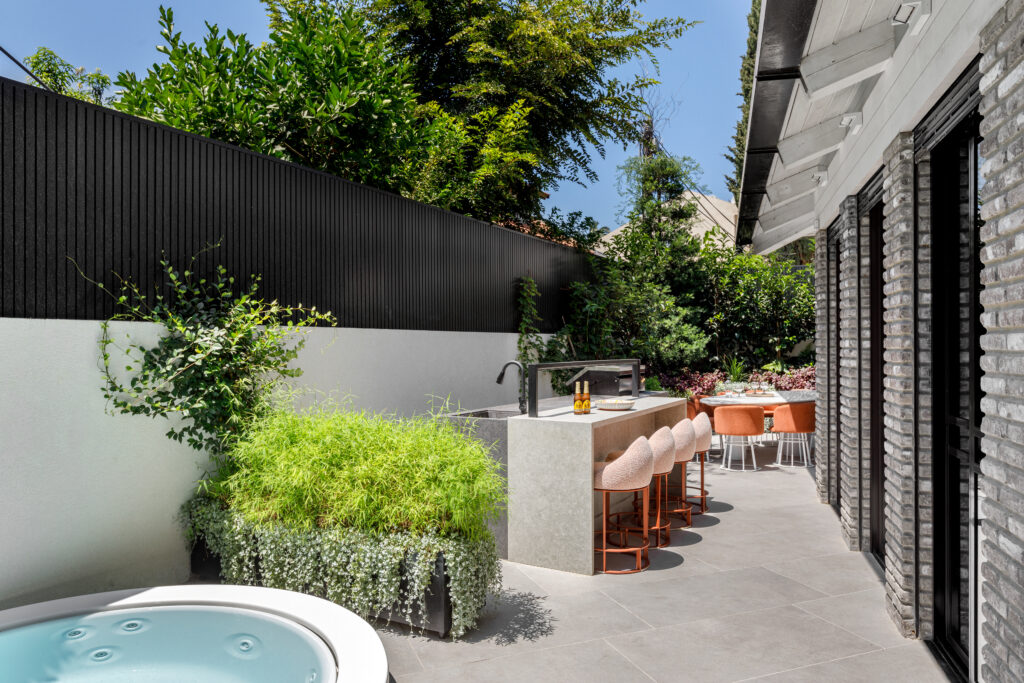
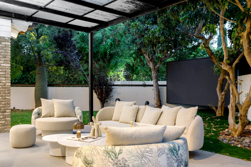
Just as important was the relationship with the garden. By strengthening the connection between the main living areas and the exterior, the landscape becomes part of everyday life rather than something observed from inside.
The result is quieter than the complexity of the original architecture might suggest. Lines are clearer, movement through the house feels intuitive and the different functions settle naturally into place.
Panfil did not attempt to erase the peculiarities of the existing house. Instead, he gave them order.
And in doing so, transformed a house designed for another life into one that finally reflects the family living there today.
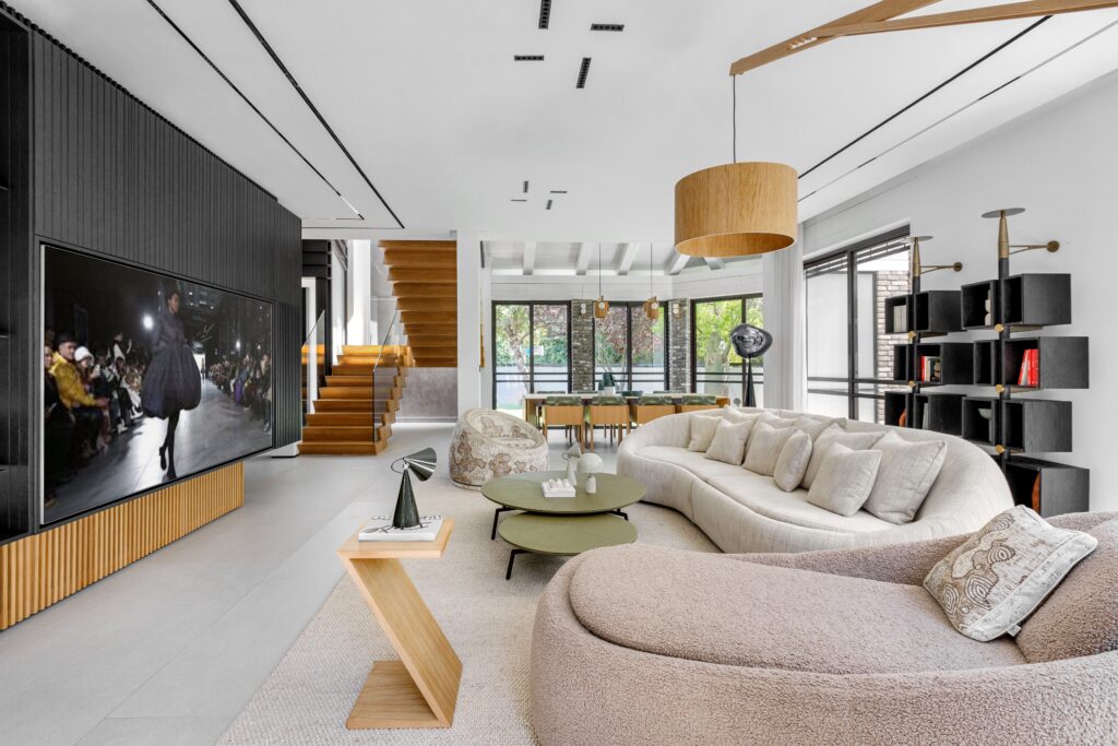
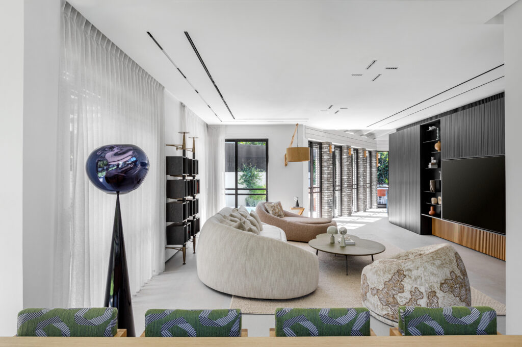
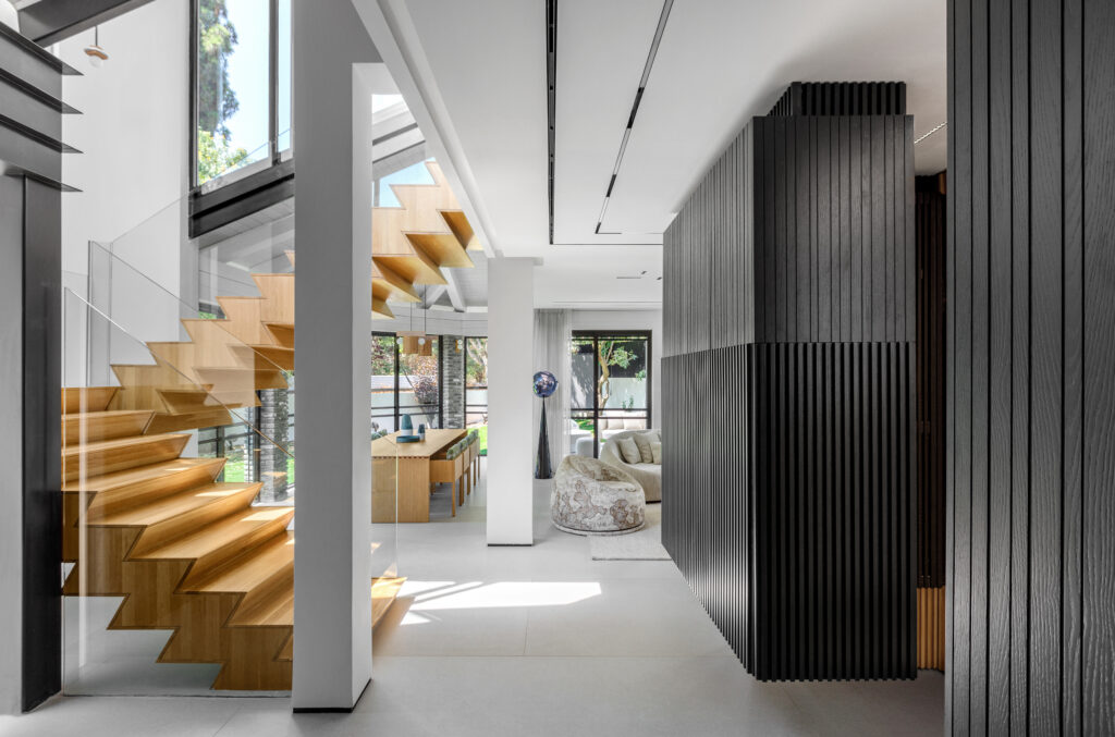
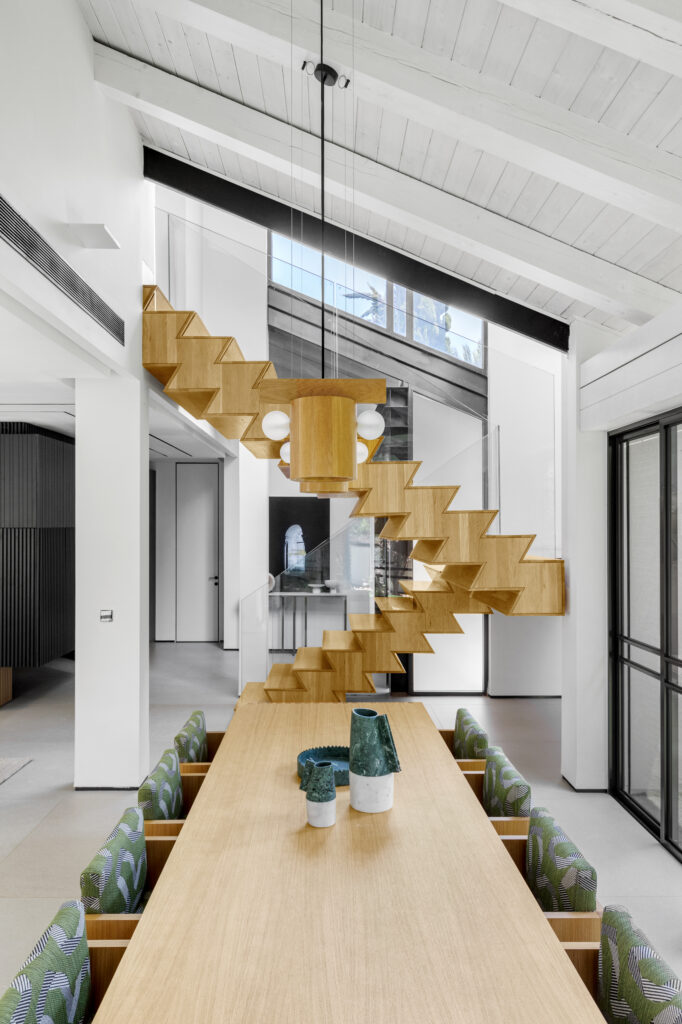
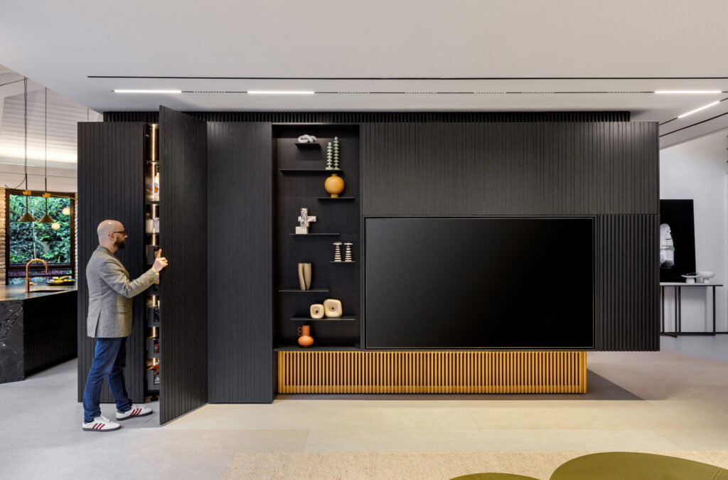
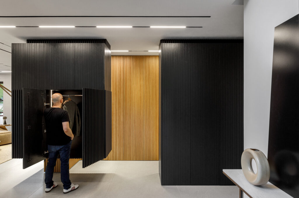
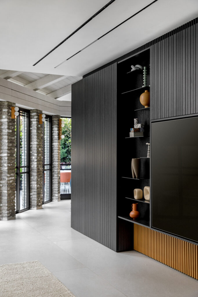
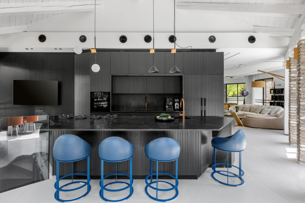
The main move in the project was to create a large and significant architectural element at the heart of the entrance floor: a kind of large carpentry cube, which organizes the public space around it. Instead of dividing the floor with new partitions, this element became an anchor that defines the different areas of the house, while still maintaining a sense of openness. “This cube faces three different directions, and each side of it has a different function,” explains the designer.“On one side it serves as the living room’s TV wall, on the other it defines the kitchen area, and on the third side it creates a neat foyer for the entrance area of the house.”
A dark finish was chosen for the carpentry, and it serves as a clear visual anchor within a bright and open envelope. A restrained color palette was built around it, including shades of gray, smoky black, warm wood, and measured touches of deep color. The existing beams were significantly reduced, choosing to leave them only in places where they have a clear architectural justification – on the columns. In this way, they emphasize the constructive elements and contribute material depth without overloading the space. They are joined by the ceiling beams, which were preserved as part of the original character of the house and integrate into the new language, while touches of color in deep shades of blue, green, and brown add interest, warmth, and a layer of depth to the restrained language.
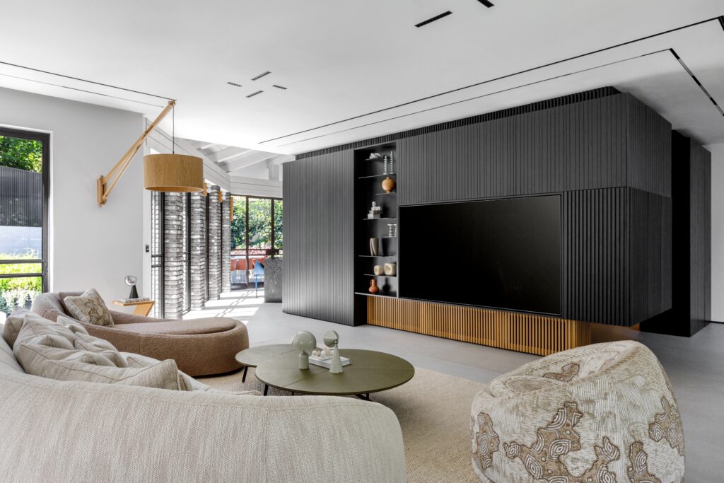
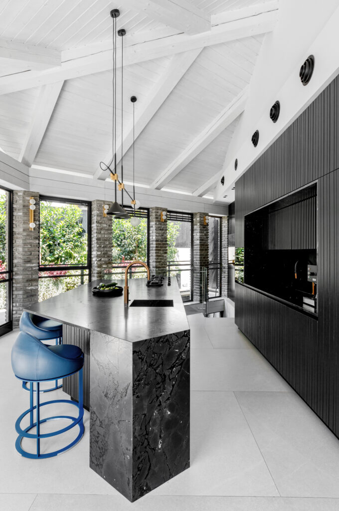
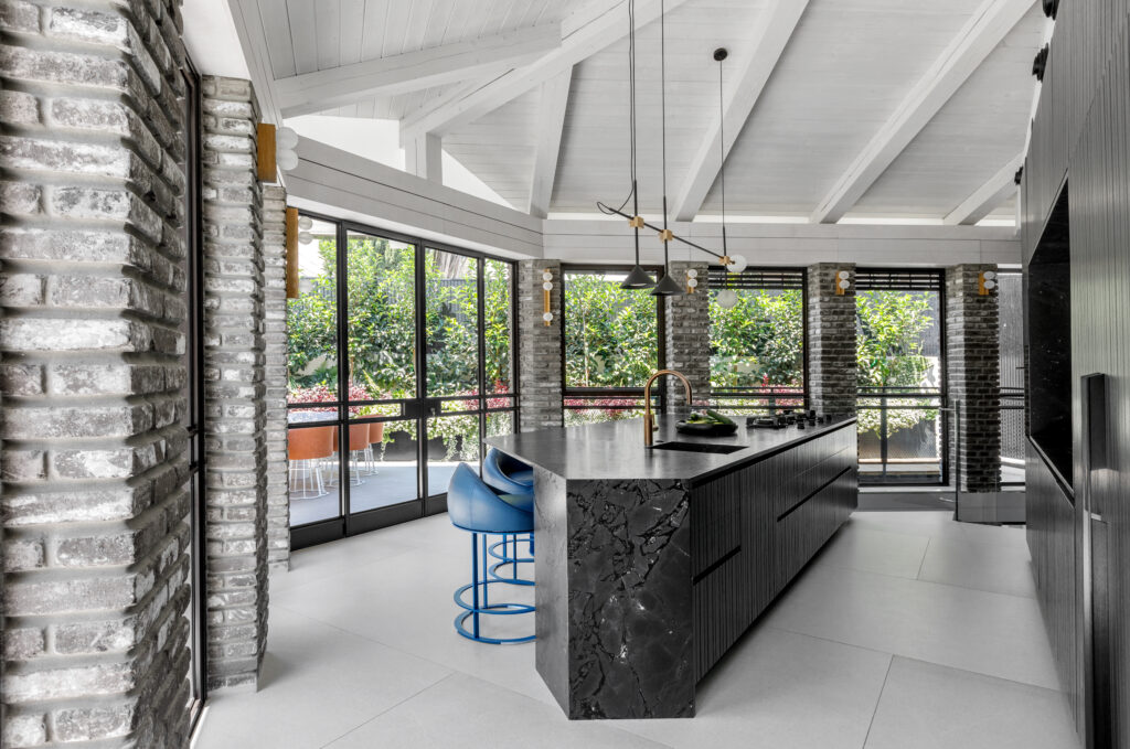
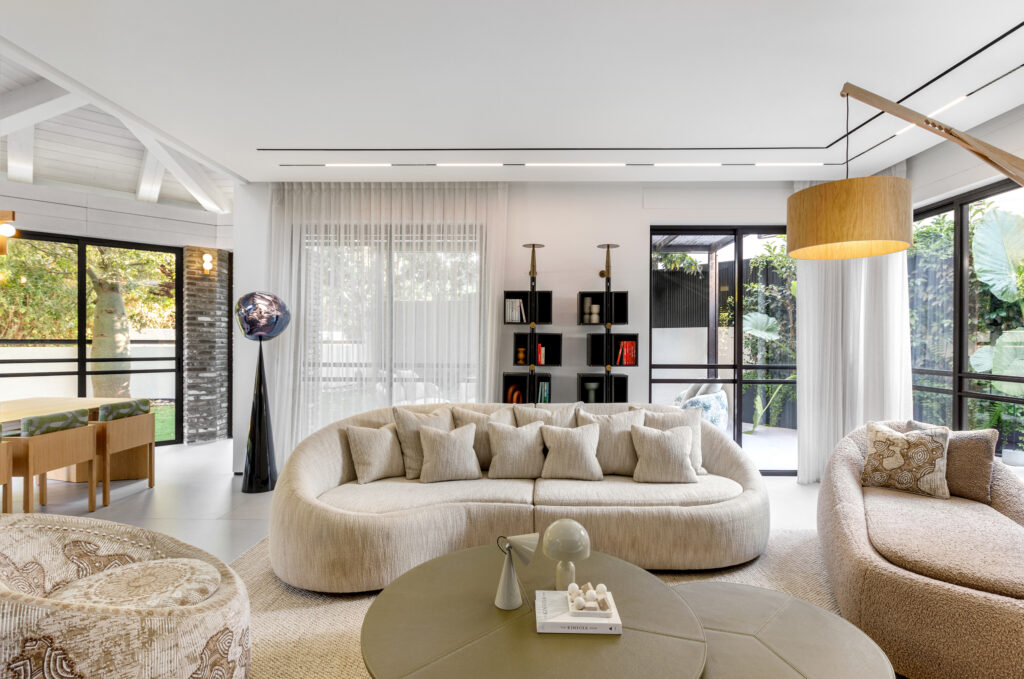 The public space was designed as an open, flowing, and connected space, where the living room, kitchen, and dining area maintain a continuous dialogue, while also having a direct and continuous connection to the outdoor spaces. The kitchen, which was relatively small in the original design and, as mentioned, faced the parking lot, was moved as part of the renovation to the back of the house, the one facing the garden and the large openings.
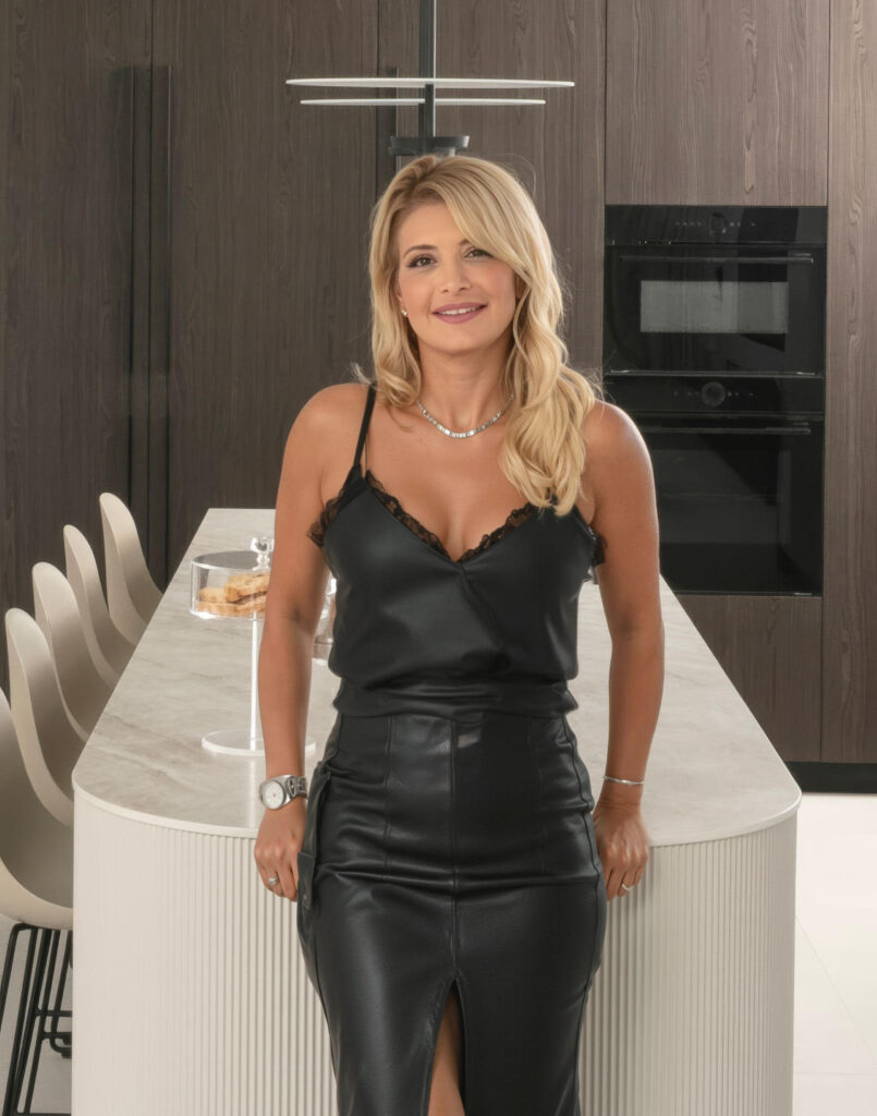
This change made a fundamental difference in the way the house functions: instead of a side and detached kitchen, a large, bright, and comfortable kitchen for daily use was created, which naturally connects to the guest areas, the yard, and the entire course of life. In its center stands an island whose shape continues the angles of the existing structure, and thus it functions as an integral part of the overall planning language. The living room is located in the center of the floor, between the kitchen and the dining area, and the atmosphere in it is relaxed and intimate thanks to the choice of furniture with rounded lines, which soften the sharp geometry of the shell.
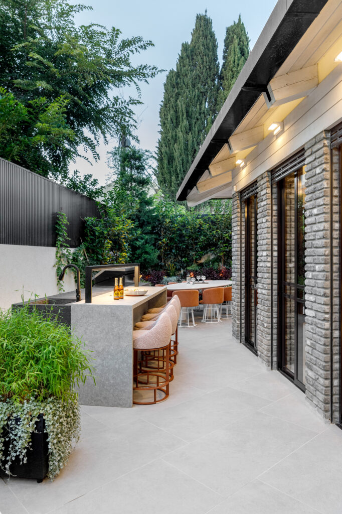
The dining area is located next to large display windows facing the garden, so that the entertainment naturally expands to the outdoors, which was also designed as a direct continuation of the public space, with seating and entertainment areas that reinforce the sense of continuity between the interior of the house and the garden.
On the upper floor, the atmosphere changes noticeably – from the open and dynamic hospitality space to a calm, intimate and softer space, dedicated entirely to silence and privacy. This transition is not only functional, but also sensory: the lighting softens, the materials become warmer, and the architectural rhythm slows down to an enveloping and inclusive experience.
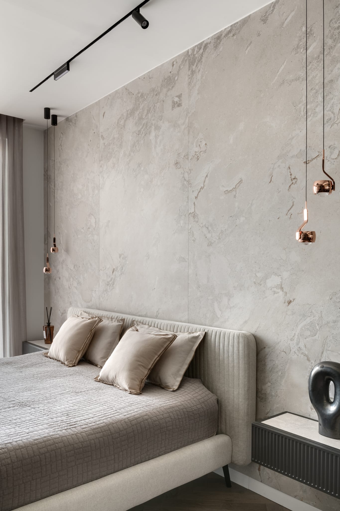
The master suite is one of the most prominent and precise spaces on this floor, and it was designed around one central and particularly significant item – an adjustable AUPING Essential bed. The bed, designed and engineered by the Berlin-based design duo Köhler and Wilms, has won prestigious international design awards, including the Red Dot Design Award, Good Industrial Design and the iF Product Design Award. Already in the early stages of the planning, it was clear that this was not a complementary item, but a conceptual and design anchor around which the entire space would be shaped.
The choice of a deep blue for the bed led the material and color language of the entire suite. The same precise blue recurs in the carpentry details, the cabinet fronts, and other complementary elements, creating a harmonious dialogue between the various items. Color is not used here merely as an aesthetic medium, but as a connecting tool that creates continuity, depth, and a sense of wholeness.
Alongside this, the rest of the room’s elements were carefully chosen to balance the dominant presence of blue – natural tones, soft textures and materials that are pleasant to the touch complement the bed and emphasize the quiet elegance of the space. The result is a suite with a clear, deep and refined identity, which manages to combine a precise design statement with a sense of everyday comfort and relaxation.
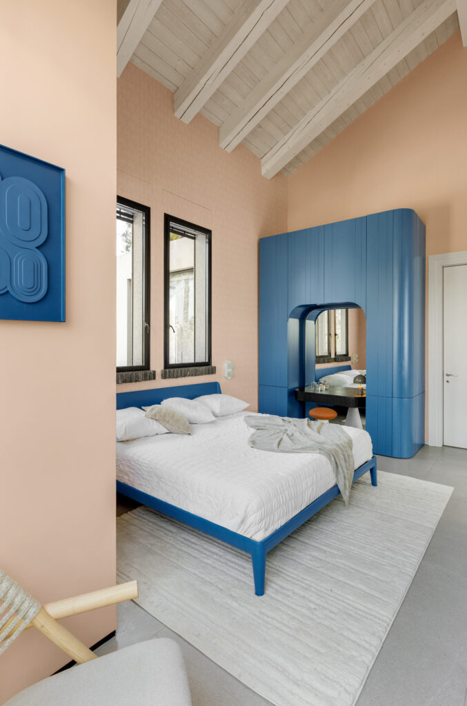
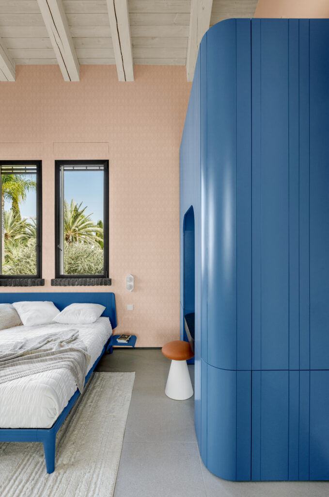
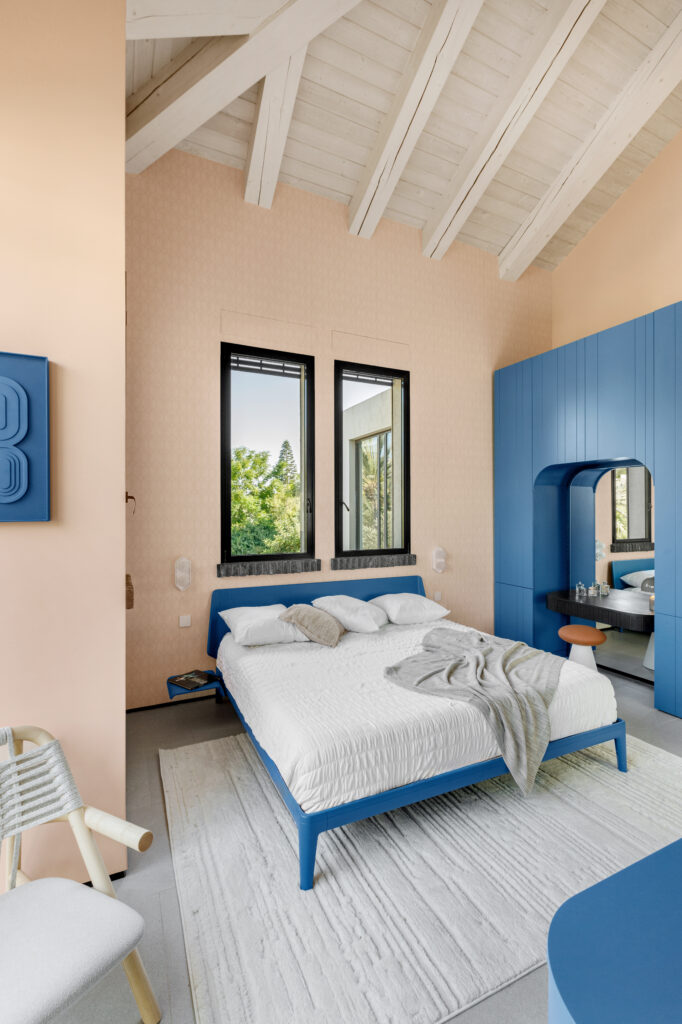
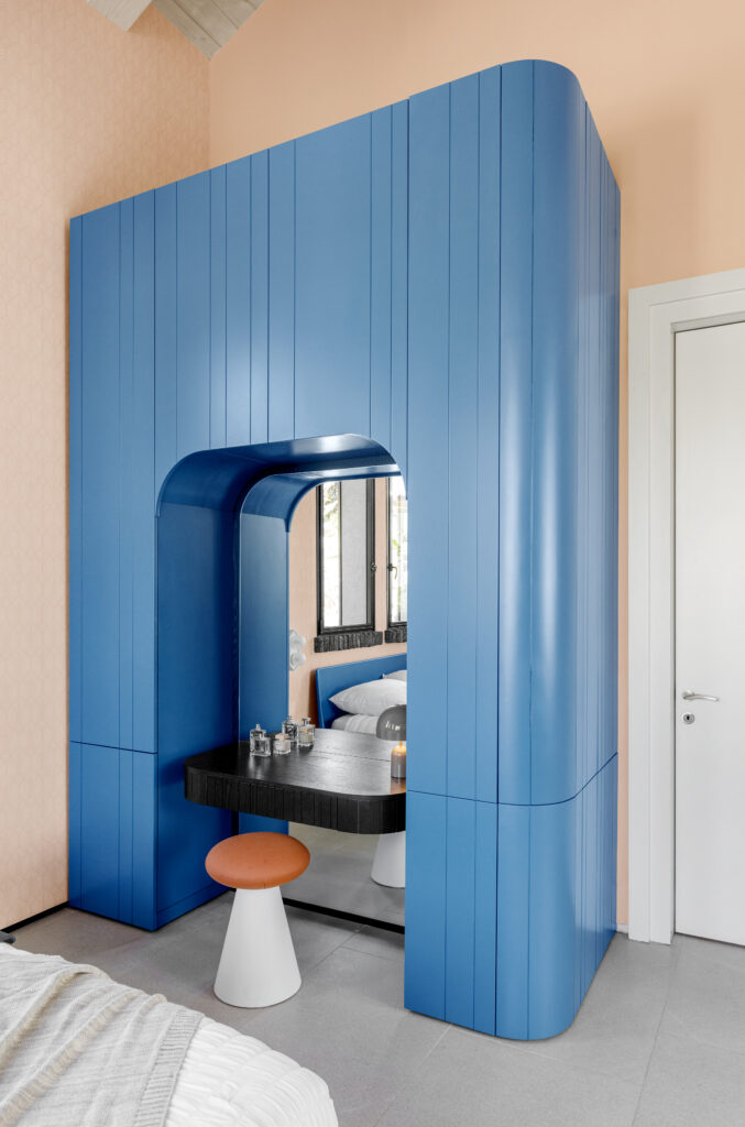
The bed itself occupies a very central place in the experience of the room, not only physically but also visually. It gives the entire unit a colorful and material anchor, and manages to be dominant without being overwhelming. The choice of a deep blue, unconventional but precise, introduces a sense of depth and softness into the space at the same time, and distinguishes the master unit from the restrained language of the rest of the house, without cutting it off from it.““Another homage to this color also appears in the public space: the bar stools in the kitchen were given exactly the same shade. This way, those passing through the spaces can recognize the context and experience the house as one complete system, rather than as a collection of disconnected rooms,” explains Panfil.
 Planning and design |Tuvia Panfil, Studio PANFILPhotography |Shiran Carmel
About the firm | Studio PANFILStudio PANFIL, founded by interior designer Tuvia Panfil and operating for about 16 years, specializes in designing private homes and residential apartments. Over the years, the firm has developed a design approach that combines precise functionality with a rich and meticulous aesthetic language, with customized carpentry and storage solutions forming an integral part of the architecture itself. As in this project, the studio’s other works also show the search for a balance between a clear design statement and a home that feels natural, right, and comfortable to live in over time.

The Vals Thermal Baths – one of the most recognizable works of Swiss Pritzker Prize-winning architect Peter Zumthor – recently returned to the spotlight with the world premiere of From Inside Out – The Architecture of Peter Zumthor at the Venice Film Festival. Wim Wenders’ new documentary, shot over more than 14 years in 3D […]
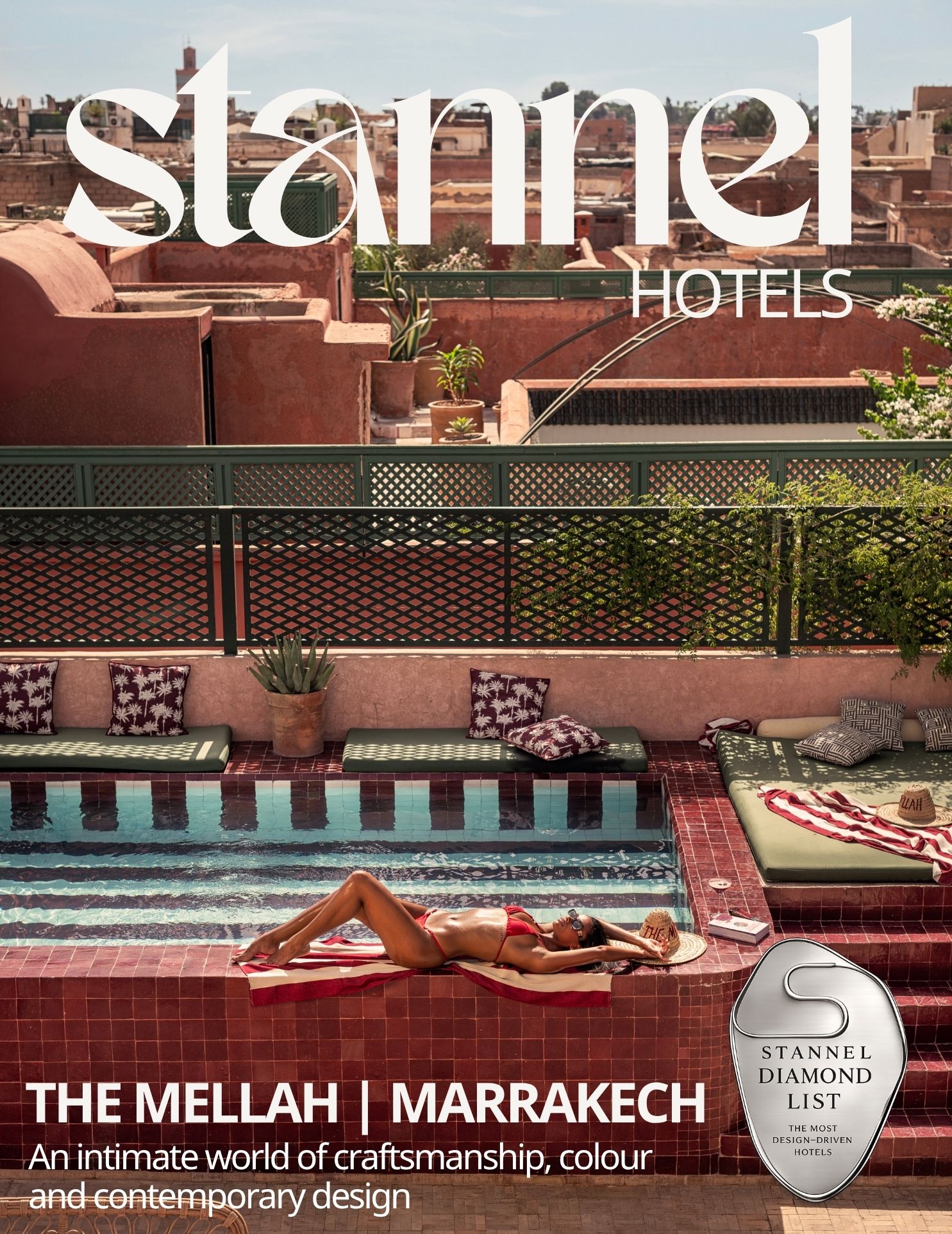
“We didn’t set out to build a hotel. We wanted to create a home, one that we ourselves would want to stay in,” says Zakaria Lamrani, one of the founders The Mellah. This sentence perfectly sums up the idea behind the boutique hotel, hidden in the heart of the old city of Marrakech, in the […]
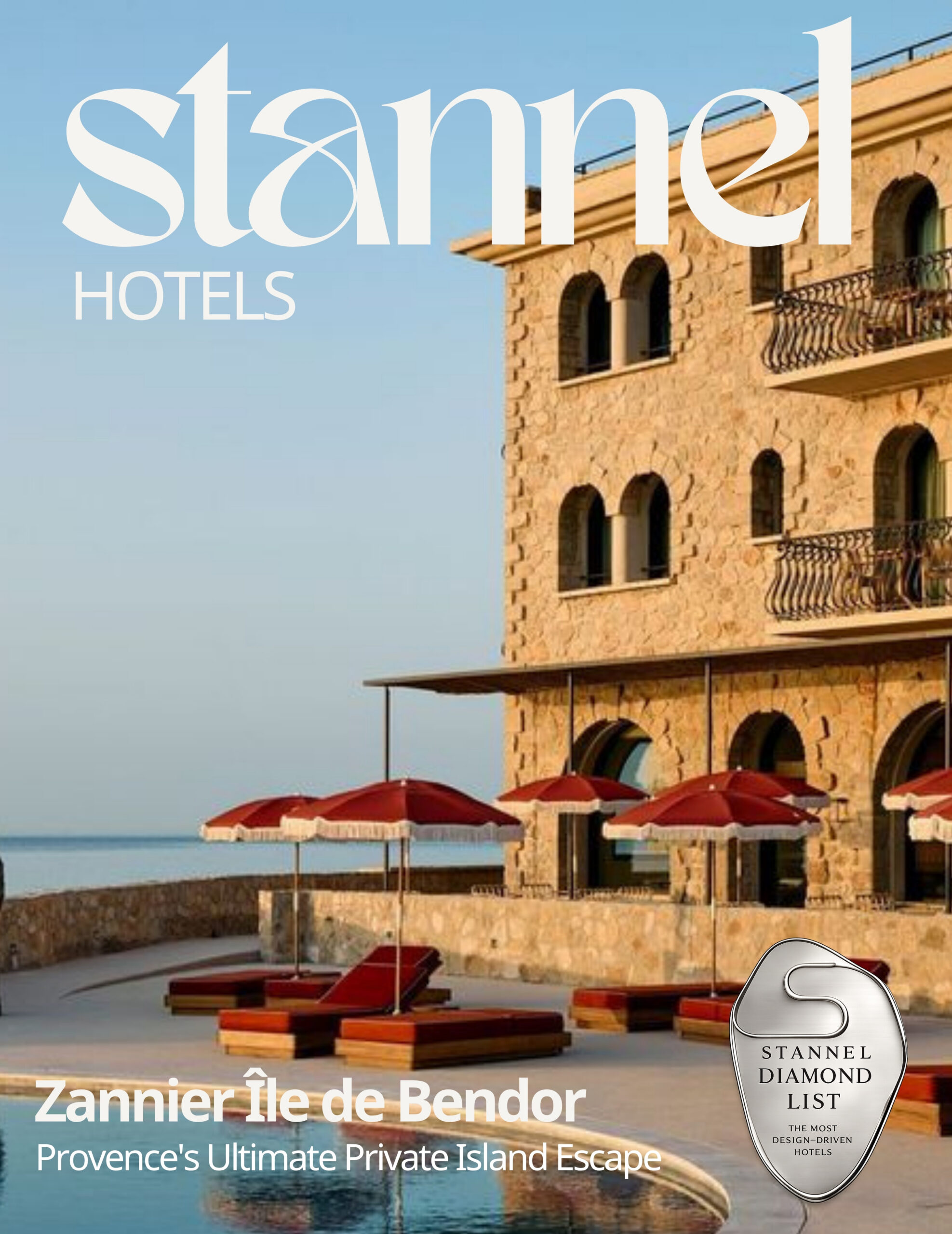
On a private 70-dunam island just off the coast of Bandol in Provence, and only a seven-minute boat ride from the French Riviera, Zannier Bendor Island opened its doors last spring. The retreat comprises 93 rooms and suites spread across three distinct settings, each offering its own interpretation of island living. Its opening marks […]



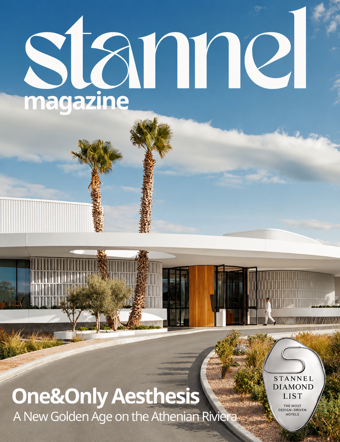
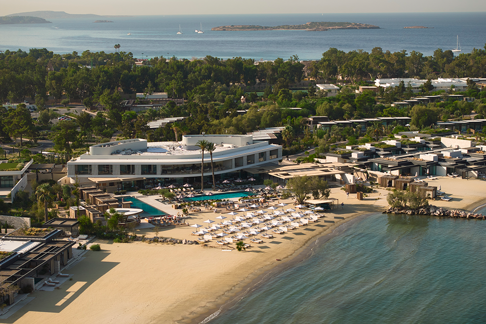
There are places that carry with them not only architectural history, but also an entire cultural baggage. One&Only Aesthesis Born from an attempt to bring back to the present the spirit of Astria Glyfada, the iconic resort that once marked the glory days of the Athenian Riviera. Located in Glyfada, south of Athens and overlooking […]
AUDO

A6Architects

K-Studio

ASPA KST

Muza Lab

210 Dunam
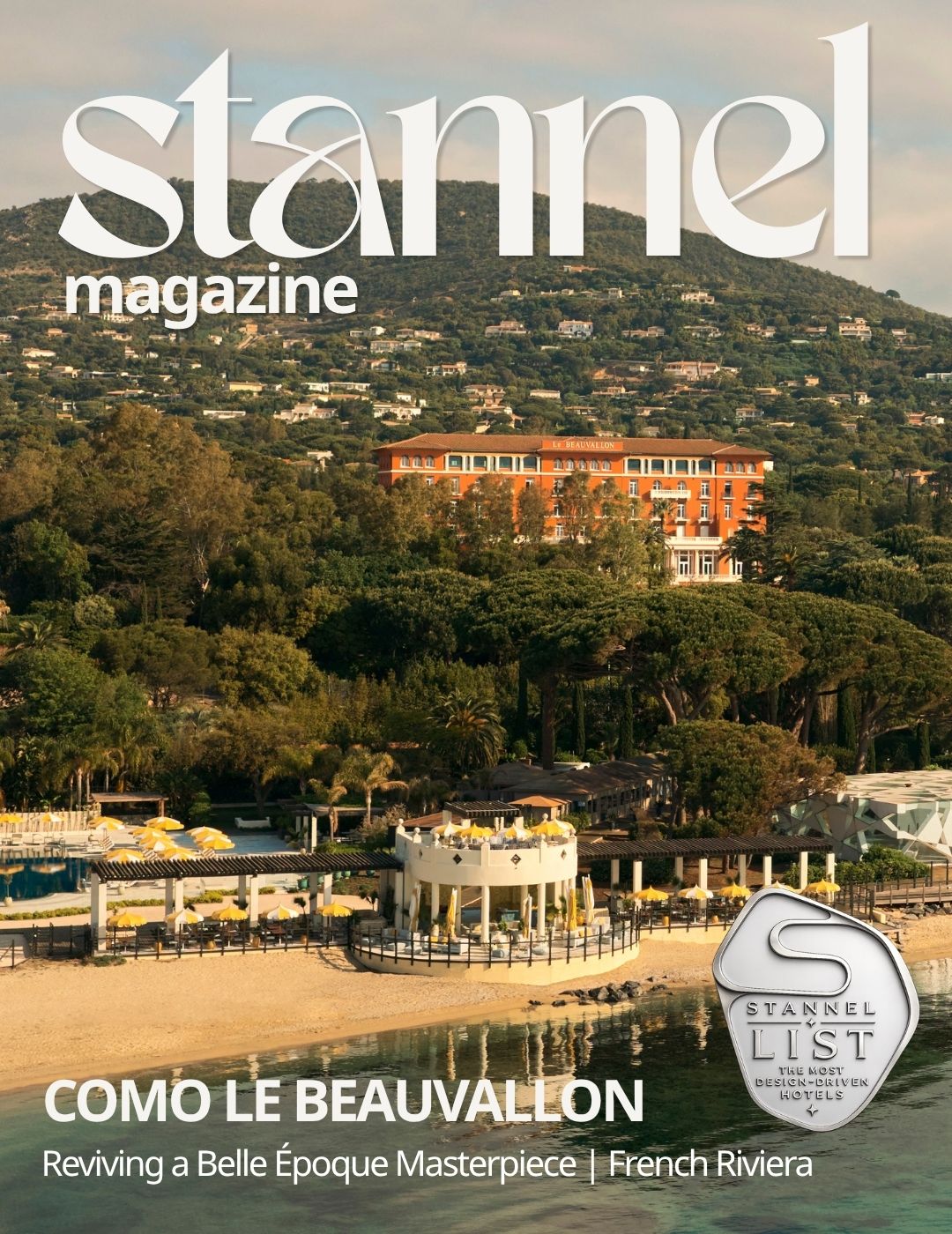
On a hill overlooking the Bay of Saint-Tropez, inside a spacious mansion on the French Riviera, recently reopened COMO Le Beauvallon – A hotel that combines the splendor of the early 20th century with a contemporary hospitality concept.The hotel is located in Grimaud, southern France, inside a palace that first opened in 1914 as Le […]
400 Dunams


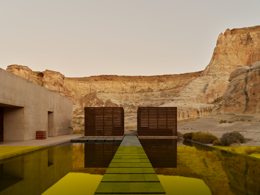
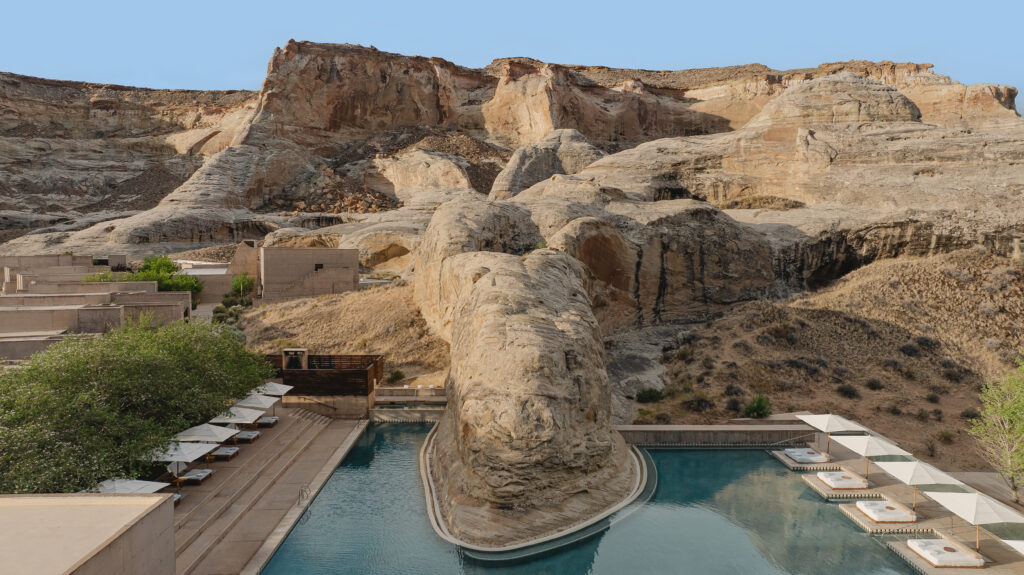
In the heart of Point Canyon in southern Utah, on an area of approximately 3,700 acres, among the desert landscapes and rock formations of the Grand Staircase-Escalante National Monument and a short distance from Lake Powell, lies Amangiri, one of the iconic hotels of the Aman Group, identified with a quiet, precise and place-connected hospitality […]
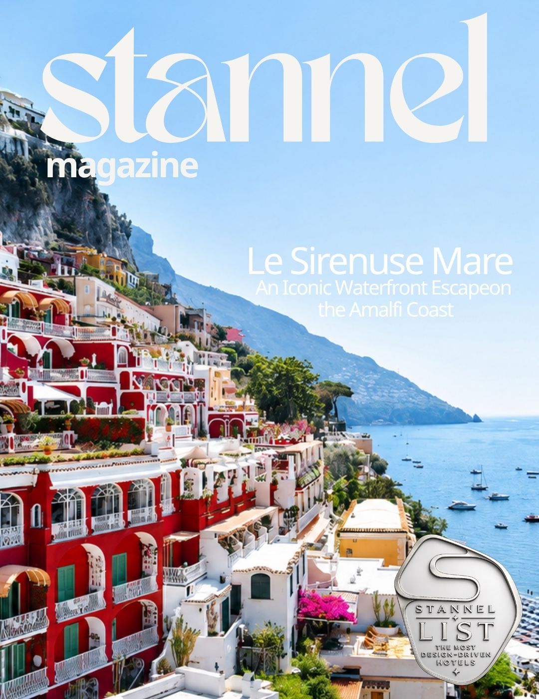
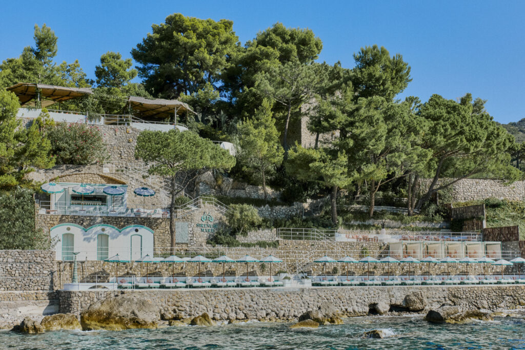
In Marina di Cantone in Narano, a small fishing village on the Amalfi Coast and about 25 minutes by boat from Positano, the new beach complex of the iconic Le Sirenuse hotel has recently opened. The project, which spans some 3,350 square meters of terraces descending to the sea, was planned and designed by Annarita […]
3350 SQM
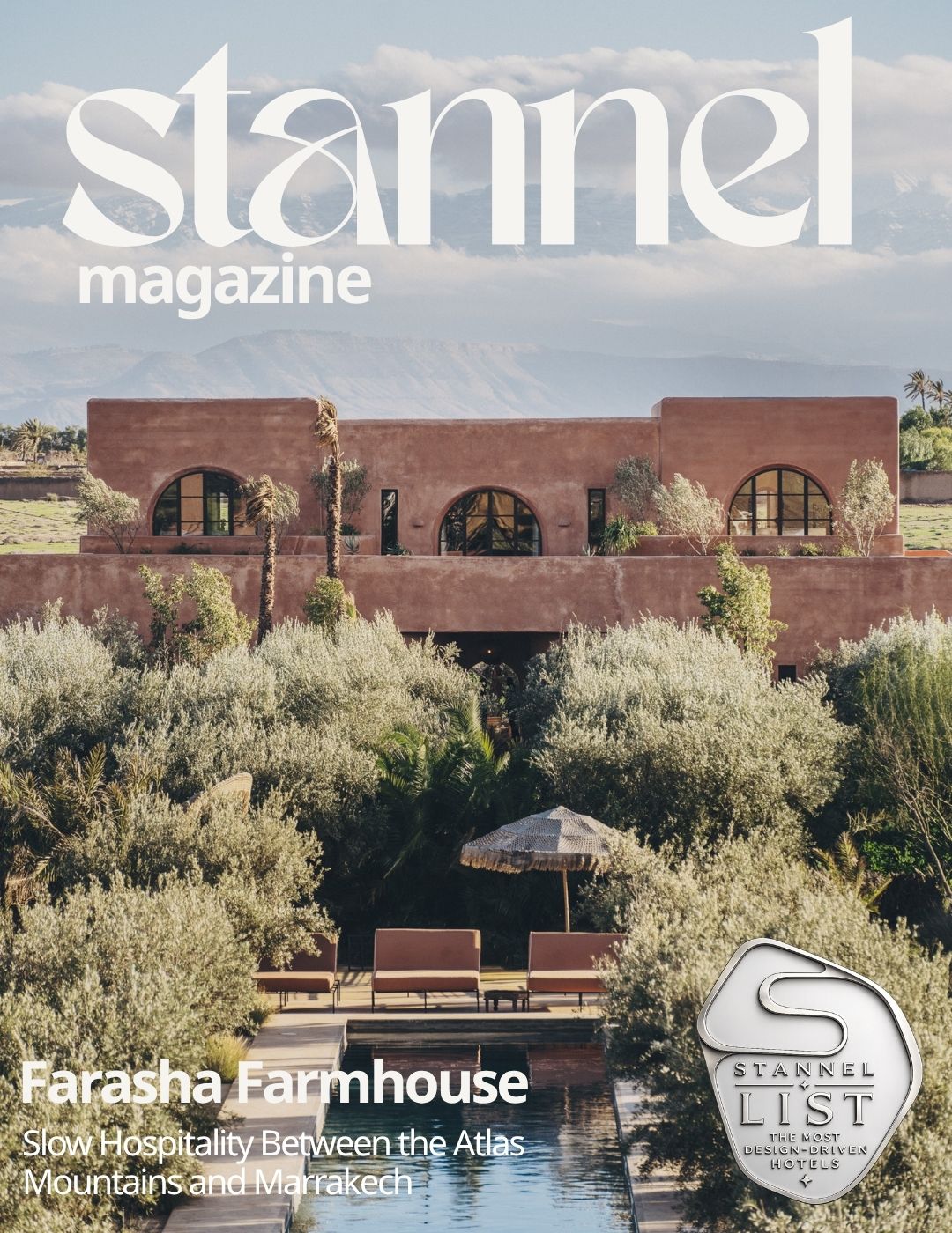
Farasha Farmhouse Located in Morocco, about a 40-minute drive from Marrakech airport, on an open plain between the Atlas Mountains to the south and the Djibouti mountain range to the north. The new farmhouse was designed by Moroccan architect Idriss Karnachi from Studio Noss Noss, in collaboration with Robert Wright, partner in the complex and […]
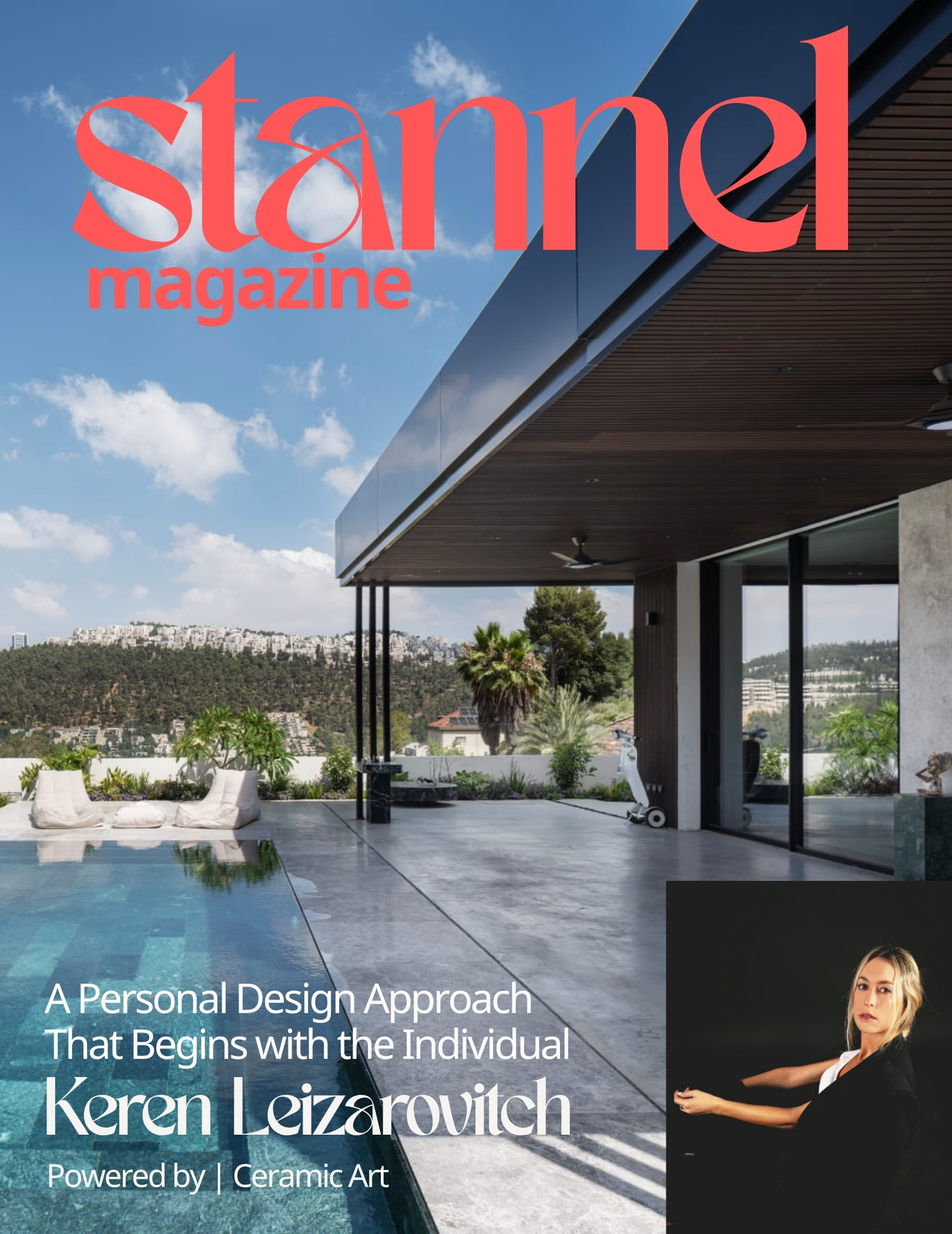
For architect Keren Lizarowitz, designing a home begins long before the first line is drawn. It begins with understanding the people who will live there, how they move, what they need and, perhaps most importantly, how they want to feel. Ofri Paz | STANNEL “I am responsible for the peace of the house,” she says, […]
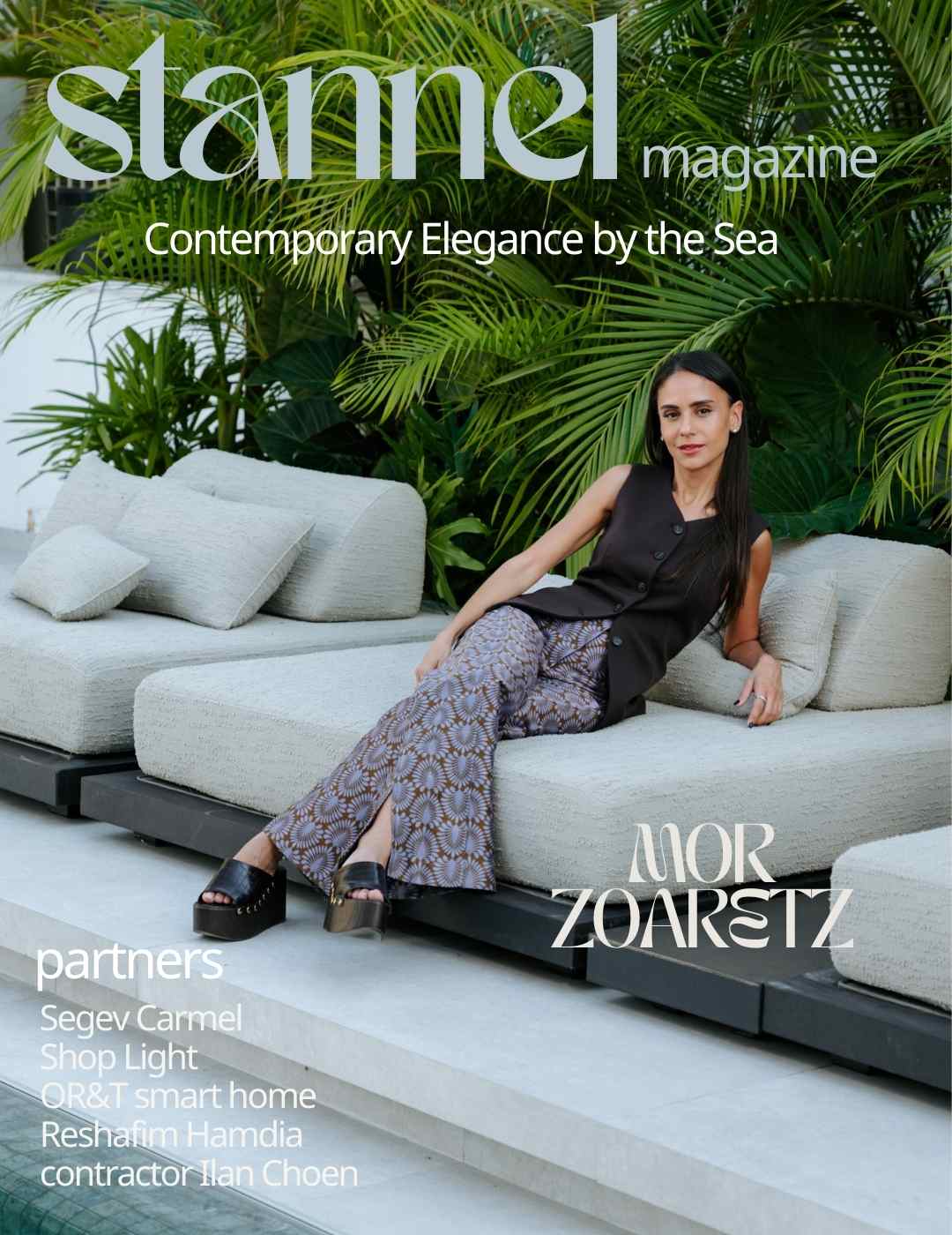
On the Ashkelon coastline lies a prestigious and impressive residential project covering an area of 560 square meters, planned and designed by architect and interior designer Mor Zuaretz. The house offers a contemporary and precise interpretation of a family home – one that gives each family member intimacy and quiet, while at the same time […]
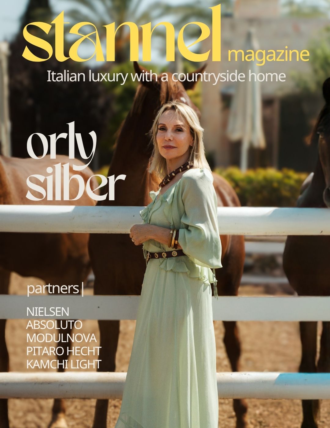
Renovating a house in a moshav in central IsraelFor a senior couple whose four children have grown up and started families. “This house is the dream of every extended Israeli family. It is the center of life for all the children and grandchildren and serves as a place for everyone to spend time together. It […]

360 SQM
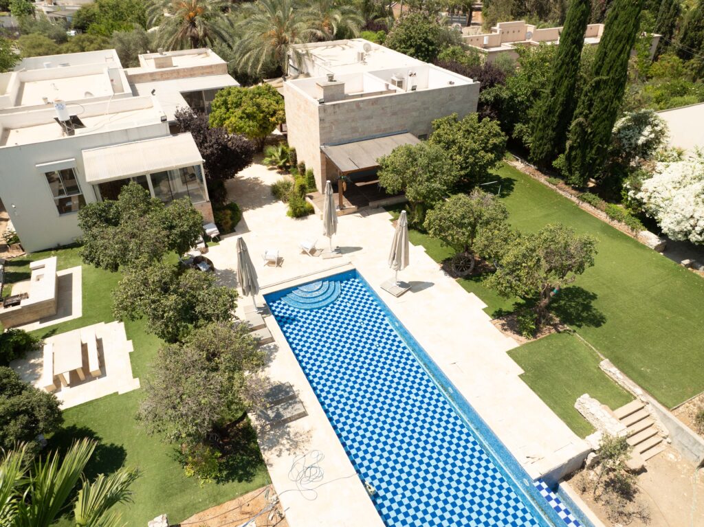
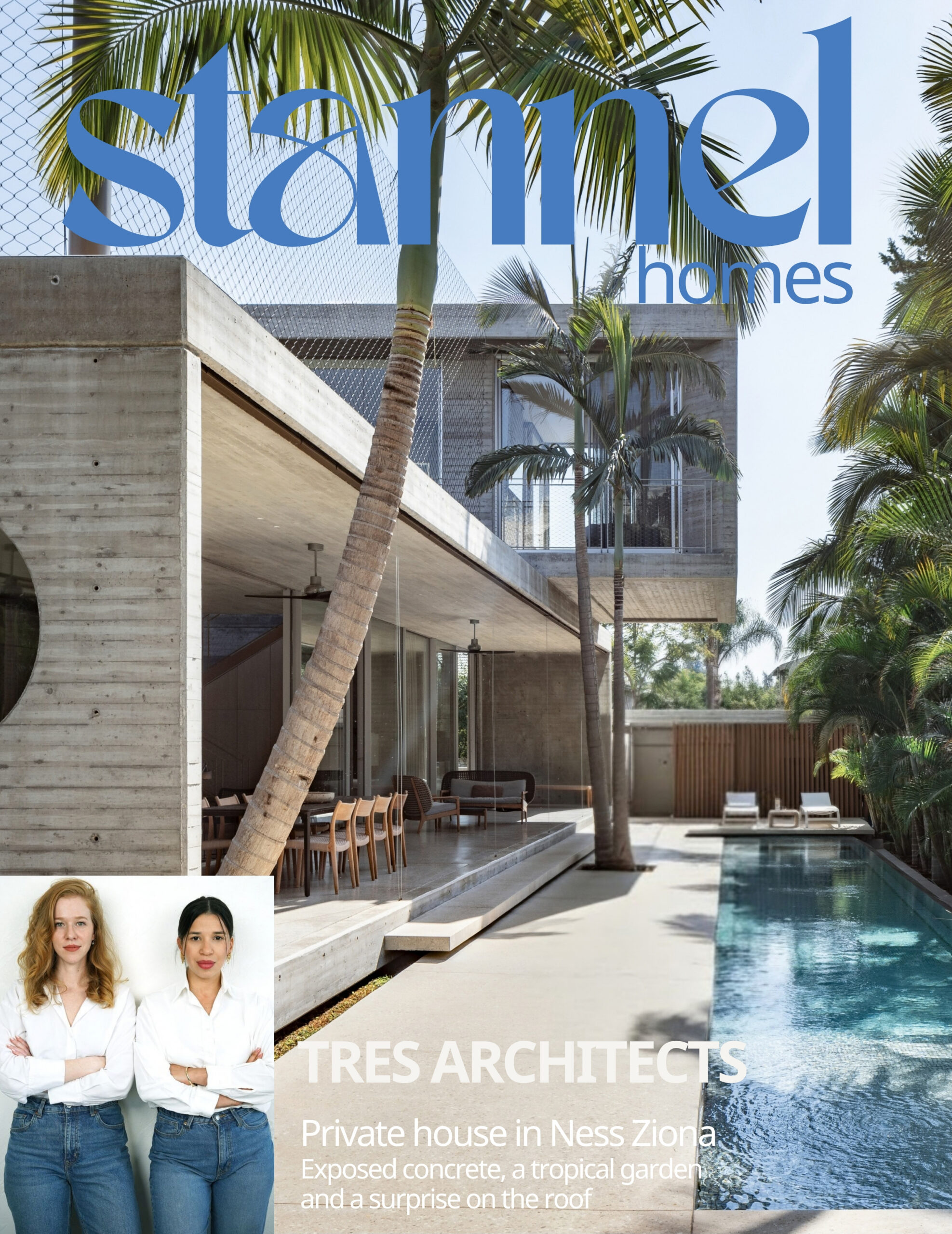
On a long, narrow lot in Ness Ziona, Maya and Coral, owners of a studio, planned TRES architecture, a two-story house spanning 740 square meters for a couple and their two teenage children. The requirement was ambitious in terms of the proportions of the plot: alongside an open and spacious family home, the tenants also […]
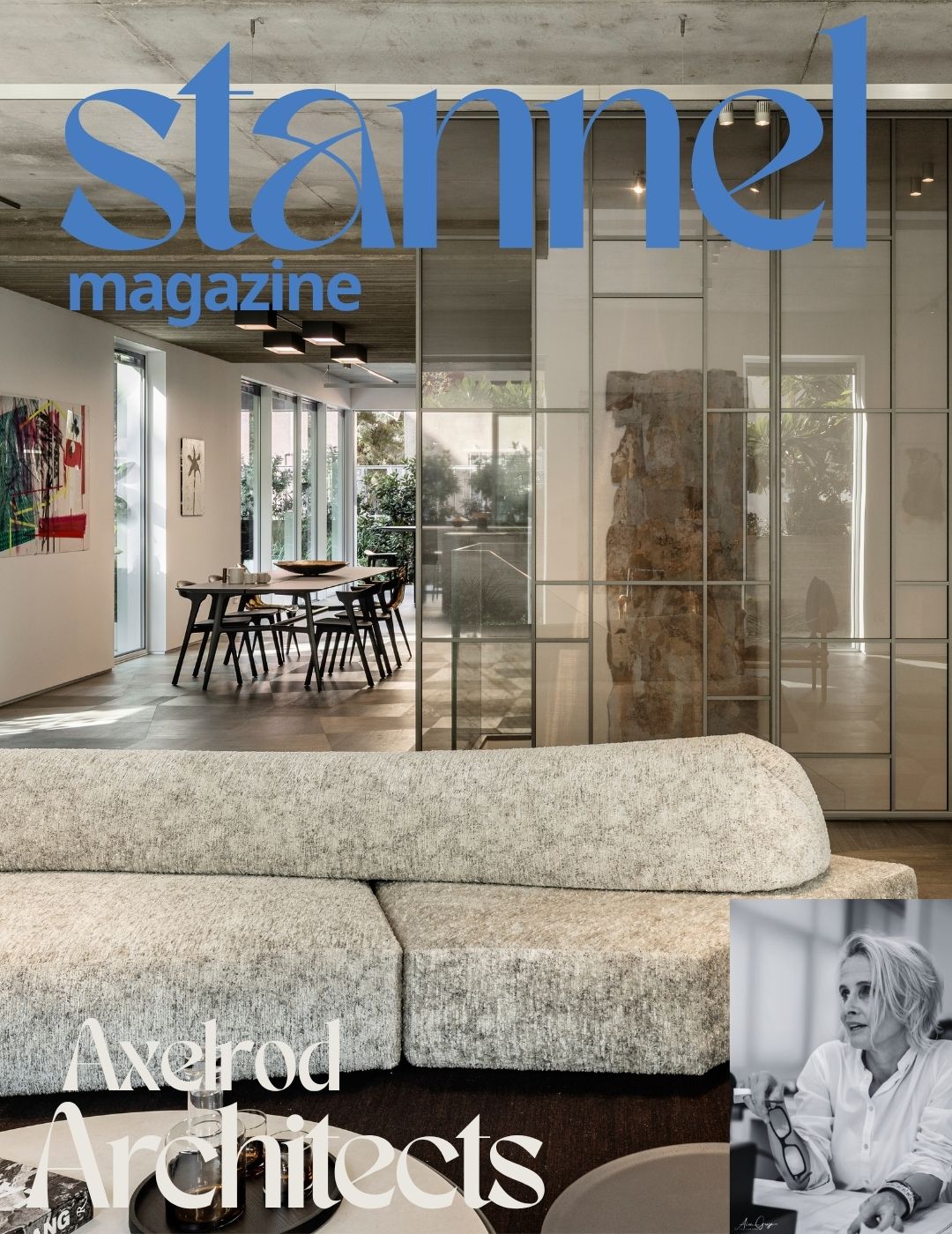
In the heart of Tel Aviv, on a quiet street surrounded by preserved buildings and in a layered urban atmosphere, a garden apartment is hidden that offers an escape from the city without being disconnected from it. Behind the street facades and the Tel Aviv hustle and bustle outside, an intimate living space opens up, […]
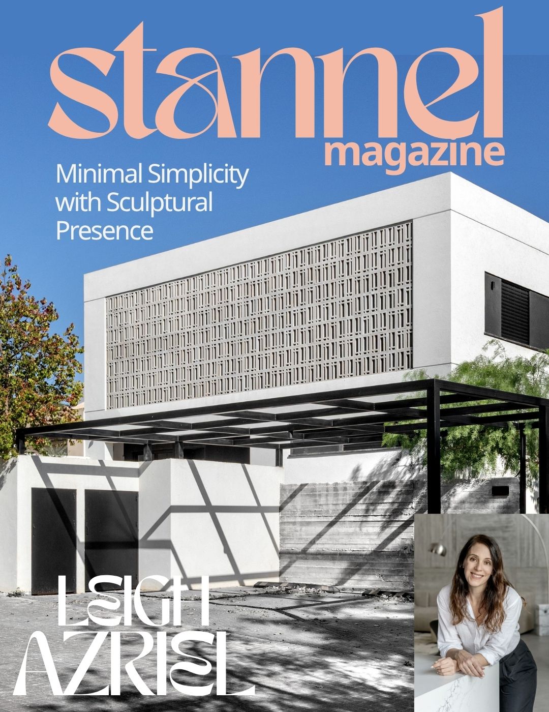
In a Suburb at the center of the country, facing an open view of a wadi and green nature, interior designer Lee Azriel planned and designed a two-family house for a family of five, a couple of parents and three sons aged 14, 12 and 7. The house, which has an area of approximately 260 […]
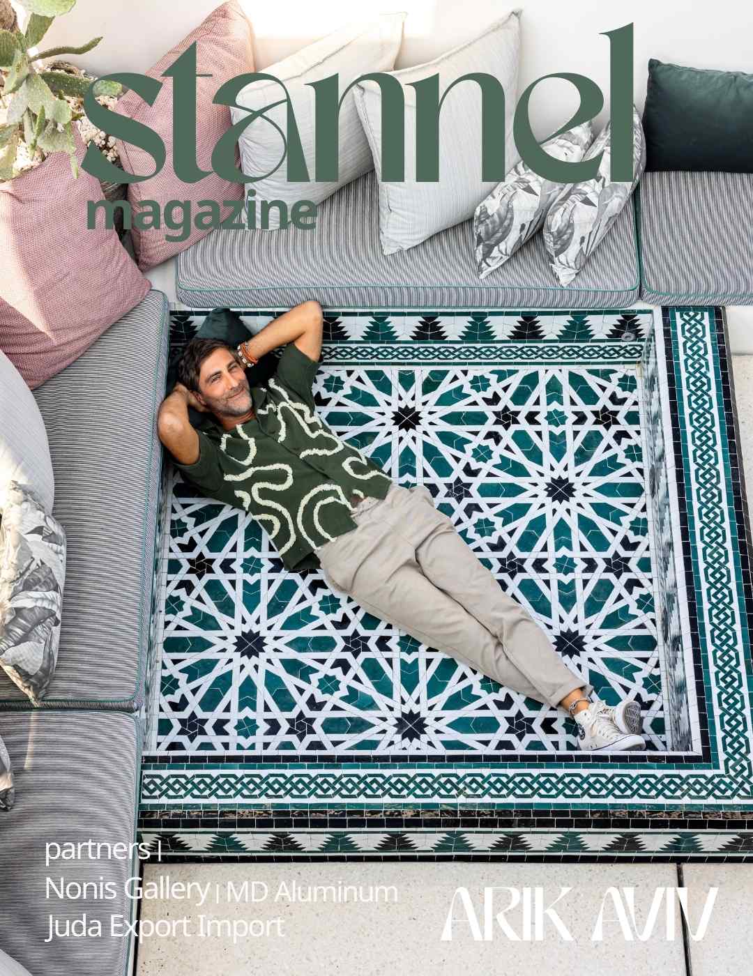
A remarkable renovation transforms a penthouse in one of Tel Aviv’s preserved buildings from a holiday apartment into a generous home designed for living, art and entertaining. Drawing inspiration from both historic Jaffa and the White City, the project extends onto an expansive rooftop conceived as a true urban garden above the city. Ofri Paz […]
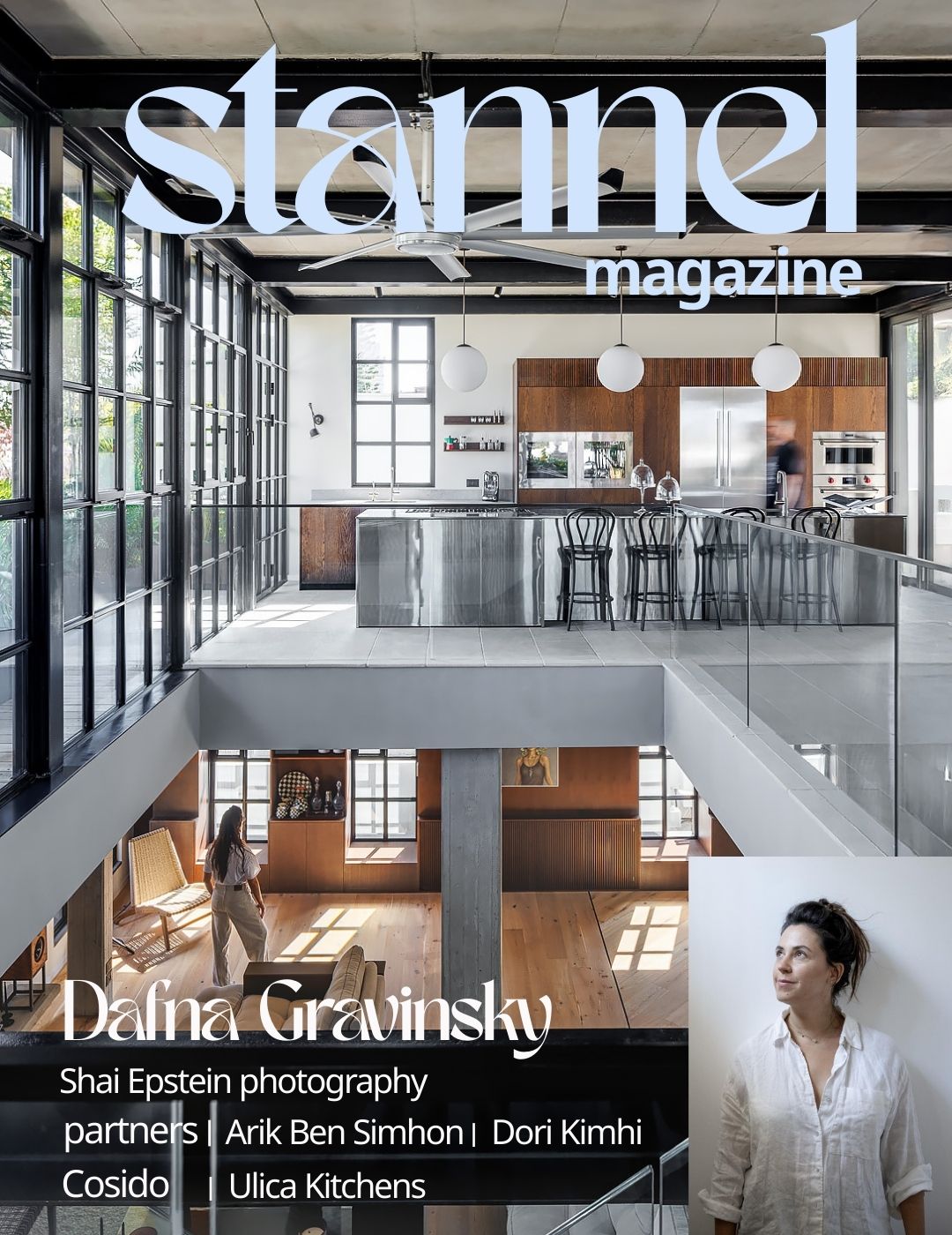
A couple and their three teenage sons purchased a house on a quiet street in north Tel Aviv and turned to interior designer Dafna Lia Grabinsky to renovate the house. In its original state, the house was stiff and rough, and they wanted to adapt it to their lifestyle and the values they brought with […]
A house in Herzliya Pituach, built for a family of six on a dunam-sized plot of land.The existing house was demolished and a 600-square-meter house was built in its place, spanning three levels. “For the family, which was expanding in advanced planning stages, it was important to create a large and spacious living space that […]
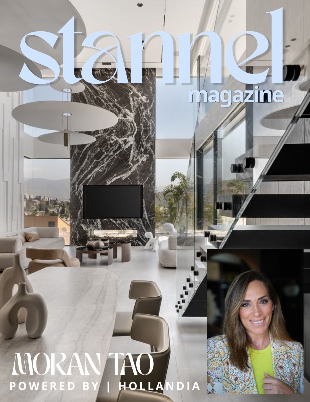
On a mountainside in Karmiel, above the street line and within an envelope of glass, stone, and wood, a house was built that creates interest in every corner. The house, which was planned and designed by architectural engineer and interior designer Moran Tao for a couple and their three teenage children, spans approximately 250 square […]
250 SQM
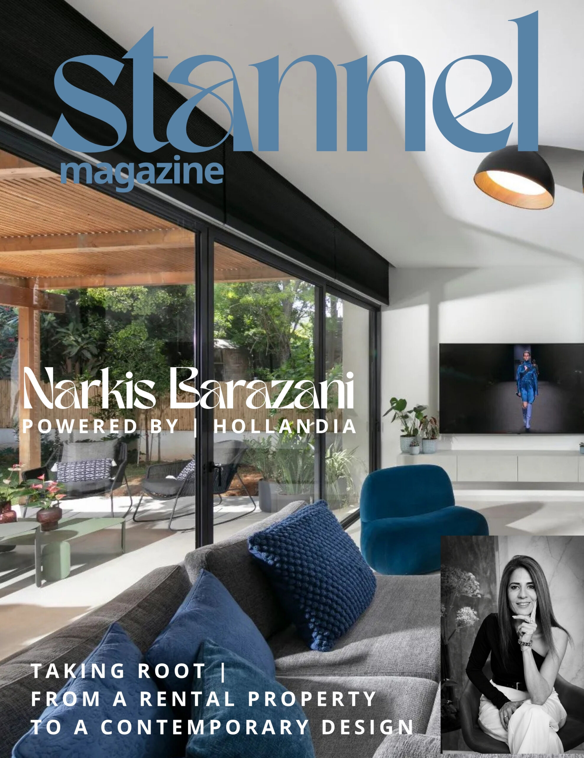
In Moshav Shilat, a private house that had been rented for years, a living space was rebuilt that tells a story of returning home. A couple in their 30s and their two young children sought to transform the old house into a contemporary, calm and precise family home, one that would reflect their lifestyle, the […]
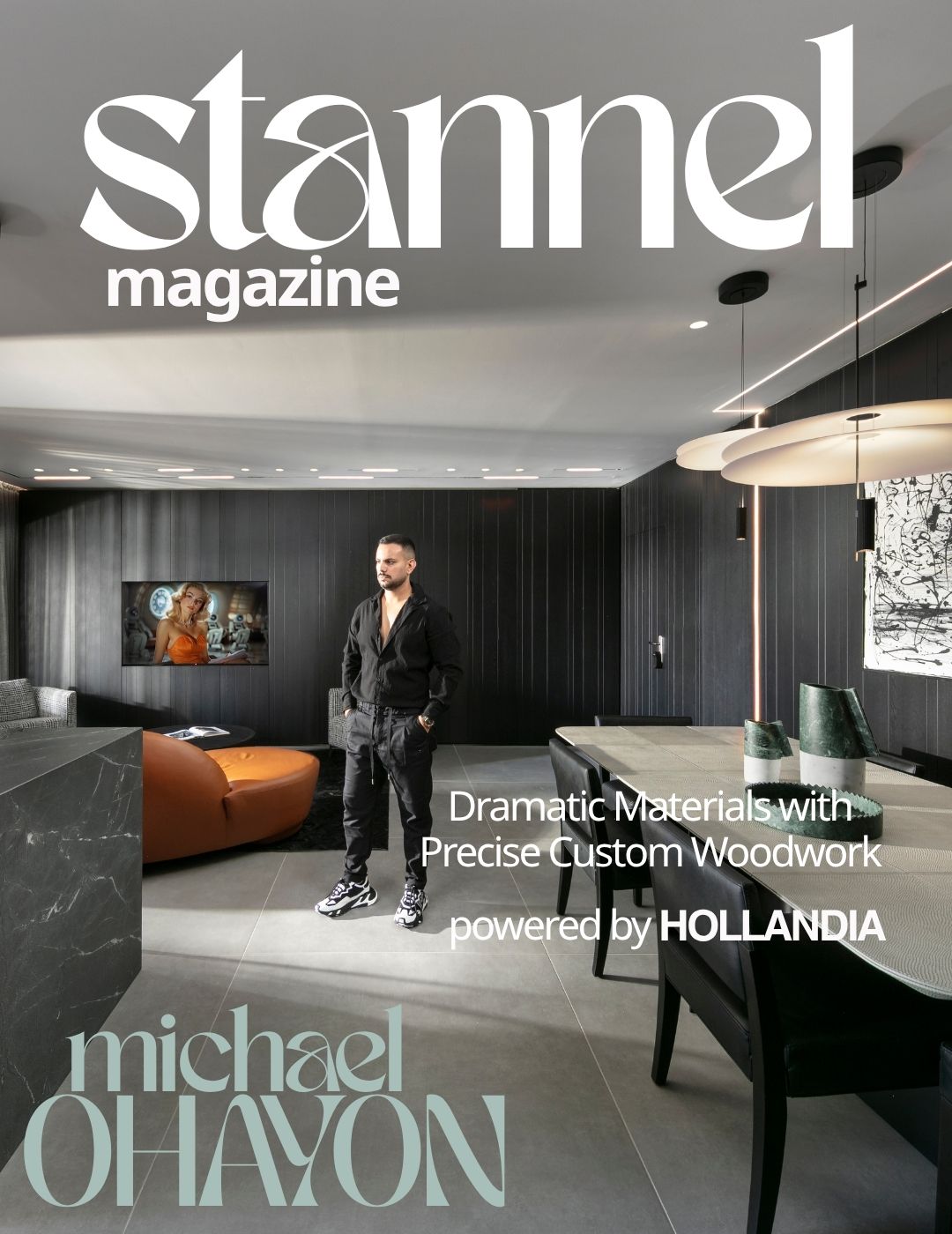
Some projects start with a plan, a material, or a design concept, and some start first and foremost with a person. In an apartment he planned and designed Michael Ohayon In Petah Tikva, the starting point was a client in her 60s, who first wanted to create her own home. The result is a personal, […]
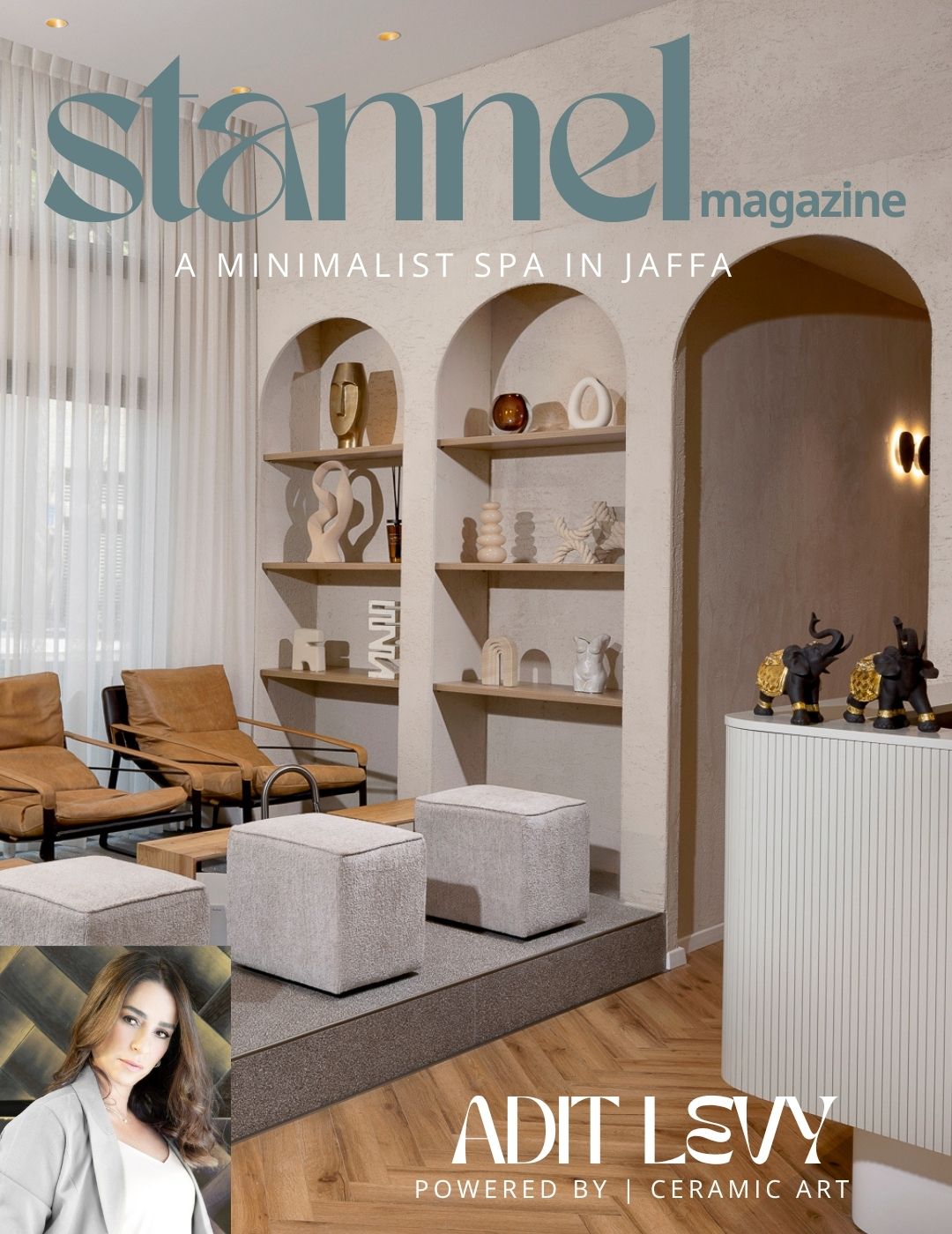
In the heart of Jaffa, in the area of the flea market and the train station, interior designer Idit Levy designed a spa complex covering an area of approximately 350 square meters, designed to offer a meticulous and quiet urban wellness experience. This is a new commercial project, established within a space that previously served […]
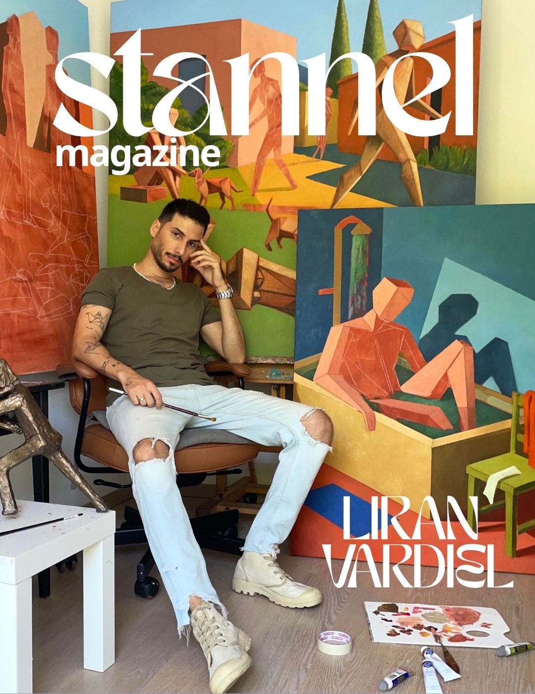
Liran Verdial’s language does not surrender to one clear definition. It moves on a delicate axis between figurativeness and geometric abstraction, essentially dealing not with form, but with a state. An emotional, internal state, one that exists beneath the surface. Ofri Paz | STANNEL The painting begins with a decomposition. The form breaks down into […]
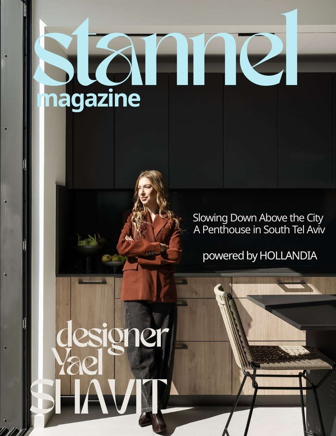
In South Tel Aviv, surrounded by carpentry workshops, studios and design stores, interior designer Yael Shavit has created a 90 square metre urban penthouse that embraces rather than disguises the industrial character outside its windows. With a 47 square metre terrace almost half the size of the apartment itself, the project was conceived for a […]
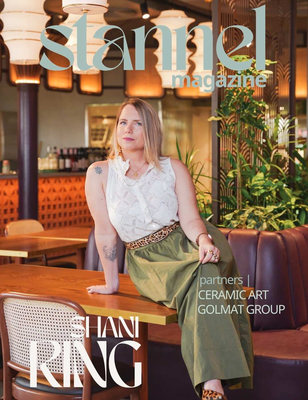
The restaurants ofStory GardenThey do not operate within the usual urban space, but rather choose to locate themselves on its quiet fringes, in the heart of green parks, on the banks of lakes, in places where the city makes room to breathe. This choice predefines the experience of visiting: no longer a restaurant as part […]
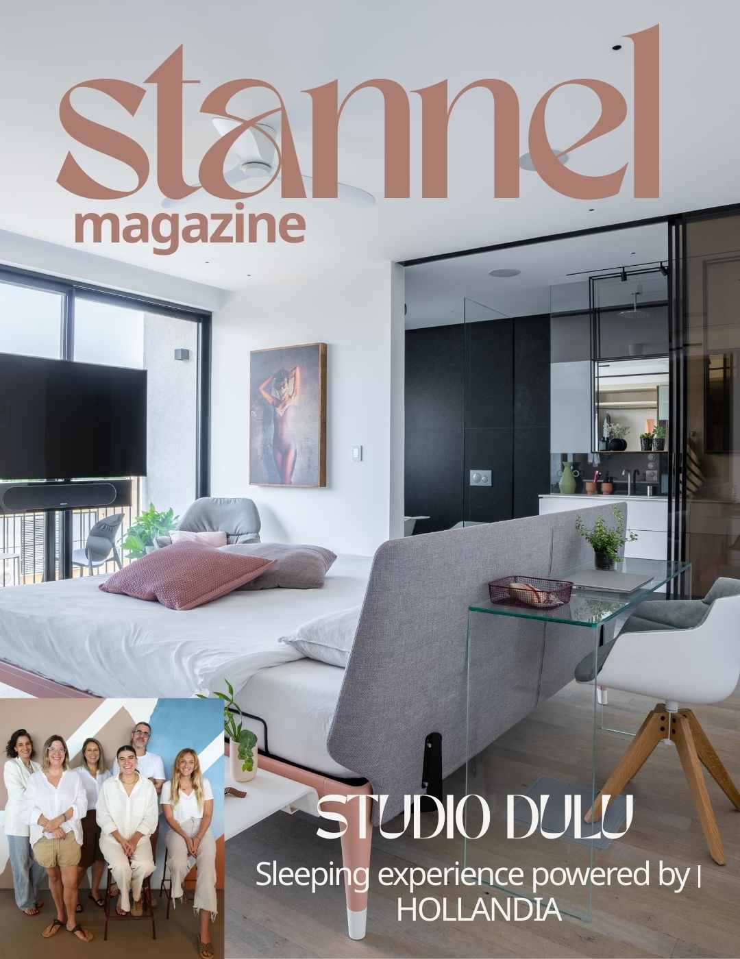
For this family, the question was not geographical at all, but essential. They wanted to live the city, not observe it from the sidelines. To be a part of it, but not be swallowed up by its rhythm. The choice of an apartment in a renovated building, in one of the small northern neighborhoods of […]
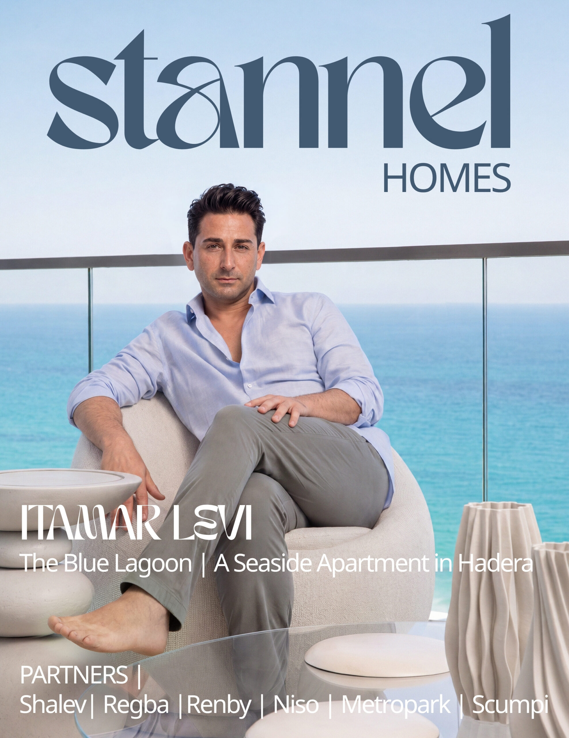
Two contractor apartments in a luxury tower opposite the beach in Hadera were combined into a spacious vacation apartment of approximately 300 square meters, with six rooms. The project, designed by interior designer Itamar Levi, was born from a clear vision: to allow the grandparents, the heads of the family, to gather around them […]
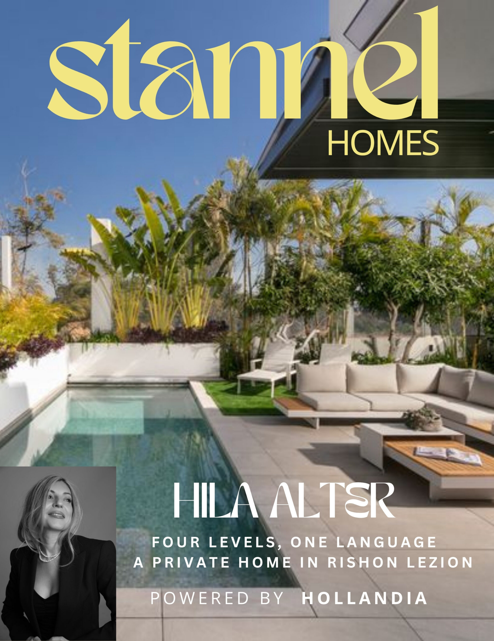
In a private home in Rishon LeZion, designed and planned by Hila Alter, every detail was conceived as part of a larger whole. Lines, materials, custom carpentry, lighting and textiles come together to create a continuous design language that flows across the home’s four levels, balancing a clean, contemporary aesthetic with a warm and inviting […]
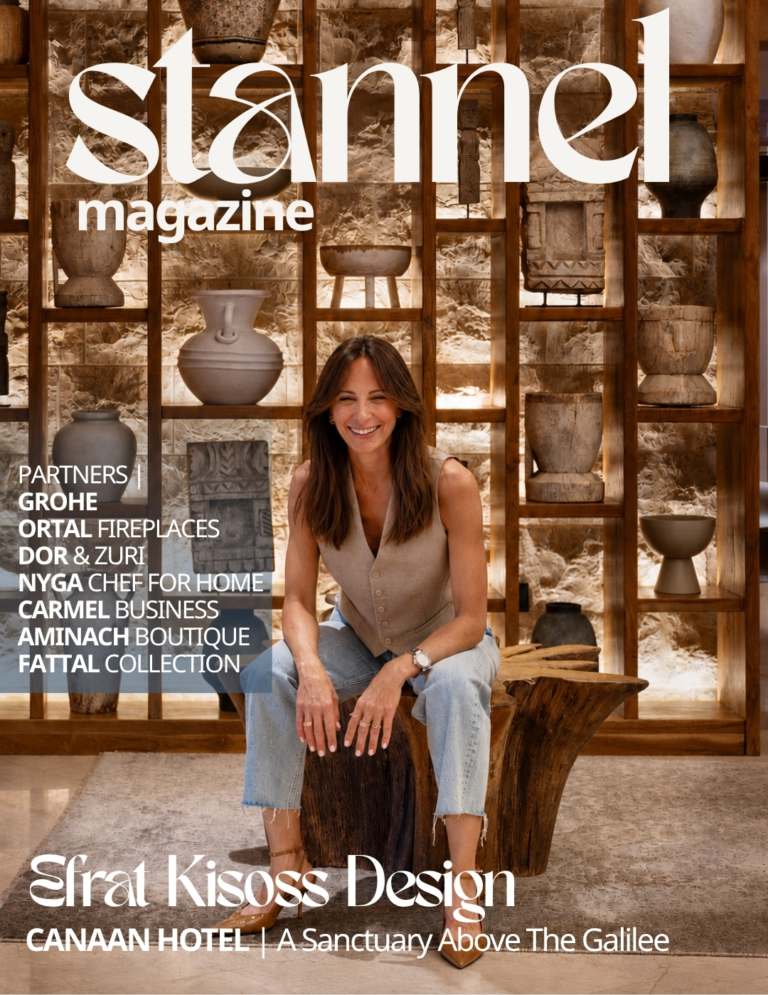
On the summit of Mount Canaan, where the clear mountain air meets the forests of the Galilee and the horizon that opens to the Sea of Galilee and Mount Hermon, time seems to slow down. There is something about this landscape, the local stone, the Mediterranean vegetation, the scents of the pine and oak trees, […]
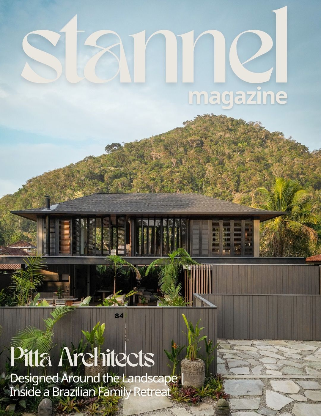
Between the Atlantic Forest and the southeastern coast of Brazil, a family home in Ubatuba offers a quiet encounter between contemporary architecture, natural materials and living close to the landscape. Ubatuba, a coastal city in the state of São Paulo near the border with the state of Rio de Janeiro, is located in a green […]
Farasha Farmhouse Located in Morocco, about a 40-minute drive from Marrakech airport, on an open plain between the Atlas Mountains to the south and the Djibouti mountain range to the north. The new farmhouse was designed by Moroccan architect Idriss Karnachi from Studio Noss Noss, in collaboration with Robert Wright, partner in the complex and […]
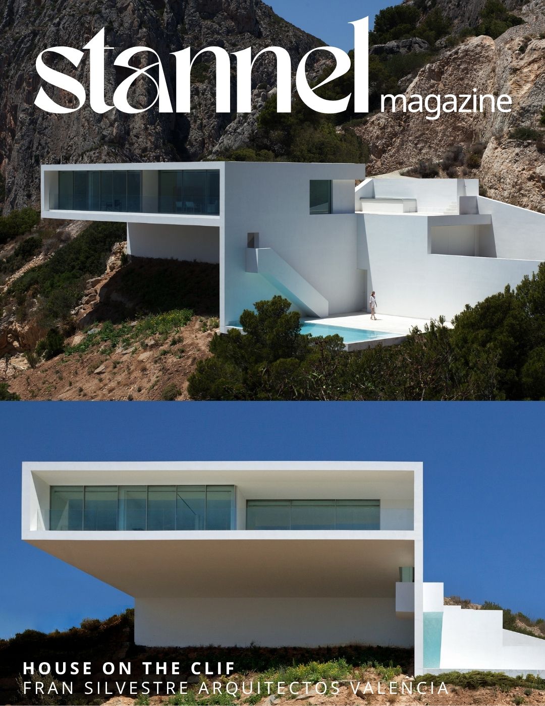
On a steep plot overlooking the sea, in the Toix-Masquerat area of Calpe, a coastal town in the province of Alicante in southeastern Spain, a private house was designed that offers a precise and sensitive interpretation of the relationship between architecture, topography and landscape. The project was designed by the firm Fran Silvestre Arquitectos, and […]
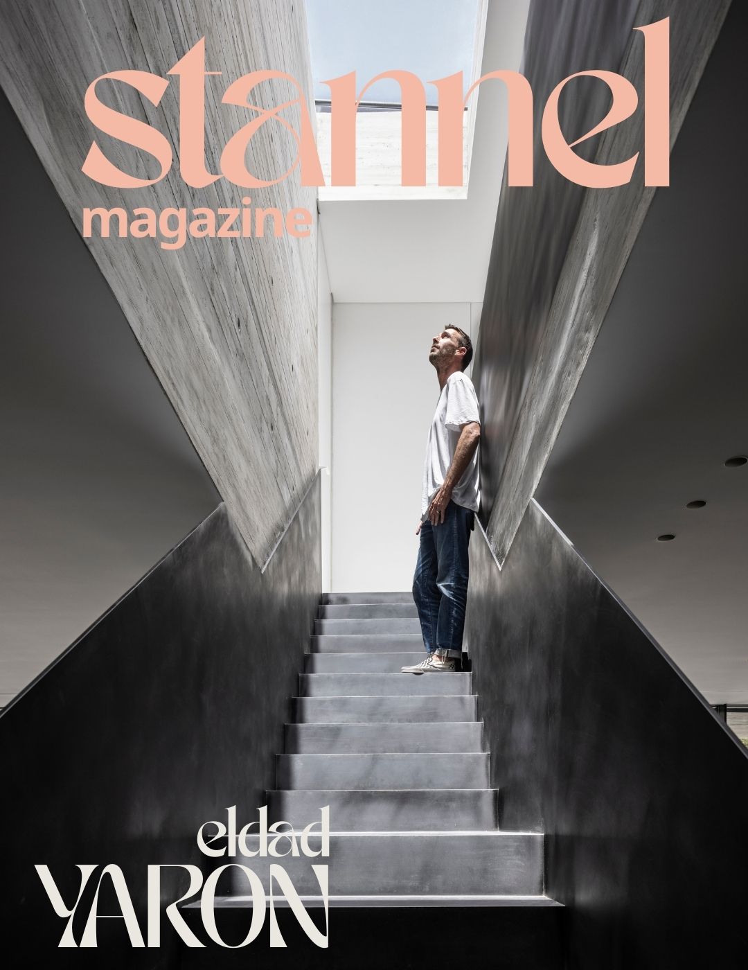
The house designed by architect Yaron Eldad, together with architectural engineer Noy Sandgarten from his office, for a family of six, relies on a clear and coherent language that he defines as warm industrial modern. This is a project that begins with a distinct concept, one that dictates the planning of the building and its […]
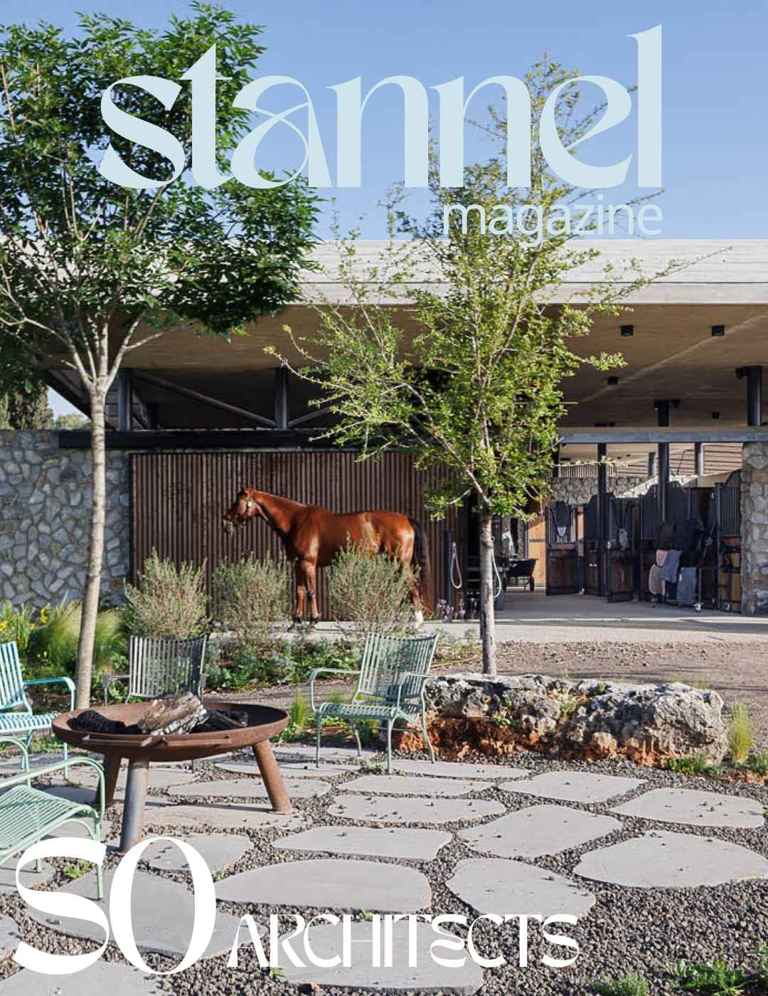
A project that connects two dreams and two adjacent plots of land in Yokneam Moshava, which share planning and value concepts.Shahar Lulav, owner and partner at the firm SO Architects Alongside Oded Rosenkiar, he was entrusted with the planning of the project, along with architects Eyal Shahar, Nir Taub and Yuval Feiglin from the firm’s […]
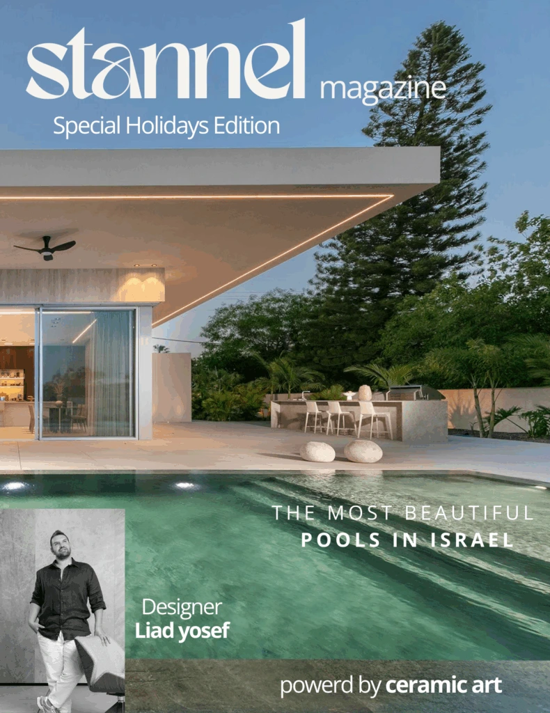
Liad Yosef, an interior designer who has already established his status as a network star and influencer in the field of design, Every project begins with a thorough introduction to the client. “I make sure to get to know all my clients personally – to research, learn, get to know their needs, their loves, their […]
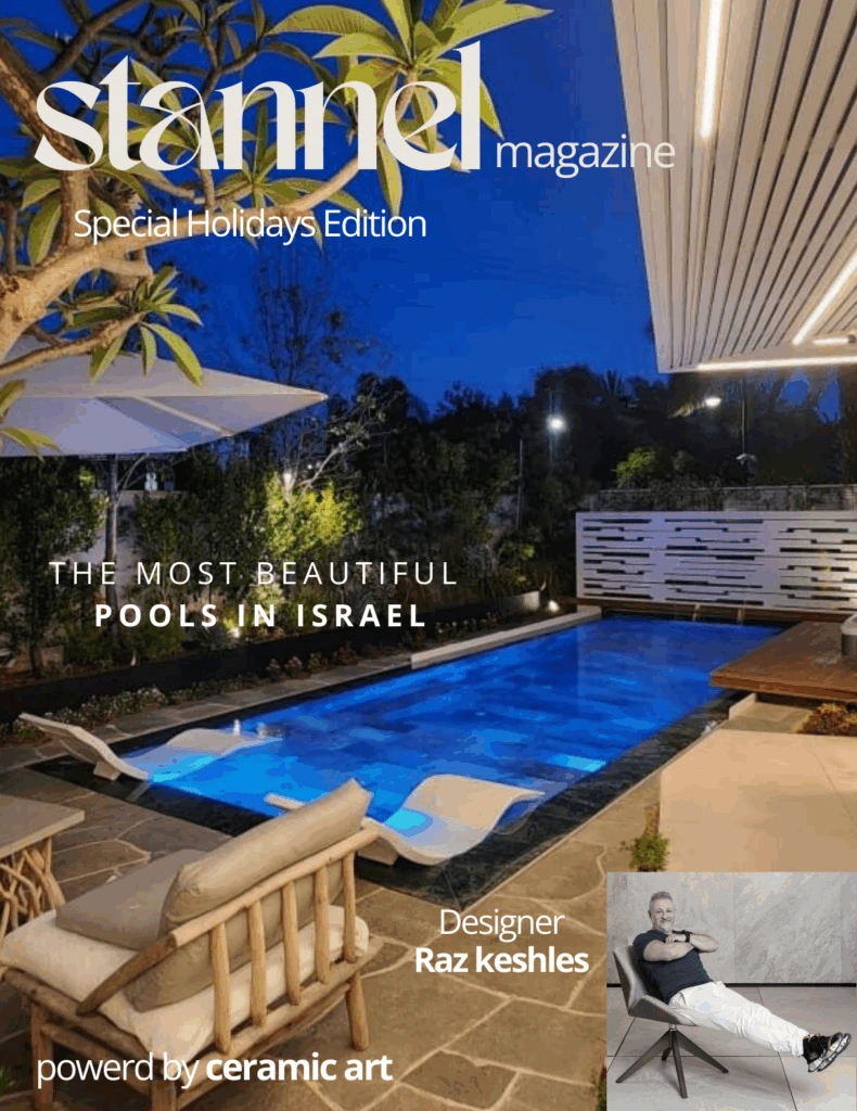
Architect Raz Keshals, who deals with private construction alongside commercial and office planning , defines his style as “dream modern” – design born from the needs of the residents and inspired by them, in a modern and contemporary style. In his projects, architectural planning, interior design and functional solutions are integrated into one harmonious language, […]
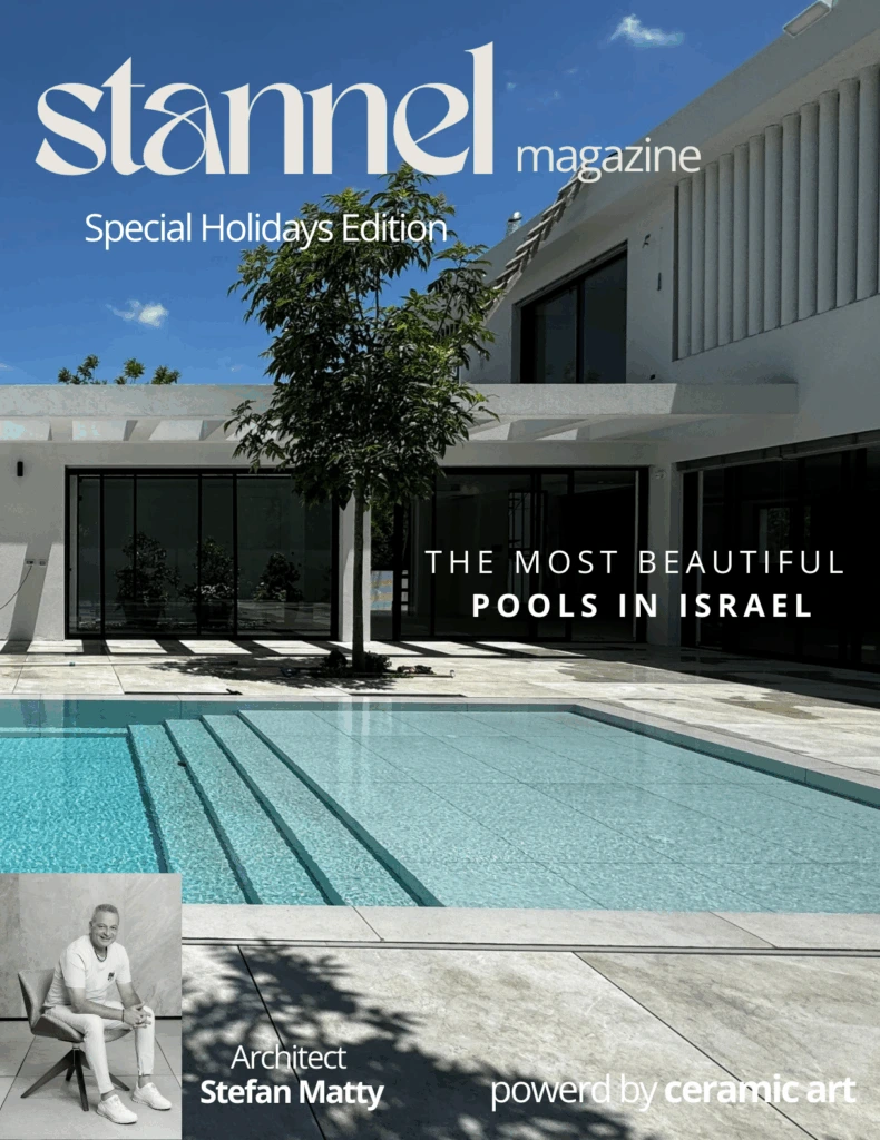
According to the vision of architect Stefan Matti, who founded his office in 2005 , the architectural structure, the interior design and the landscape planning – are one. His projects are modern and minimalist, and he strives to create a lasting experience: spaces that continue to excite over time through natural light, quality materials and […]
650 SQM
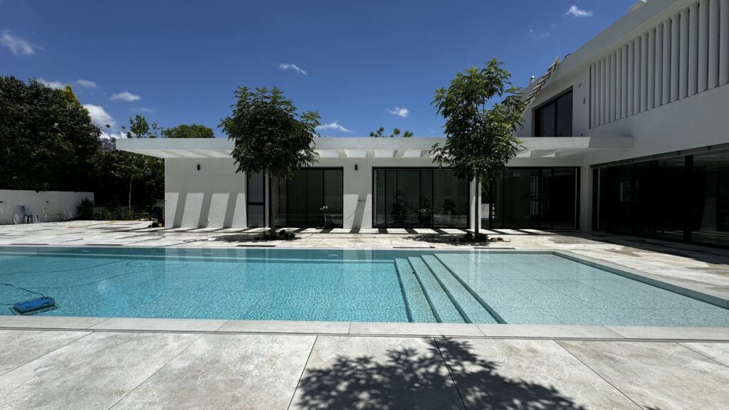
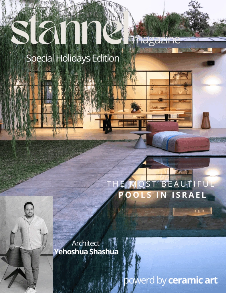
Yehoshua Shashua, an architect and interior designer, founded the firm in 2016, Within its framework, it plans and designs diverse projects of various scales in Israel and around the world – from luxury villas and apartments, through residential buildings to commercial spaces such as showrooms and galleries. Welcome to the house in Ein Vered that […]
500 SQM
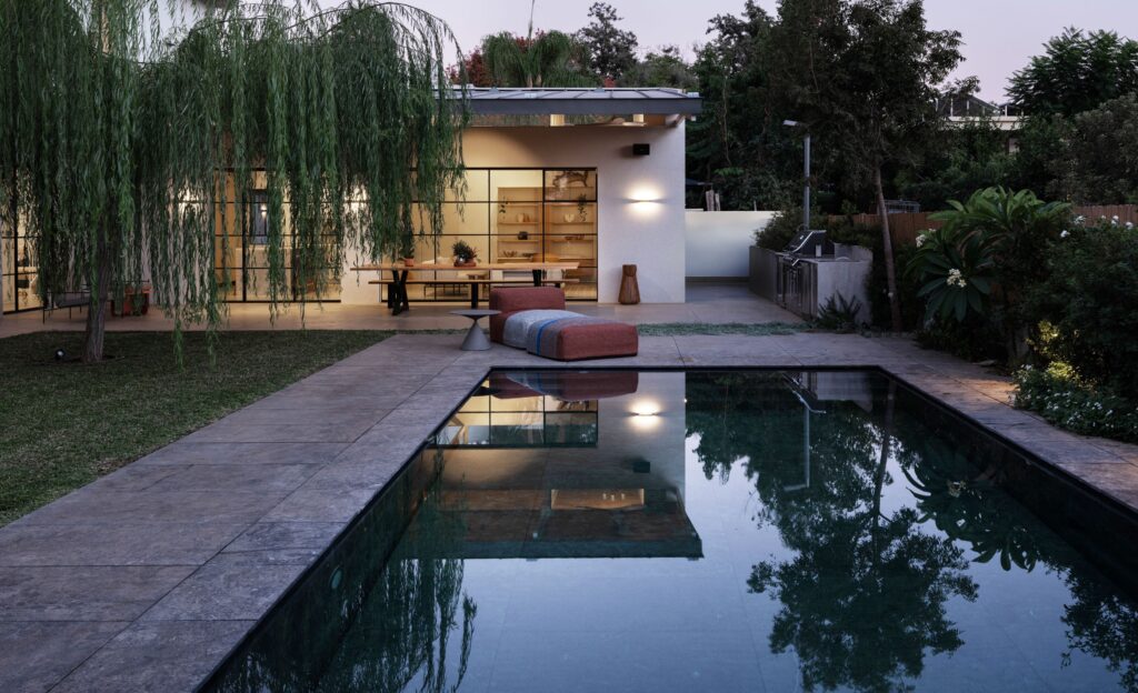
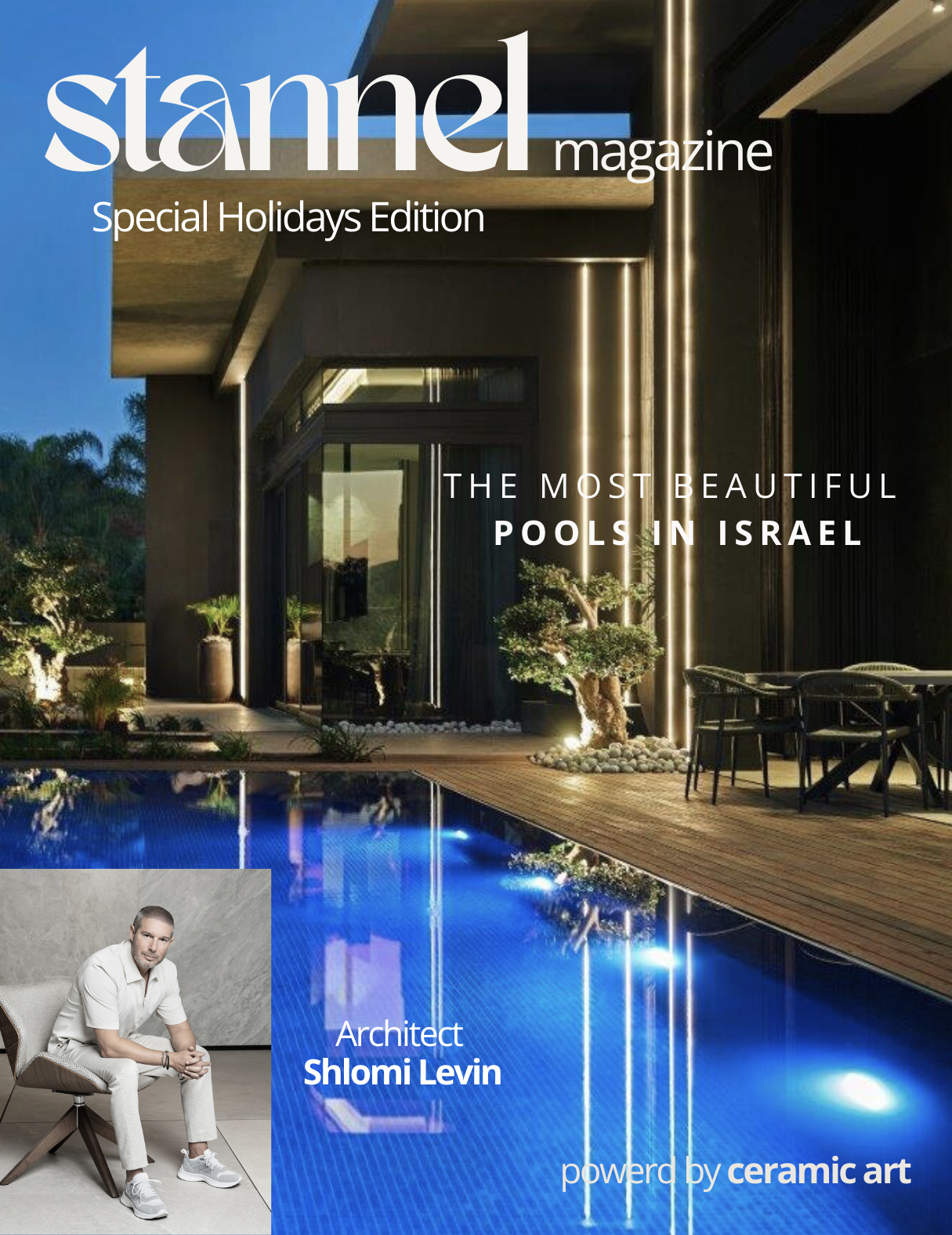
Architect Shlomi Levin, founder of a multidisciplinary boutique office, leads a holistic approach, combining architecture and interior design, to provide its clients with a comprehensive solution for all aspects of planning, design and construction. Welcome to the complex that extends over 600 square meters and includes residential suites and a shared interior space with a […]
600 SQM
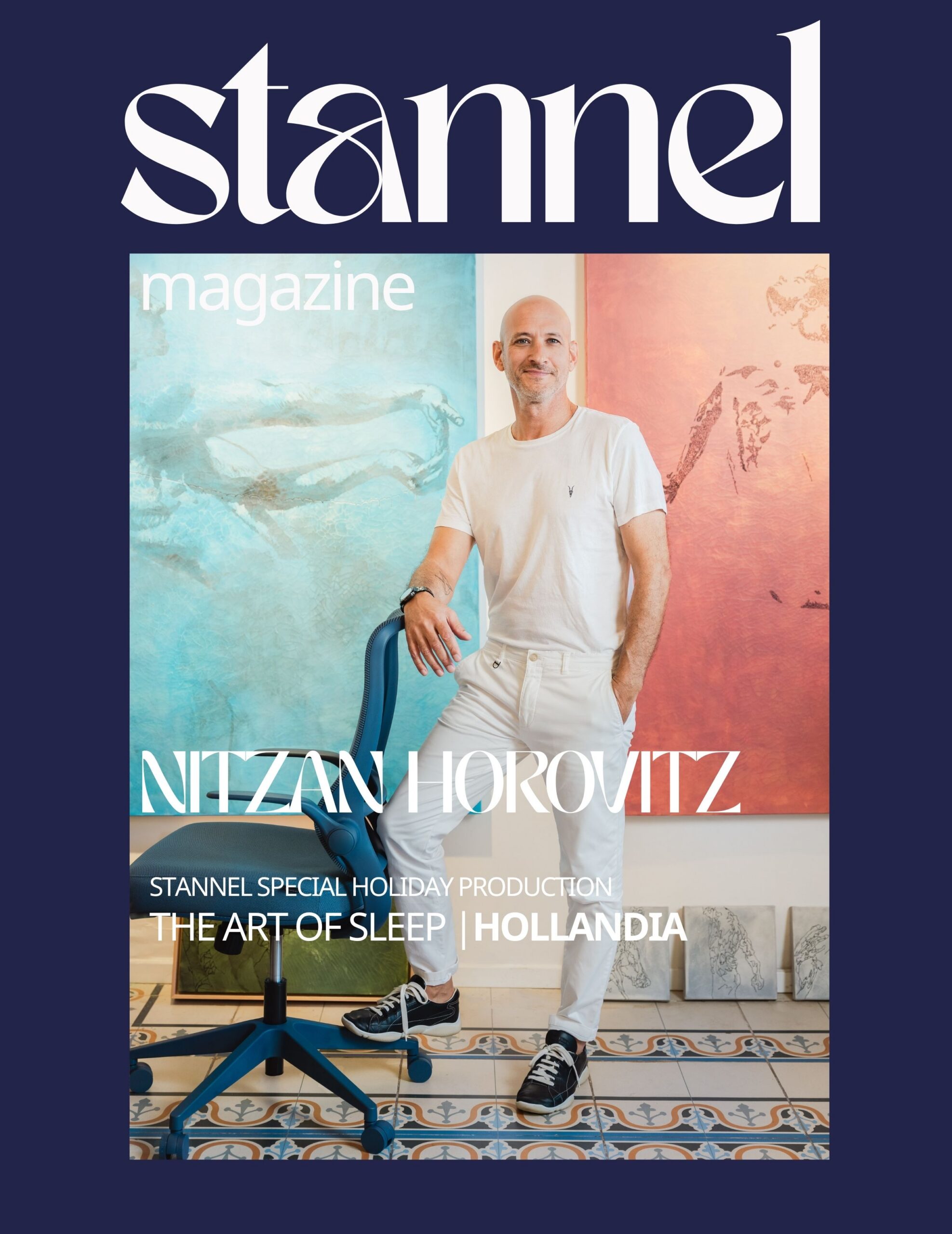
Interior designer Nitzan Horowitz He has been working in the field for about 24 years and leads a studio that deals with planning and design in the private and commercial sectors, with an emphasis on luxury homes and apartments, offices and showrooms, alongside product planning and development. His work is based on the concept of […]
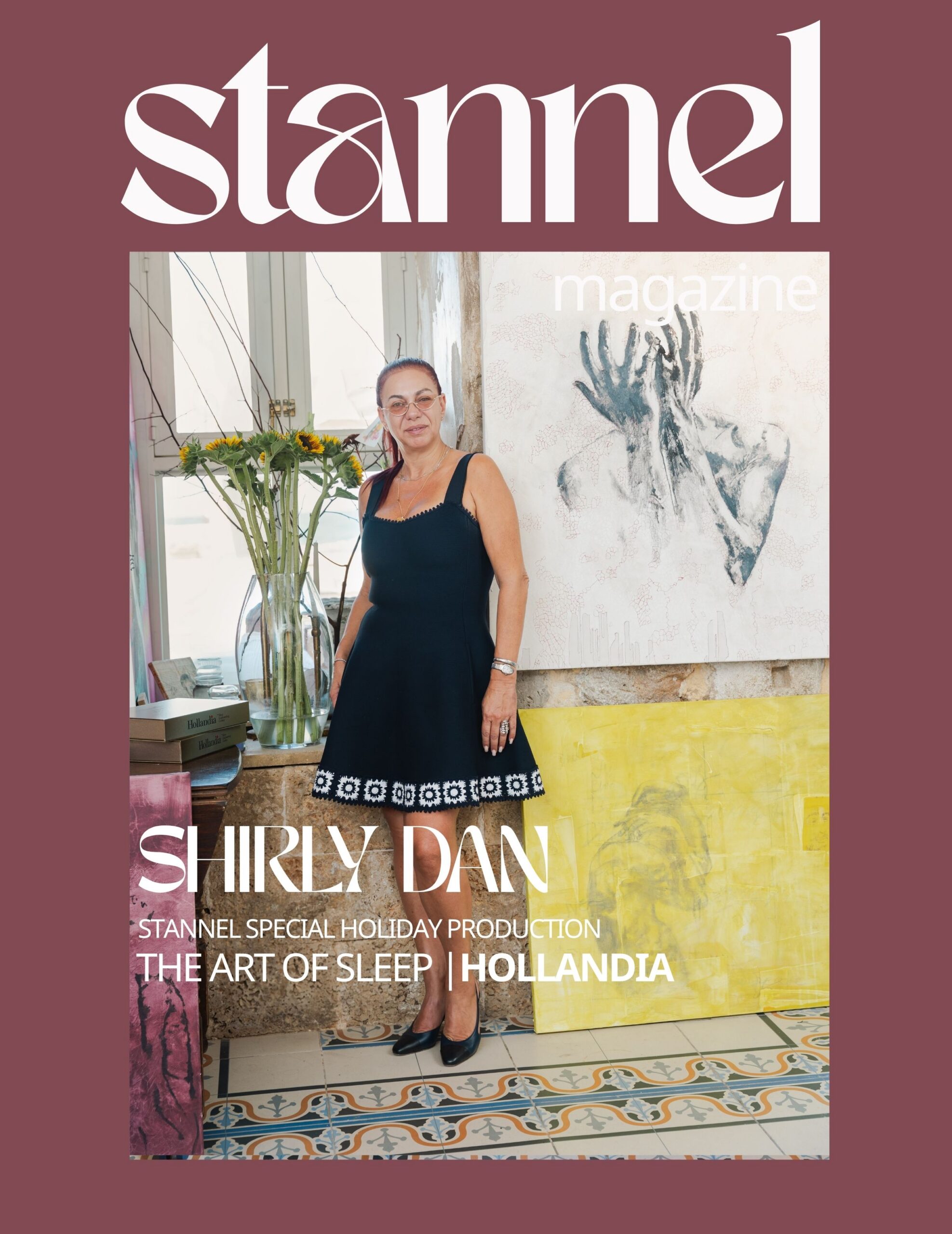
Shirley Dan Head of an architecture and interior design studio specializing in residential design and overseeing projects from the planning stage to management and supervision of execution. In her work, she seeks to combine aesthetics with practice and create harmonious, comfortable, and enveloping homes, a concept that is also clearly expressed in the way she […]
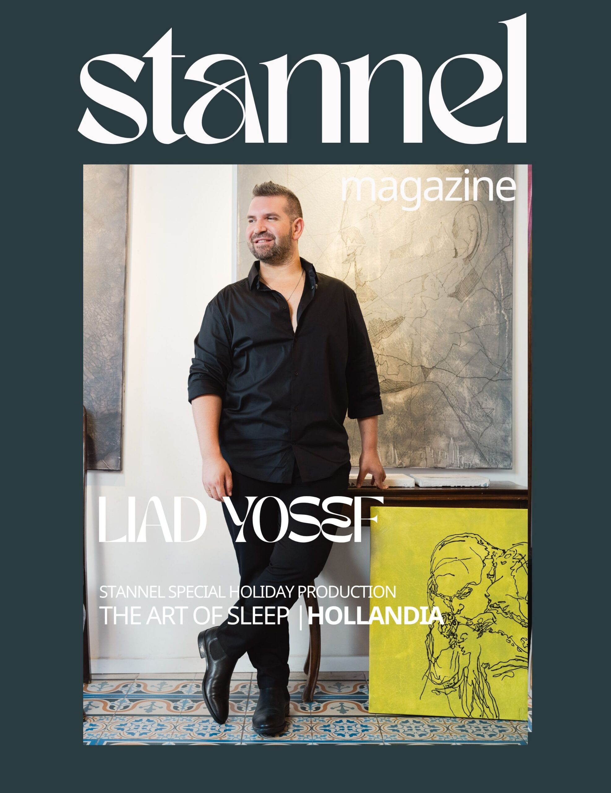
Interior designer To Yosef, a native of Moshav Margaliot in the north, has been leading a studio that designs private homes, luxury apartments and commercial spaces across the country for over a decade. His work is based on a personal approach that puts the client at the center, alongside a modern language, the use […]
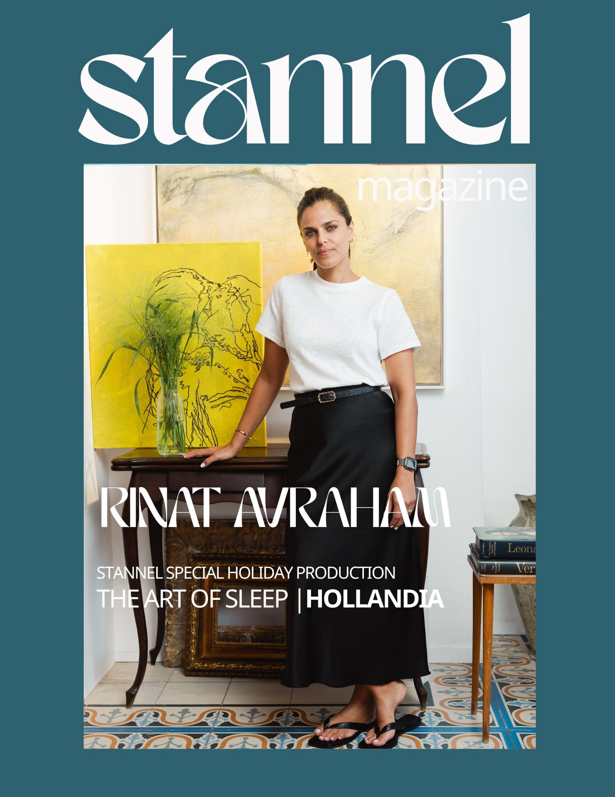
The interior designer Rinat Avraham She founded the studio that bears her name in 2016, with a vision that connects dreams with practice. The studio specializes in planning and designing private homes and apartments, and accompanies projects from the concept phase to the home’s furnishing. Avraham’s work is characterized by a clean and functional […]
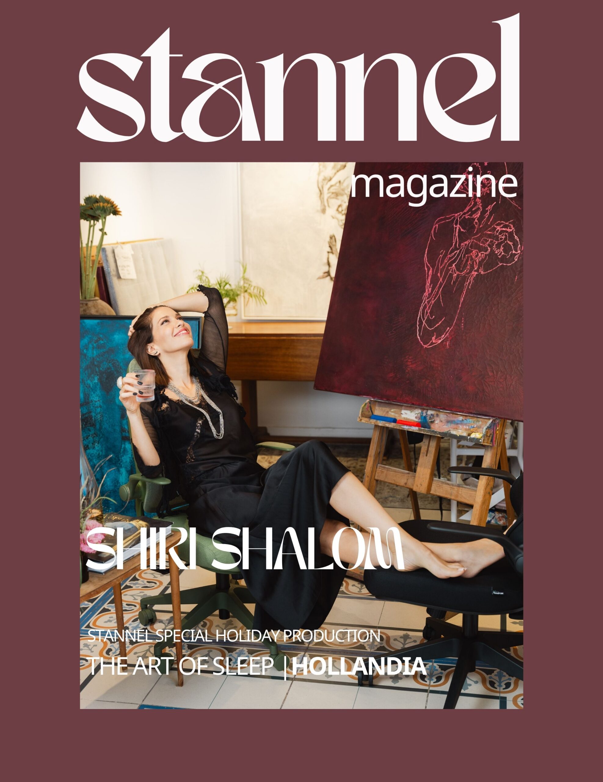
The designer Peace songs Comes to the world of design from a broad creative background, which also includes years as a singer, writer and composer. She currently works in interior and product design, and has won awards and international recognition for her work over the years. Her studio designs residential and commercial spaces in […]
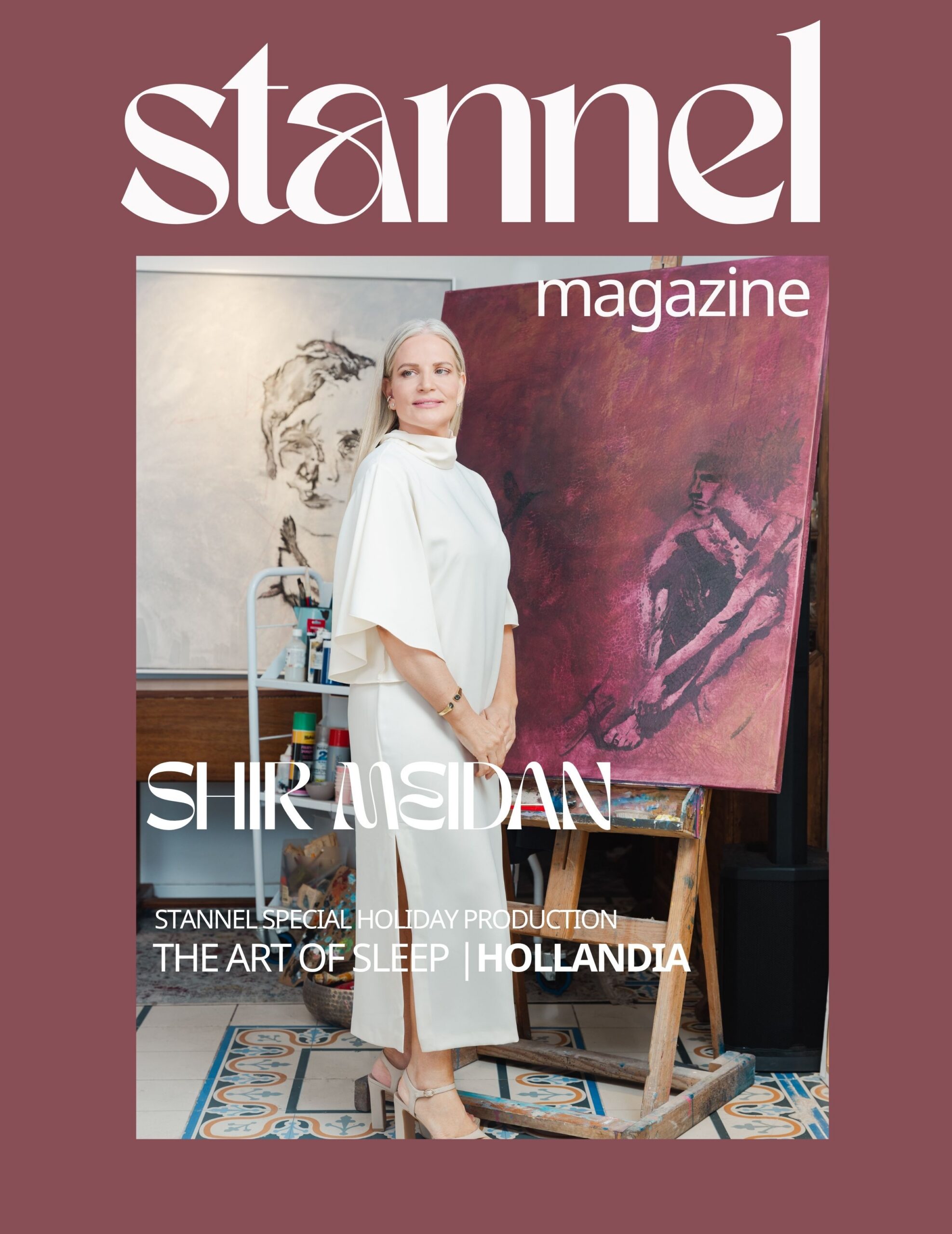
The designer Maidan song, founder and owner of the studio that bears her name, leads projects in the areas of residences, hotels, work spaces and commerce, for entrepreneurs and private clients. The studio’s work is characterized by a minimalist and functional language, alongside the use of materials, finishing details and furniture that bring warmth and […]
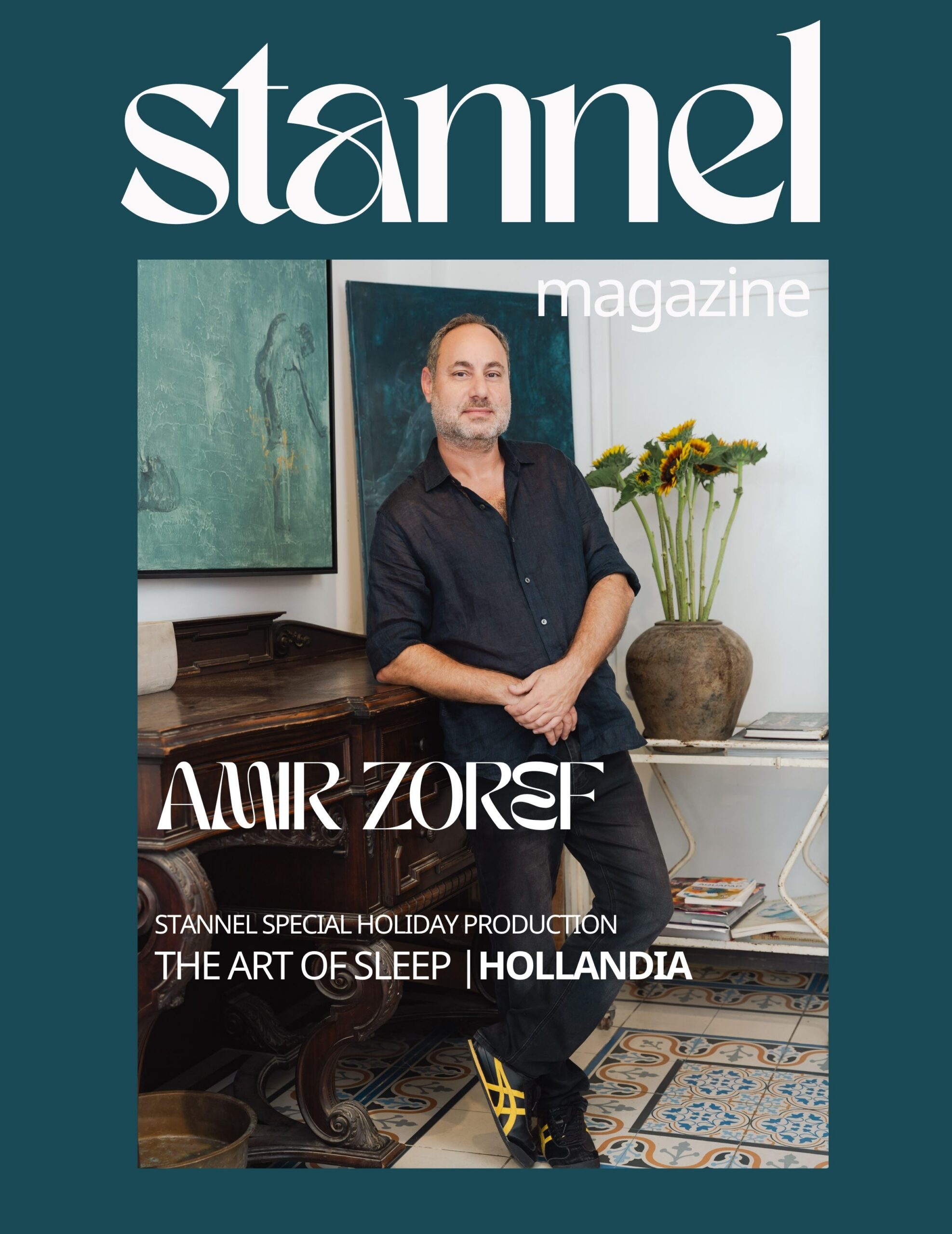
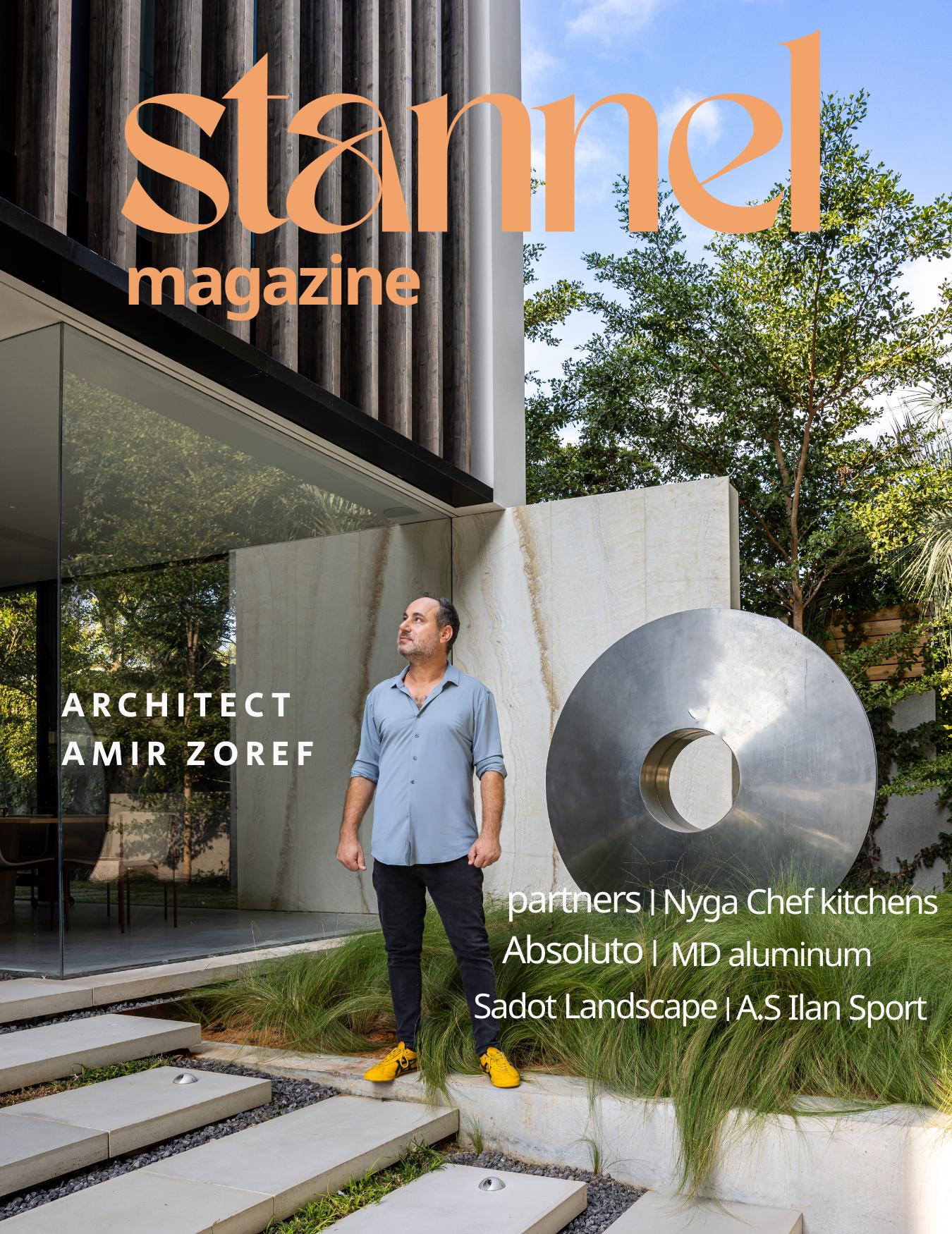
The connection between art and architecture accompanies the architect Amir Zoref Since childhood. As a teenager, he studied painting in a studio, and to this day he uses drawing as a tool for thinking, expressing, and illustrating ideas in the planning process. Zoref, a graduate of the Technion and owner of an independent office […]
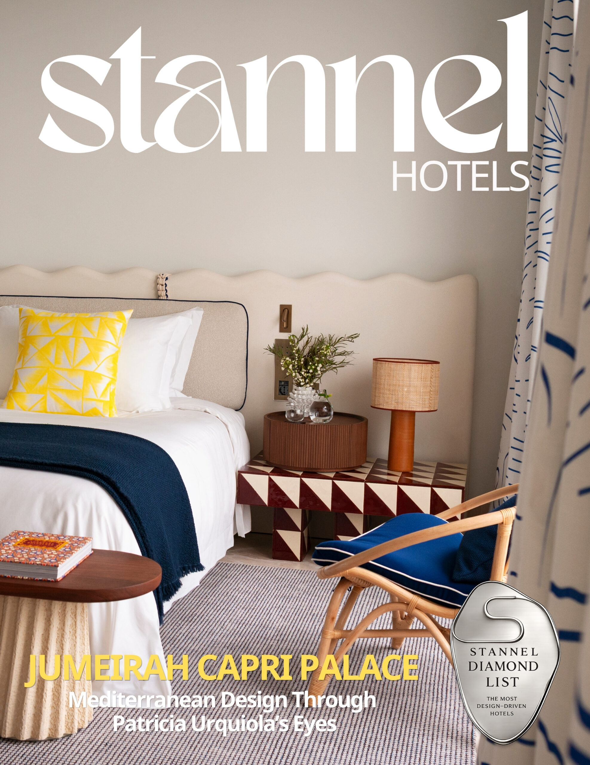
There is Capri, with its piazza, yachts and elegant bustle, and there is Anacapri – the high and quiet part of the island. At an altitude of more than 300 meters above sea level, facing the Bay of Naples and at the foot of Monte Solaro, stands Jumeirah Capri Palace, a hotel that seeks to […]
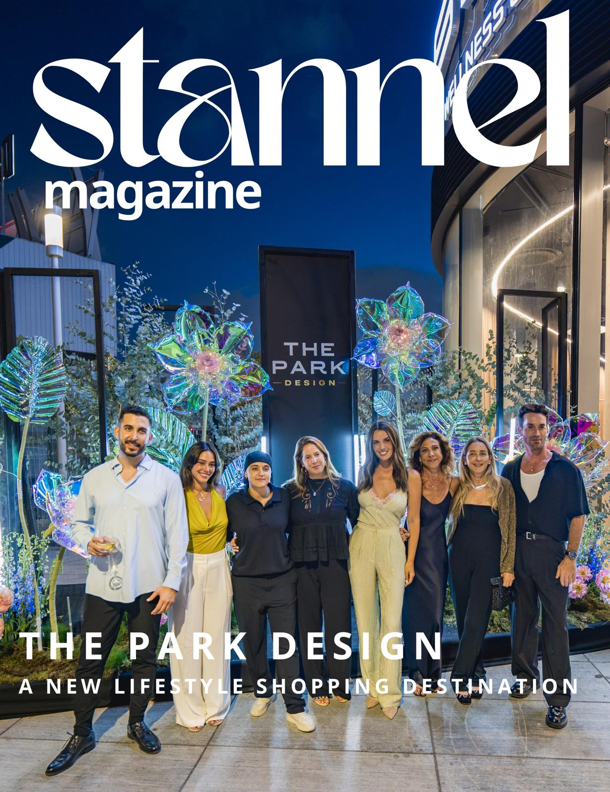
In the heart of the Lehi area, one of Israel’s renowned design hubs, a complex was recently launched THE PARK DESIGN – A new space for home design and lifestyle, which seeks to offer a more complete visiting experience: less exhausting transition between suppliers, stores and parking searches, and more of a concentrated path of […]
For this family, the question was not geographical at all, but essential. They wanted to live the city, not observe it from the sidelines. To be a part of it, but not be swallowed up by its rhythm. The choice of an apartment in a renovated building, in one of the small northern neighborhoods of […]
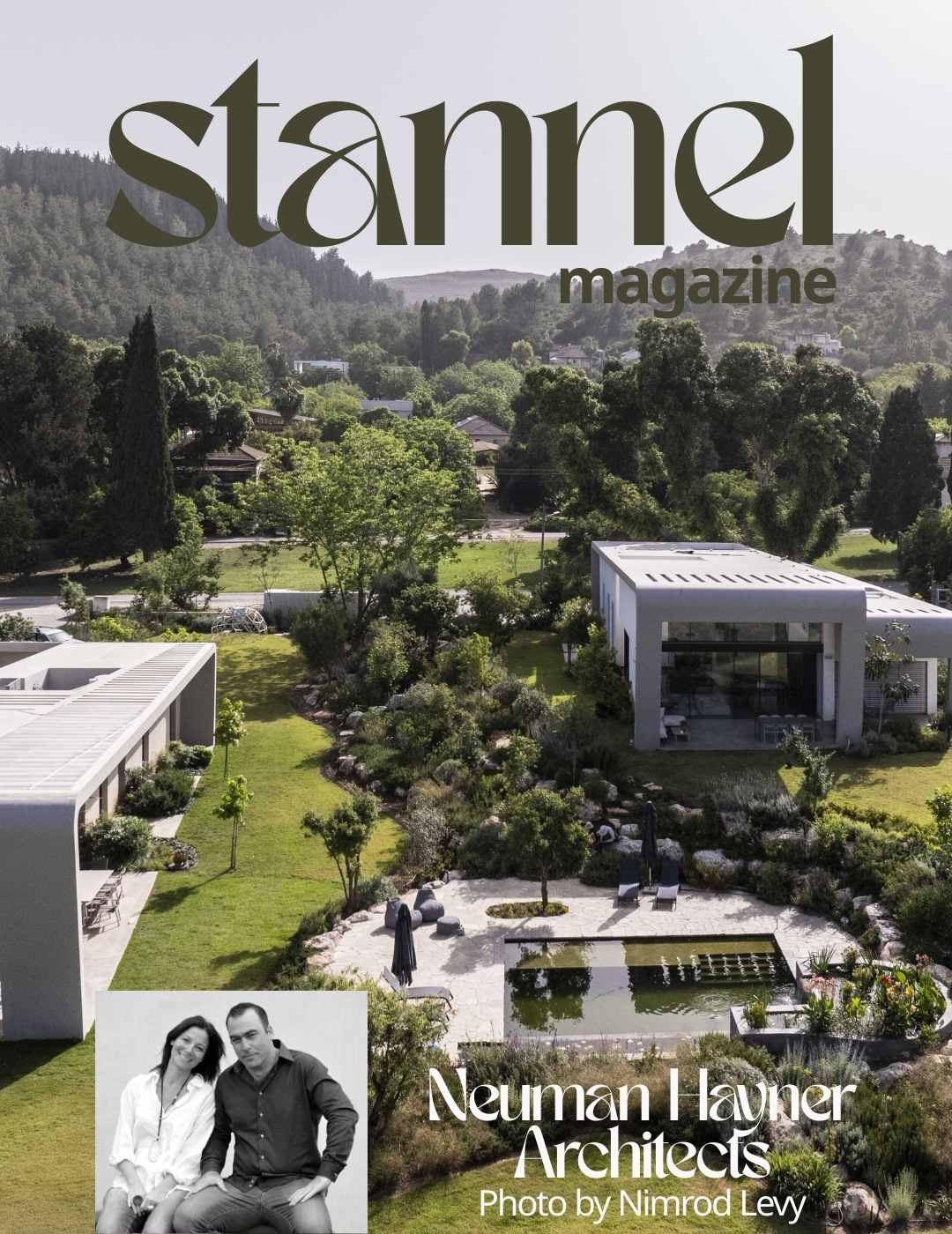
Neumann-Heiner Architects, led by architects Sharon Neuman and Yiftach Hainer, is among the most diverse we have encountered on the Israeli landscape. They design buildings and spaces of all sizes and types – public buildings, hotels, visitor centers and museums, residential buildings, office buildings, commercial spaces, urban renewal, building preservation, offices, restaurants, private homes and […]
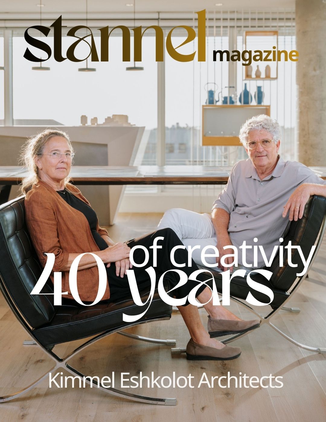
The Kimmel Eshkolot architectural firm, founded by Eitan Kimmel and Michal Kimmel-Eshkolot, is celebrating 40 years of extensive activity in the fields of architecture and design in Israel and abroad this year. A pop-up exhibition that opened last week somewhat summed up their journey, but according to them, they are always looking ahead, towards the […]
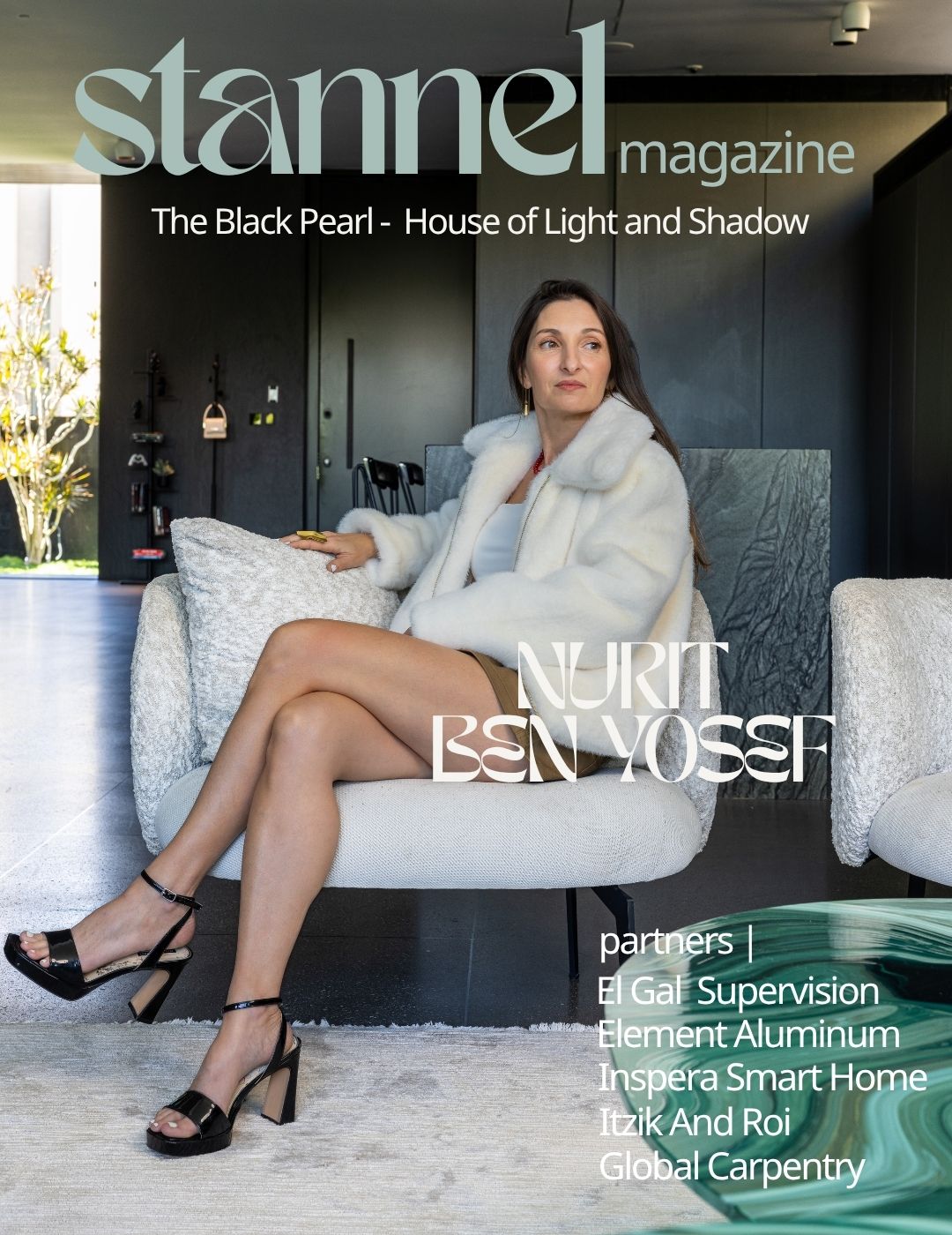
From every angle and every view, this house is impressive and meticulous.And so it is perhaps even more surprising to discover that its opening details were far from exciting – “A rectangular plot of half a dunam, in a quiet and monotonous neighborhood; a semi-detached house, without a special view and without much sun,” says […]

In recent years, the bedroom has become the central space in the home, not only as a functional space, but as a space that directly affects the quality of life. Hollandia, which began its journey in 1981, leads the world of sleep in Israel, combining comfort, innovation, design and many years of expertise. Alongside bedroom […]
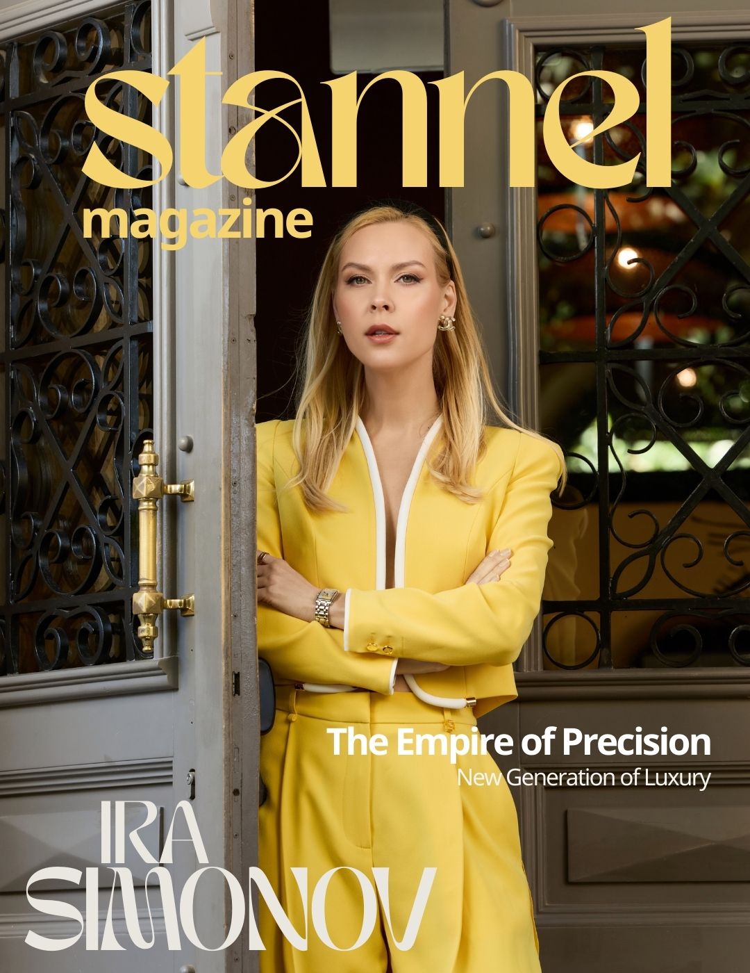
In an era where anyone can define themselves as a content creator, the term “lifestyle” has sometimes become empty of meaning.But for Ira Simonov, one of the most prominent and influential lifestyle influencers in Israel, it’s a coherent and clear concept of life. Not aesthetics for aesthetics’ sake, not exposure for exposure’s sake, but a […]
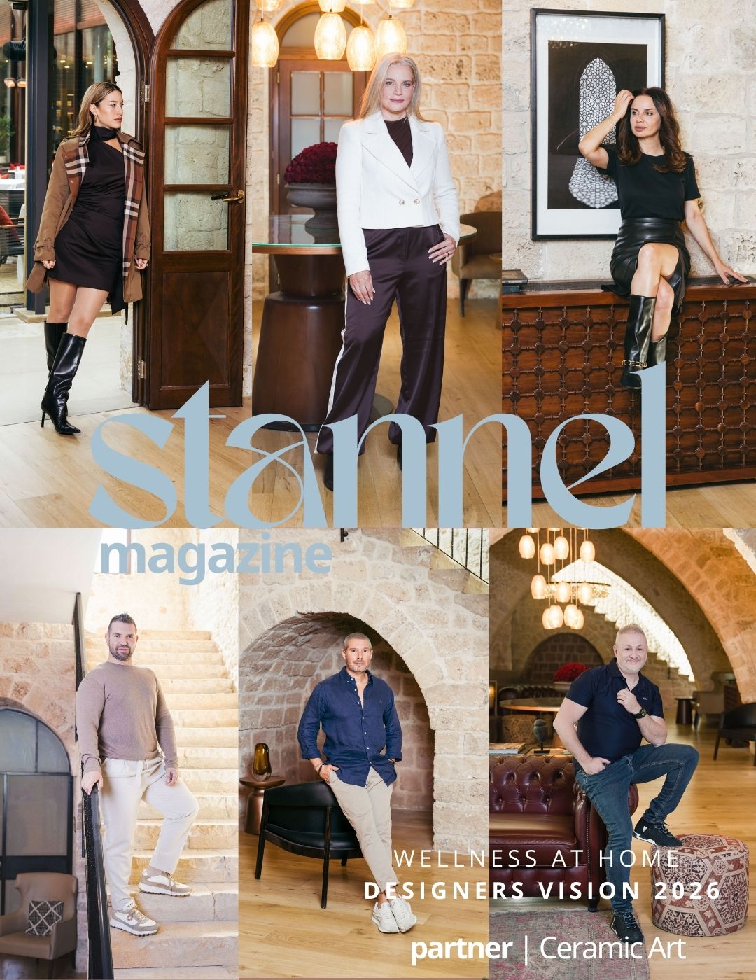
In recent years, the world of wellness has undergone a profound transformation.What began as a concept related to fitness, nutrition, or exotic retreats has become a broad concept that defines an entire lifestyle. Wellness is no longer a one-time action, but a system of daily decisions aimed at improving the quality of life, reducing mental […]
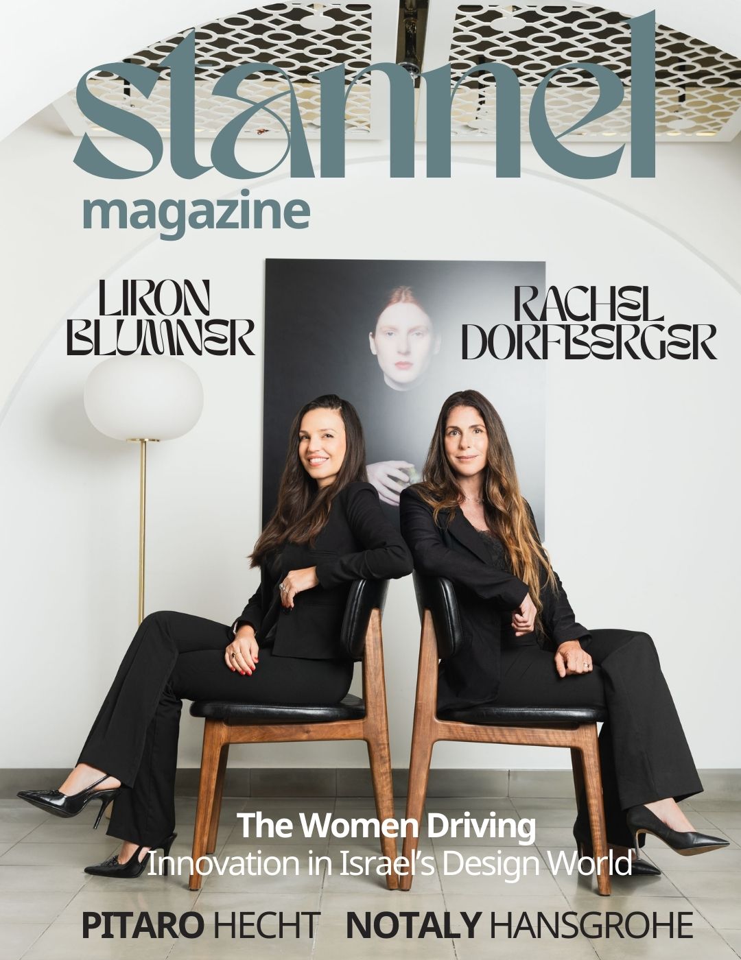
Women’s Day is a great reminder to look not only at the result, but also at those who are leading the way to it.In the design industry in Israel, this is felt at every stage: in the studio, on the ground, in the showrooms, and also behind the scenes, with the women who connect an […]
In the heart of the Lehi area, associated with showrooms and home design stores, was recently launched THE PARK DESIGN – The design and commercial complex of THE PARK Complex. The complex offers a centralized and convenient space for inspiration, choice and planning, alongside accessibility and a complete visiting experience, and appeals to both the […]
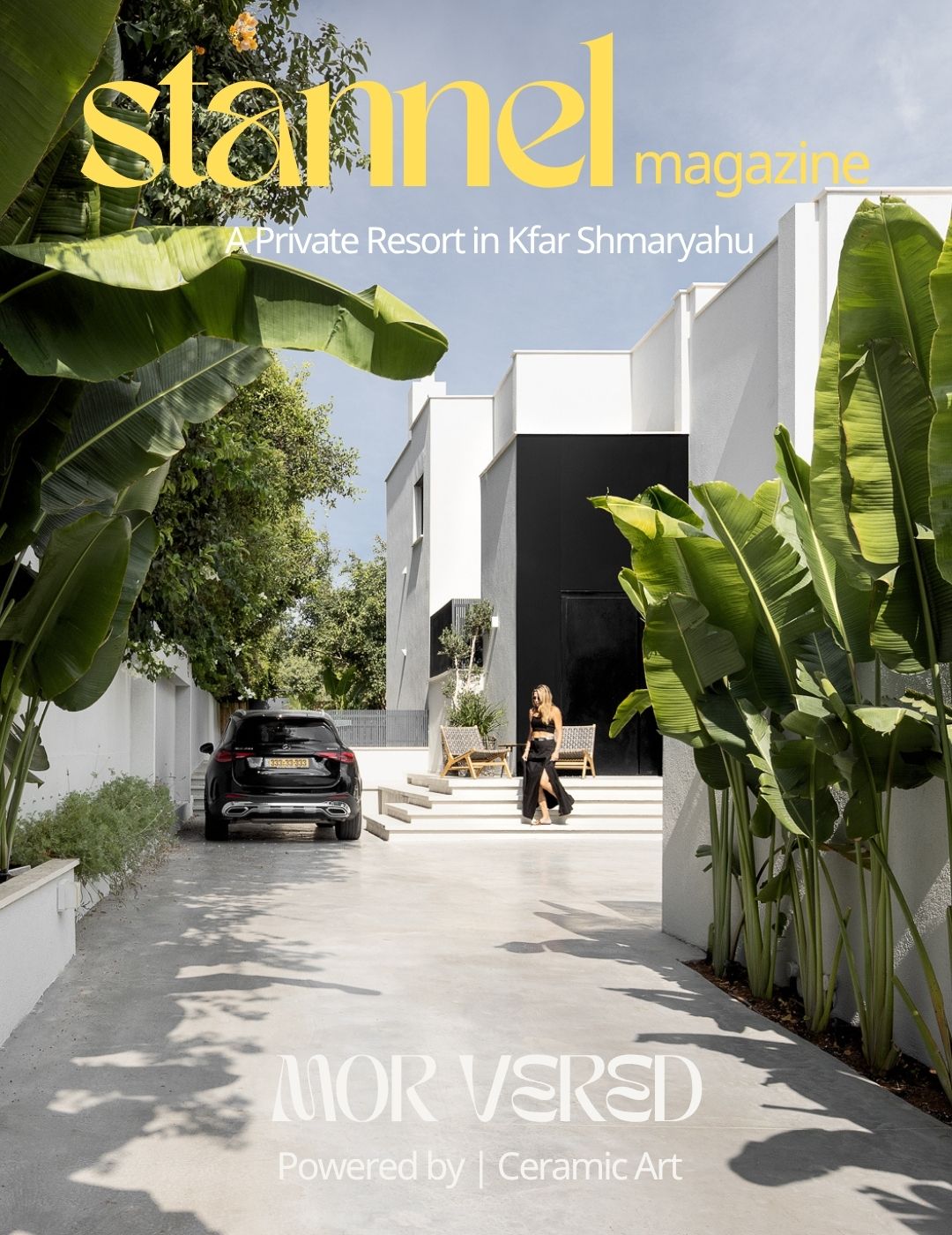
In the village of Shmaryahu, on a plot of about 700 square meters and inside a three-story house, a comprehensive renovation plan was formed that changed the house from the ground up — literally. All the walls of the building were demolished, the openings were widened, the rooms were enlarged, and the spaces were reorganized […]
In the village of Shmaryahu, on a plot of about 700 square meters and inside a three-story house, a comprehensive renovation plan was formed that changed the house from the ground up — literally. All the walls of the building were demolished, the openings were widened, the rooms were enlarged, and the spaces were reorganized […]
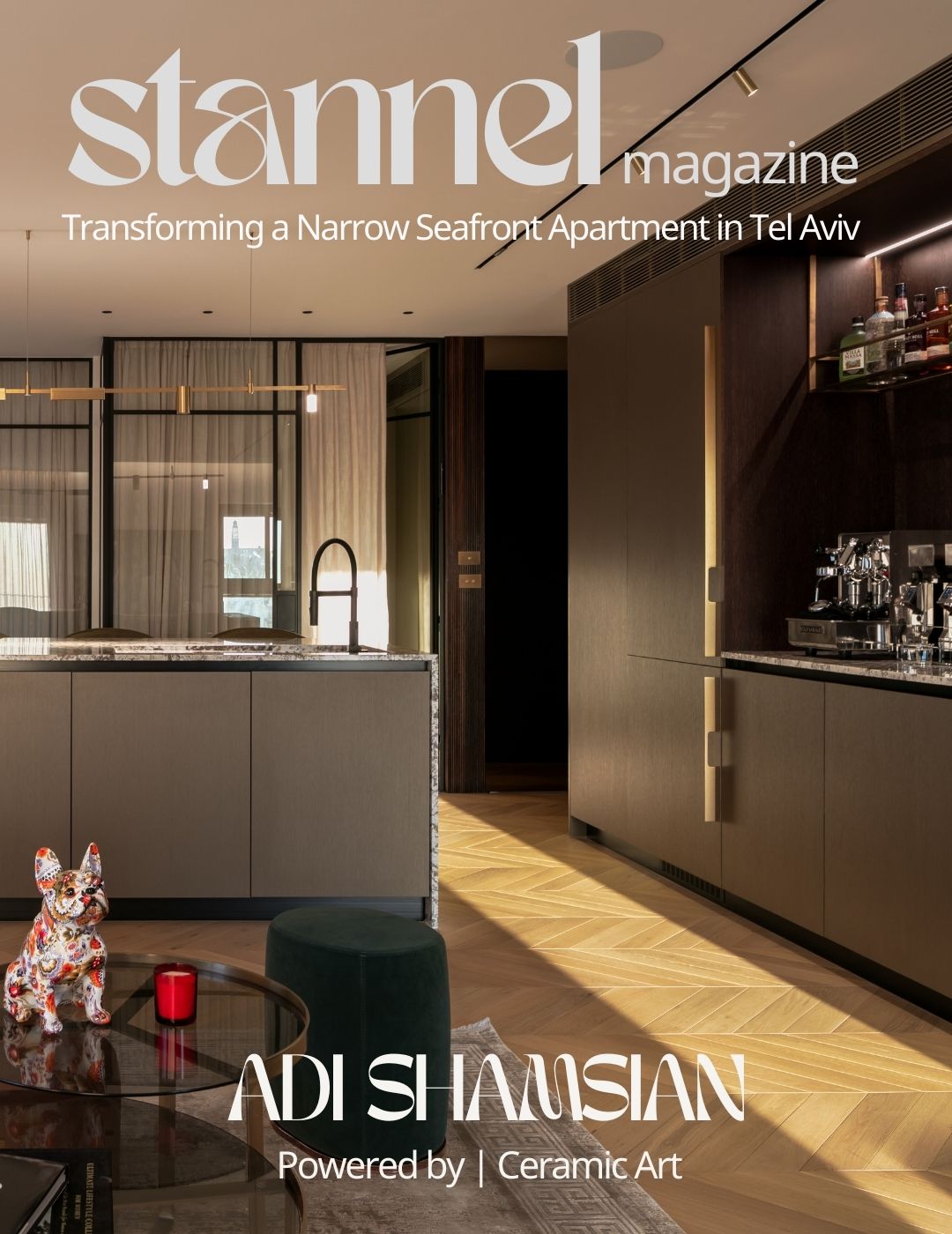
The project began with a simple request from a couple: to transform a long, narrow contractor’s apartment into a space that serves their daily lives but also allows for a sense of hospitality, freedom, and comfort of a boutique hotel. They requested clear division, precise storage, a kitchen that functions as the center of the […]
בכפר שמריהו, על מגרש של כ–700 מ״ר ובתוך בית בן שלוש קומות, התגבשה תכנית שיפוץ מקיפה ששינתה את הבית מן היסוד — תרתי משמע. כל קירות המבנה נהרסו, הפתחים הורחבו, החדרים הוגדלו והחללים אורגנו מחדש כך שיתאימו במדויק לאורח החיים של הזוג וילדיהם. התוצאה היא בית שעוצב מחדש כמעין ריזורט אישי, מקום מפלט מודרני שמציע […]
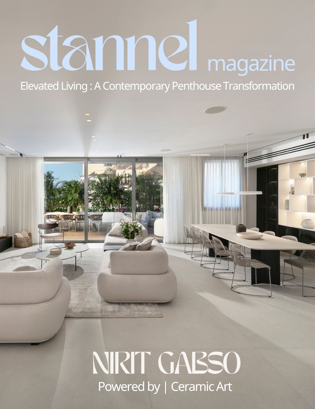
בקומה השמינית של בניין עירוני במרכז הארץ, תכננה המעצבת נירית גבסו שיפוץ מקיף לפנטהאוז בשטח של כ-200 מ”ר ומרפסת של כמעט 100 מ”ר. הדיירים , זוג ושלושה ילדים ביקשו בית מאורגן, אלגנטי ונקי, המשקף קווים עכשוויים לצד נוחות שימושית ותפקוד יומיומי יעיל. גבסו הובילה תהליך תכנון שנע בין עיצוב מדויק לפרקטיקה מוקפדת, והצליחה לגבש שפה […]
200 SQM
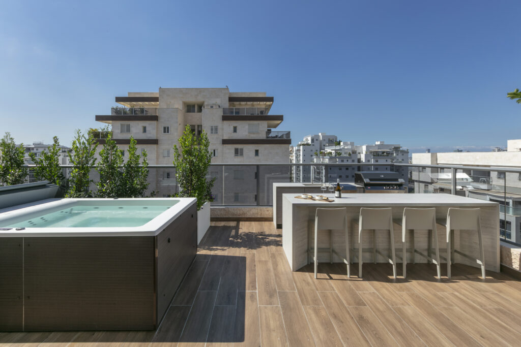
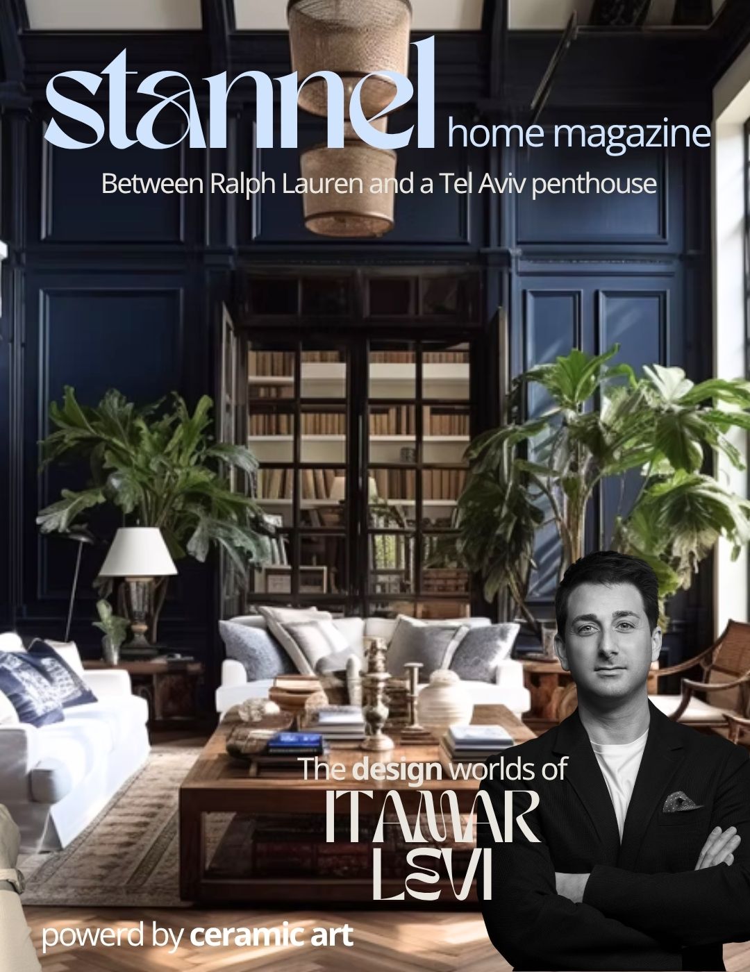
Itamar Levy came to the world of design out of a passion for art.: Painting, sculpture and even fashion design were an integral part of his life since high school. But he found his true stage when his parents built a house, and he was exposed to the process and even actively participated in it. […]

Our magazine team receives a variety of homes. Sometimes we understand the home immediately from the first picture, but sometimes the beauty and wisdom behind the home are revealed gradually. From angle to angle, from picture to picture, we discover the thinking behind the design, the small details, the hidden surprises that make this house […]

Dana Elkon Architects The basics: Dana’s studio has been operating for over 15 years and is distinguished by its special attention to every detail, small and large, in the process of designing residential interiors and dressing the home. This creates a sense of completeness in the space, where all the details and accessories fit together […]
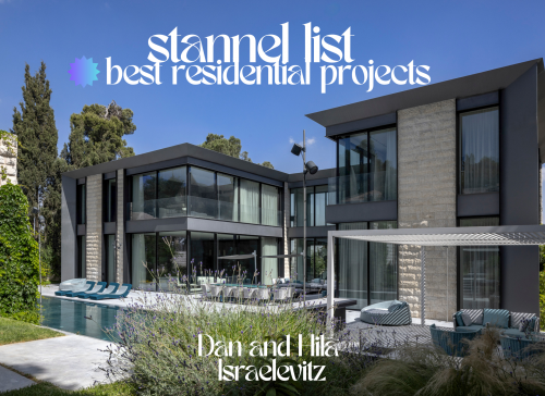
Meet Dan and Hila Israelevitz, who have headed the Israelevitz Architects firm for over twenty years. The firm specializes in planning and designing luxury homes, residential buildings, public buildings and commercial spaces, with an emphasis on support throughout the process, with the aim of creating a uniform and continuous continuity between the architectural process and […]

Meet Michal Matalon, engineer, interior designer and studio ownerHomeMakerfor planning and design. She founded the firm 17 years ago, “out of a love for architecture that combines precision, emotion and connection to the environment.” “Our way of working is based on deep listening, meticulous design, and a harmonious combination of old and new, natural and […]
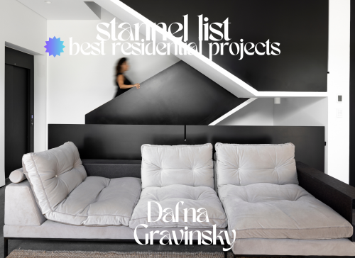
Meet Dafna Grabinsky, an interior designer and owner of an independent office for 11 years, where she designs houses, apartments and commercial spaces. In addition, she owns a design school in collaboration with the Crazy Nordic brand, and holds professional tours for designers among artisans at the flea market.Dafna defines herself as an artist and […]
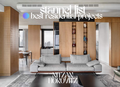
Meet Nitzan Horowitz, a multidisciplinary designer and owner of an office that has been operating for 24 years, dealing with a wide variety of projects from the private and commercial markets. The firm employs architects and interior designers, and 3D work is an integral part of the work process. “We do a significant portion of […]

Meet Kfir Galatia Azoulay – an architect, engineer and multidisciplinary designer, who heads KOT Architects. The studio has seven employees and is involved in a variety of residential, office, hotel and commercial projects. They are currently working on a 70-room boutique hotel in Budapest in a listed building, As well as establishing a new nationwide […]

Meet Anna Weil, interior designer and owner of Wantym Studio, which was established in 2021 and specializes in residential planning and design. Anna opened the studio after the split of ‘Studio Matka’, which she founded in 2007 together with Hila Gal. For seven years, she lectured in a variety of courses in the Department of […]

5 tips for renovating your home before selling Not being able to sell your apartment? It could be that you’re not preparing it enough before the date with the buyers. We have collected for you the best tips from interior designers regarding designing an apartment before selling, so that it sells – and at the […]
Combining and balancing ease of use and visual appearance are at the center of all areas of design, How to balance them in a way that one does not come at the expense of the other is the question for every designer. In accessible budgets and apartments in buildings, where the framework is dictated in […]
In design, there is no single right answer and there are many approaches, styles, and ways to reach the goal. In terms of design concept, there are apartments and houses where each room stands on its own For each space, the appropriate materials, finishes, and details are selected, and each room tells a slightly different […]
Many current trends in design represent our desire to mix styles and create something that is both or in between. A space that takes elements and characteristics from all sorts of styles and worlds and mixes them together to create something new, one that suits our lifestyle and character. The Hippie style, which mixes Japanese […]
When we prepare for a house or apartment renovation, we usually know that planning and patience are required, we will take into account the investment in time and money, we will recruit professionals around us and mark everything we dream of on Pinterest. Flexibility, openness, and listening are not the first principles we think of, […]

The basics: Studio Tali Gotthilf is an interior design firm specializing in commercial design – work environments, clinics, public spaces and accommodation units in Israel and abroad. The studio was founded by interior designer Tali Gotthilf three decades ago and has expanded its creative fields over the years. The studio, which has won international design […]
Meet Dafna Grabinsky, an interior designer and owner of an independent office for 11 years, where she designs houses, apartments and commercial spaces. In addition, she owns a design school in collaboration with the Crazy Nordic brand, and holds professional tours for designers among artisans at the flea market.Dafna defines herself as an artist and […]

There is something very romantic and nostalgic about elements that have a story and history behind them. These will always attract our eye and arouse questions and curiosity. This house, designed by Liat Post for a family in central Israel, is full of such stories. The homeowners maintain their own workshop, where they renovate and […]
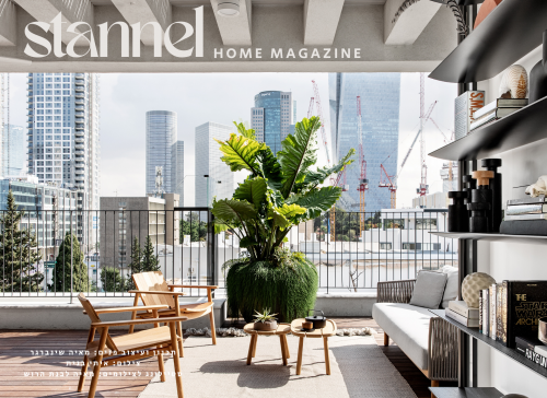
Three ways to enhance the sense of space we learned from this apartment When we look at this Tel Aviv apartment and hear its story from designer Maya Sheinberger, we get a sense of expansion – a couple who became a family, a new apartment added to the building as part of the TAMA 38 […]

After years of right angles, cubes and straight lines, arches and curved lines are returning to our lives and the design of our homes. Like other trends in design and in general in recent times, this too is probably related, in one way or another, to our desire for softness and a return to nature, […]
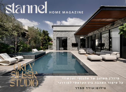
Yes, there is no doubt that the tension between adherence to the sources and modern adventures is present in almost every field of creation.Those who succeed in identifying the timeless classics, those that always remain relevant, and weave them into the contemporary themes of modern design (and even postmodernism, which is everything), with wisdom and […]

When renovating a house or apartment, clients, with the close assistance of the designers who accompany them, are required to make countless decisions, small and large, with each decision also affecting those that follow. For many, this process is complex and very emotional, but there are tools to navigate it well and effectively. One of […]
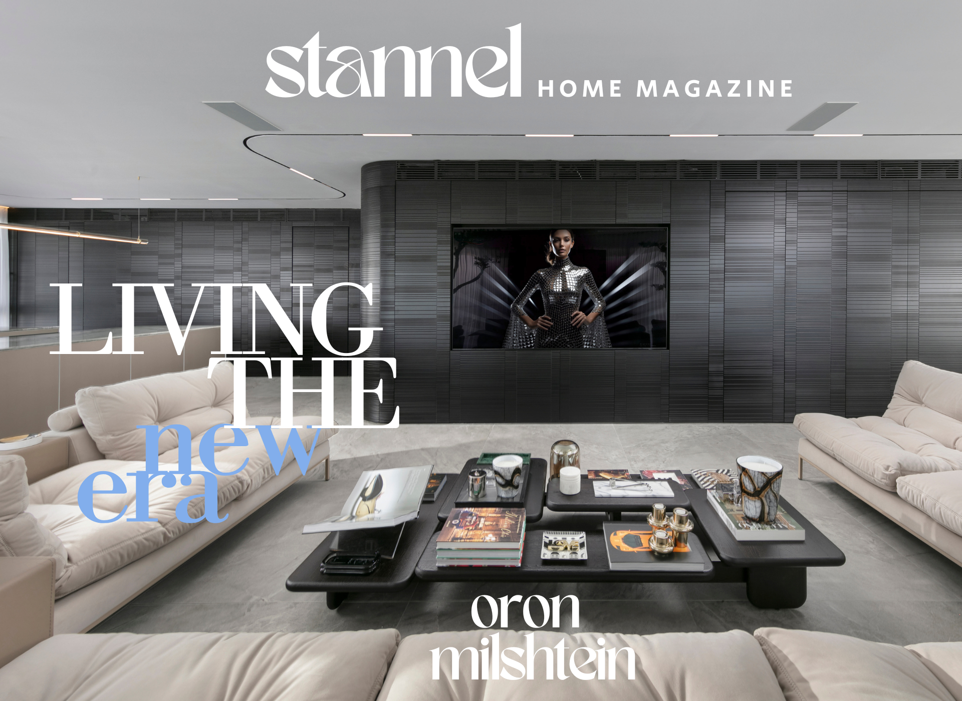
Meet Oron Milstein, Interior designer and owner of an independent studio for over 16 years, specializing in planning and designing apartments and luxury homes, alongside commercial spaces such as fashion stores and showrooms. Oron’s design language is concise and unique, and he draws inspiration from diverse fields, including fashion and art. His style is characterized […]
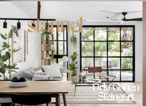
We all want a cozy, warm, and welcoming home. But how do you create such a home? How do you combine all the elements well to create a home that is both comfortable and practical, as well as relaxing and caressing? In this home in north Tel Aviv designed by Orly Gonen Steingart of Gonen […]

We invest a lot of time, energy and thought in choosing our living environment, the place where we will settle and build (or renovate) our home. In some cases, we will want to bring the environment into the house, at least conceptually, and create a design language that looks outward and draws inspiration from the […]
Yes, there is no doubt that the tension between adherence to the sources and modern adventures is present in almost every field of creation.Those who succeed in identifying the timeless classics, those that always remain relevant, and weave them into the contemporary themes of modern design (and even postmodernism, which is everything), with wisdom and […]
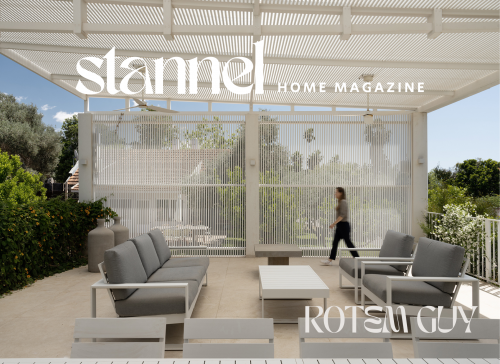
An old house on an agricultural estate in a moshav in central Israel was demolished and a new house was built in its place for a couple in their seventies. On the outside, existing olive trees were preserved and the yard was designed according to the existing slope of the lot. On the inside, the […]
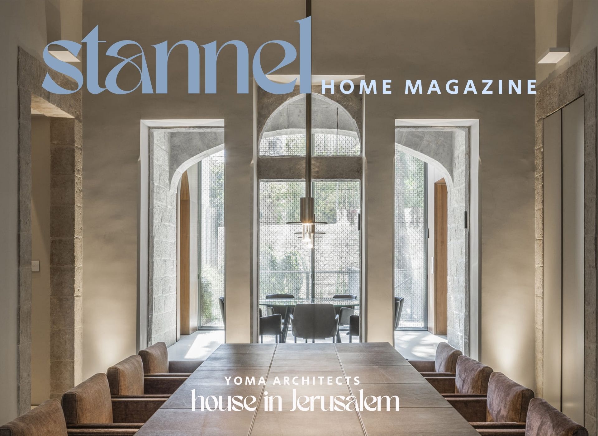
The house covers an area of 500 square meters and is surrounded by an impressive garden of approximately 400 square meters.The project, designed by Yuma Architects, owned by Netanel and Michal Meir, involved a meticulous and profound process of preserving the existing structure, alongside the integration of modern and new infrastructure and construction, while creating […]
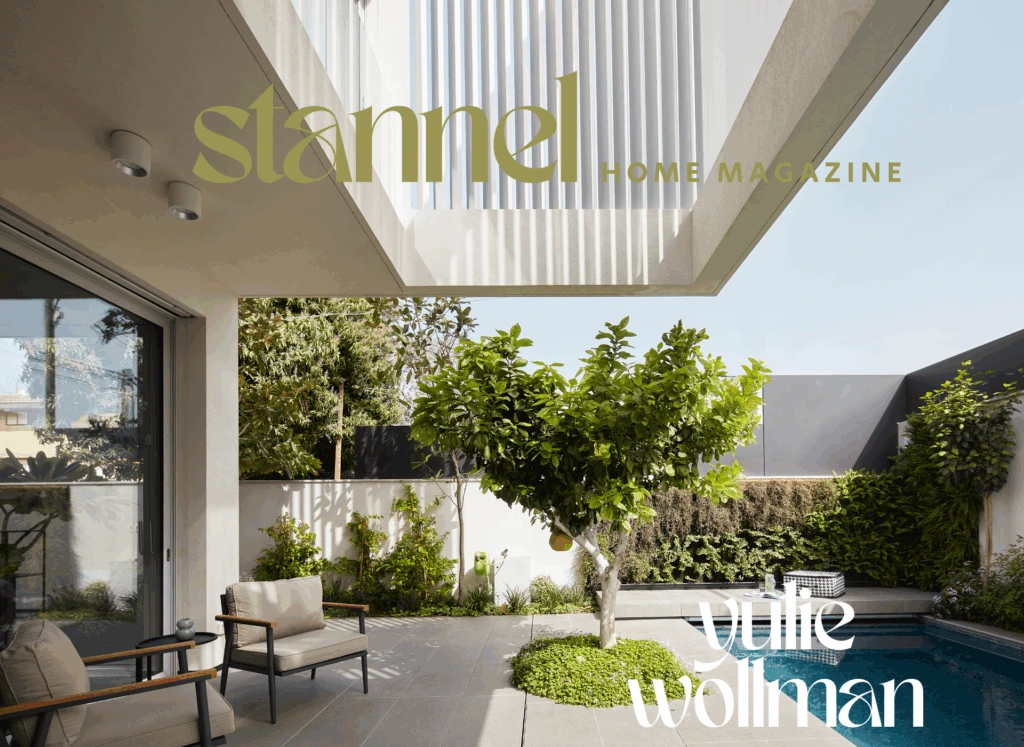
Our magazine team receives a variety of homes. Sometimes we understand the home immediately from the first photo, but sometimes the beauty and wisdom behind the home is revealed gradually. From angle to angle, from picture to picture, we discover the thinking behind the design, the small details, the hidden surprises that make this […]
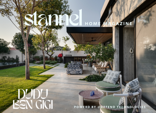
When designing a home, it’s not just about choosing colors, materials, or furniture pieces.– This is a process that requires forward-looking thinking,Deep thinking about the present and future lifestyle and adapting to changing needs. How do you create a home that will still feel right in a decade or two? How do you maintain a […]

A family of four fell in love with the yard and pool of this home in Hod Hasharon. They approached designer Shir Steigman with the idea of a small upgrade. But after a short tour of the house, Shir realized that a more significant intervention was needed here: “They were thinking of something specific, but […]

Subscribe to our lifestyle channel newsletter
Error: Contact form not found.
Subscribe to our lifestyle channel newsletter
Subscribe to our lifestyle channel newsletter